AIB life
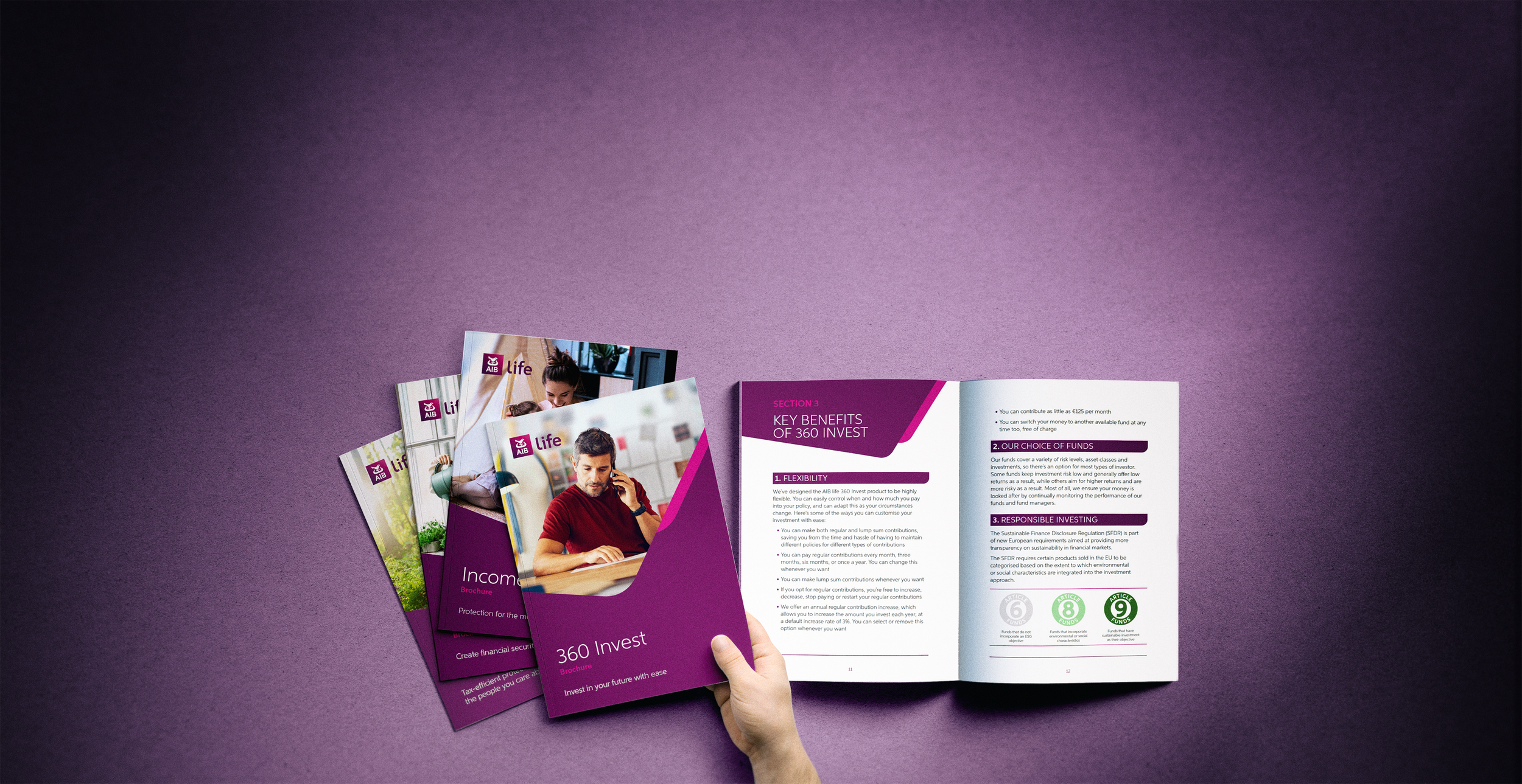
AIB life – Literature Transformation Programme
A strategic redesign programme for AIB life, focused on transforming a complex suite of customer-facing financial publications into a clearer, more engaging and scalable communication system. The project set out to improve readability, accessibility and consistency across a range of regulated product literature, while exploring how AIB life could communicate with more warmth, confidence and visual distinction.
The Brief
AIB Life required a refreshed suite of life insurance literature that would feel clear, reassuring and easy to navigate, while still working within the structure and expectations of regulated financial communications.
The objective was to review how the material could be modernised, both visually and editorially, without losing the sense of trust, clarity and accessibility expected from the brand. The work needed to support different product categories, make complex information feel more approachable, and create a stronger connection with customers at important life decision points.
From the outset, the challenge was to balance practicality with personality: creating a system that could work across a broad suite of documents, while exploring whether the literature could move beyond a purely functional format into something more distinctive, engaging and ownownabler AIB Life.
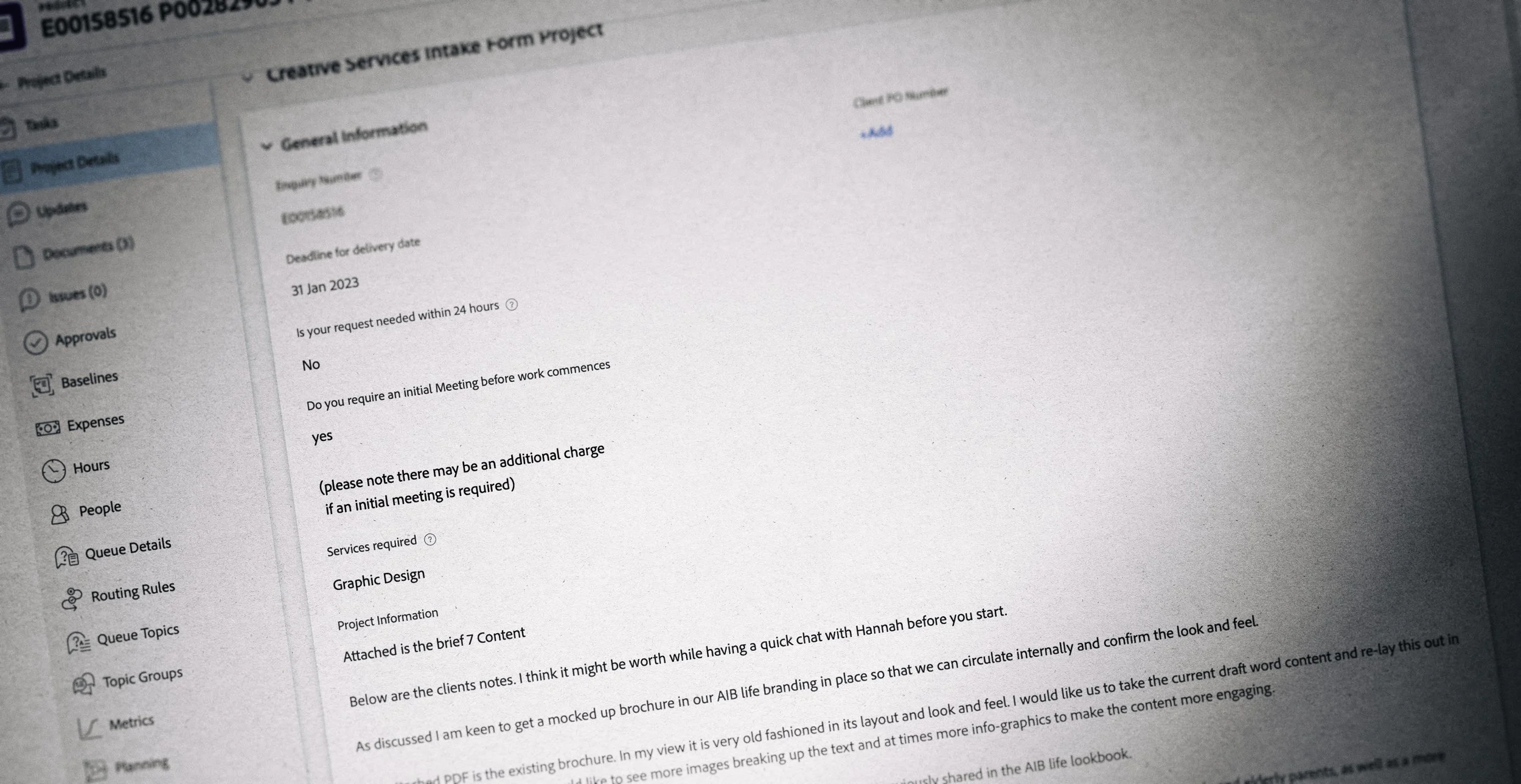
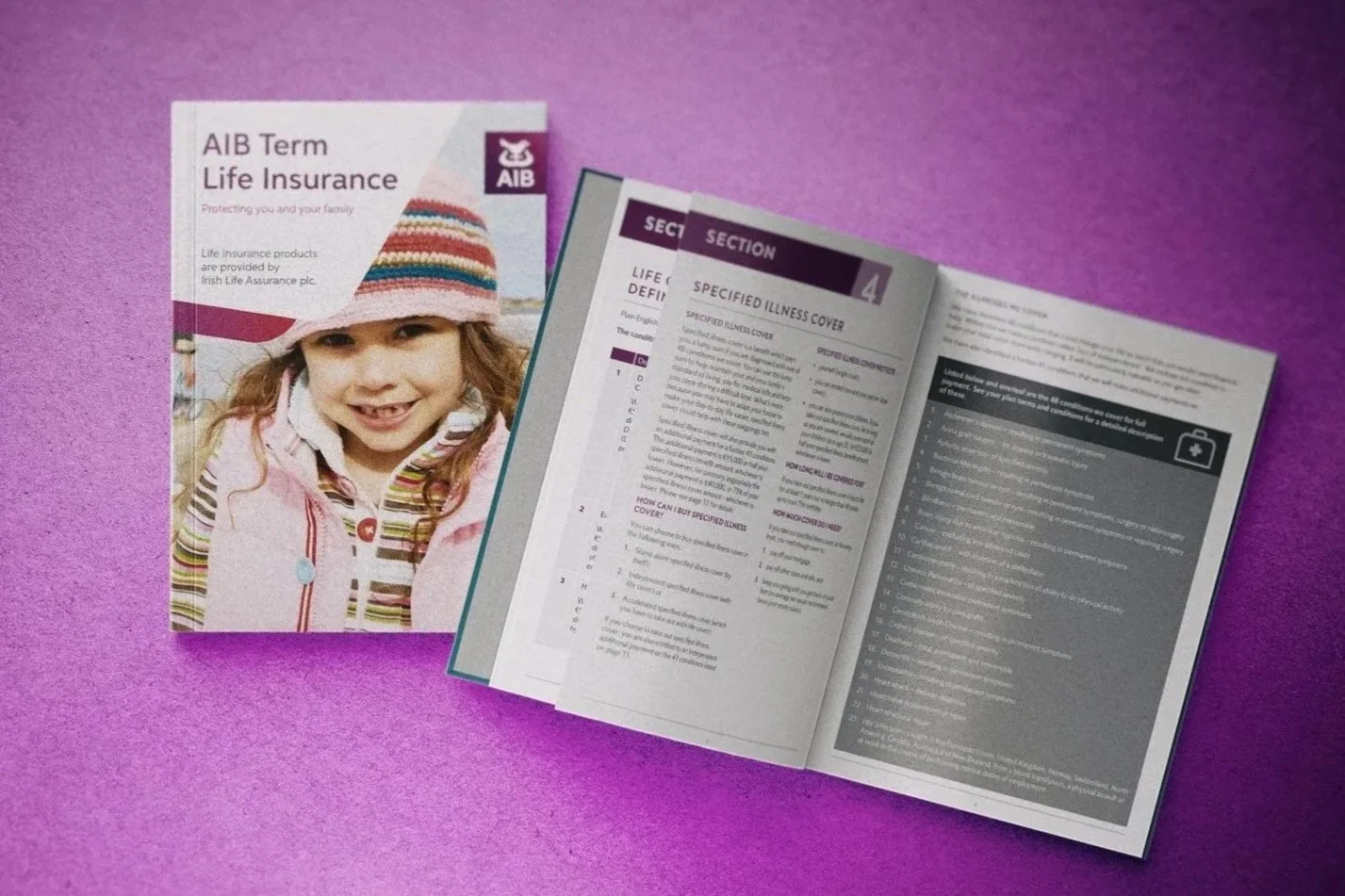
Initial Creative Exploration
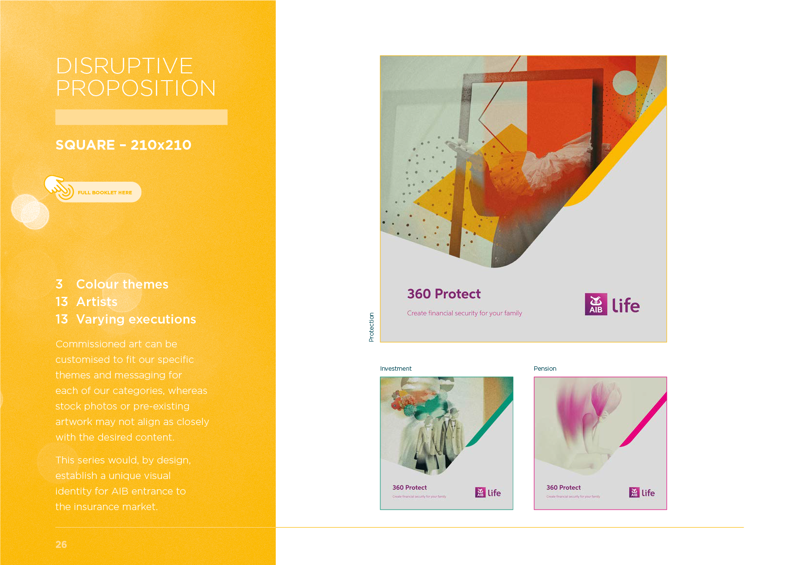
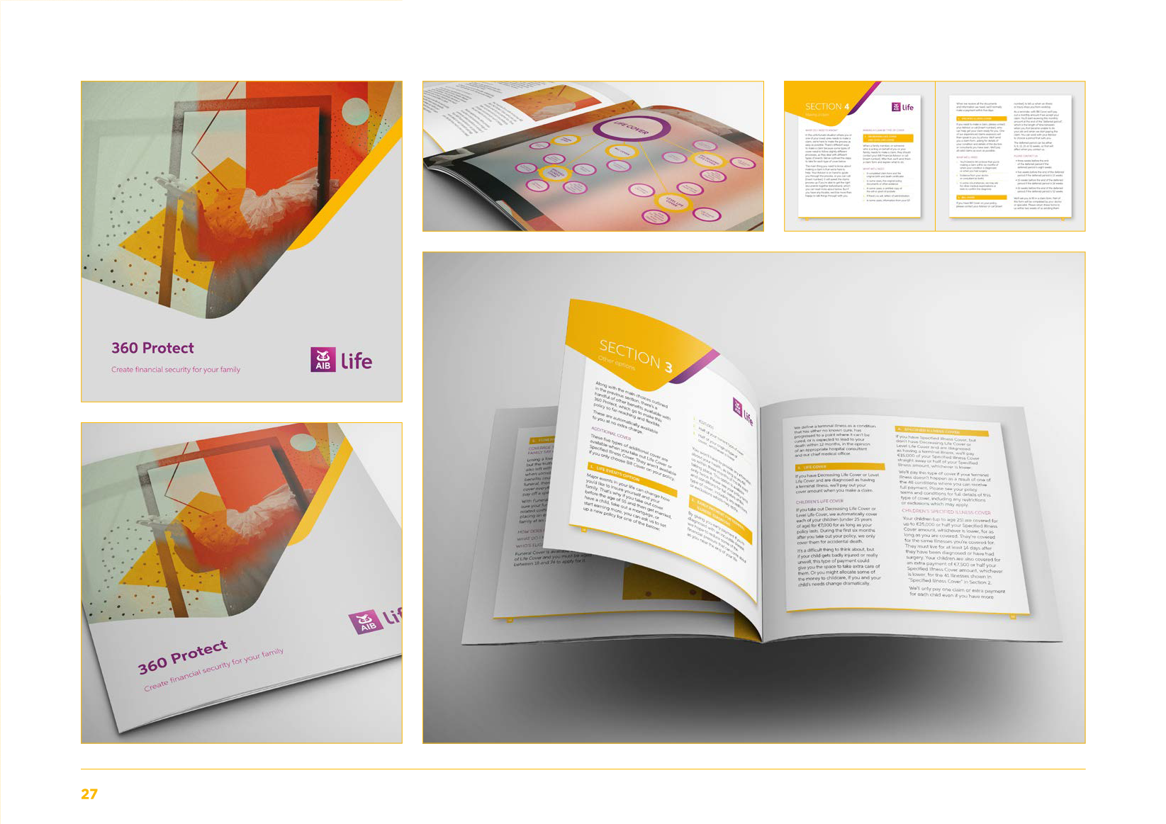
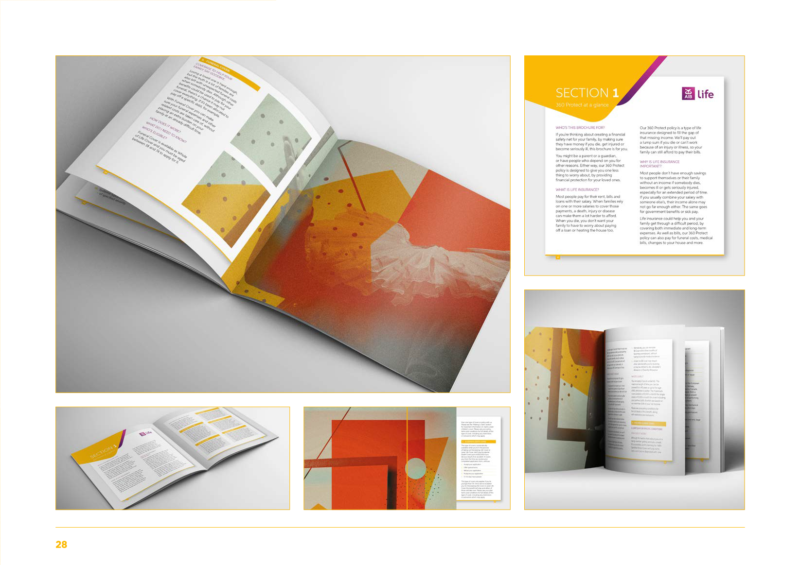
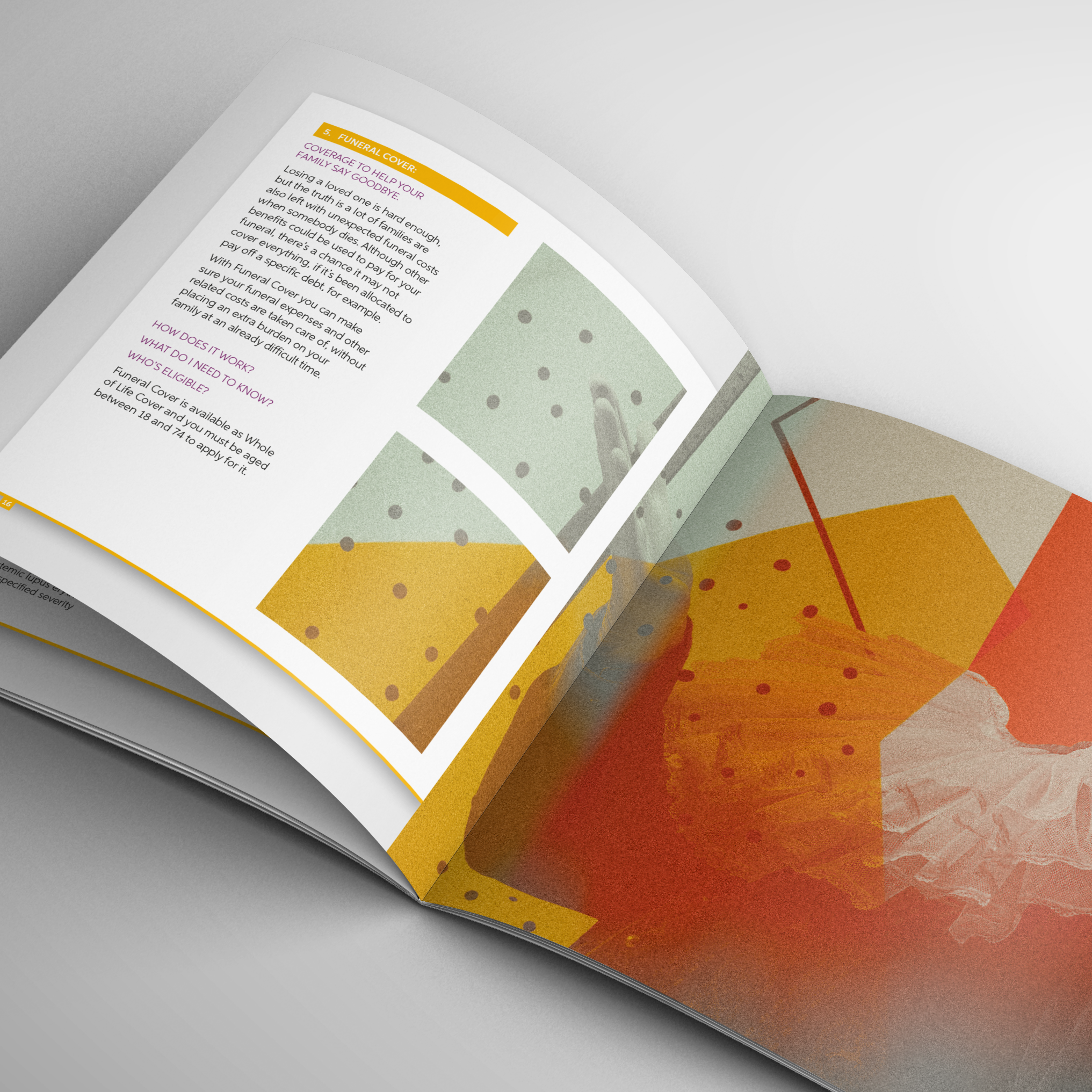
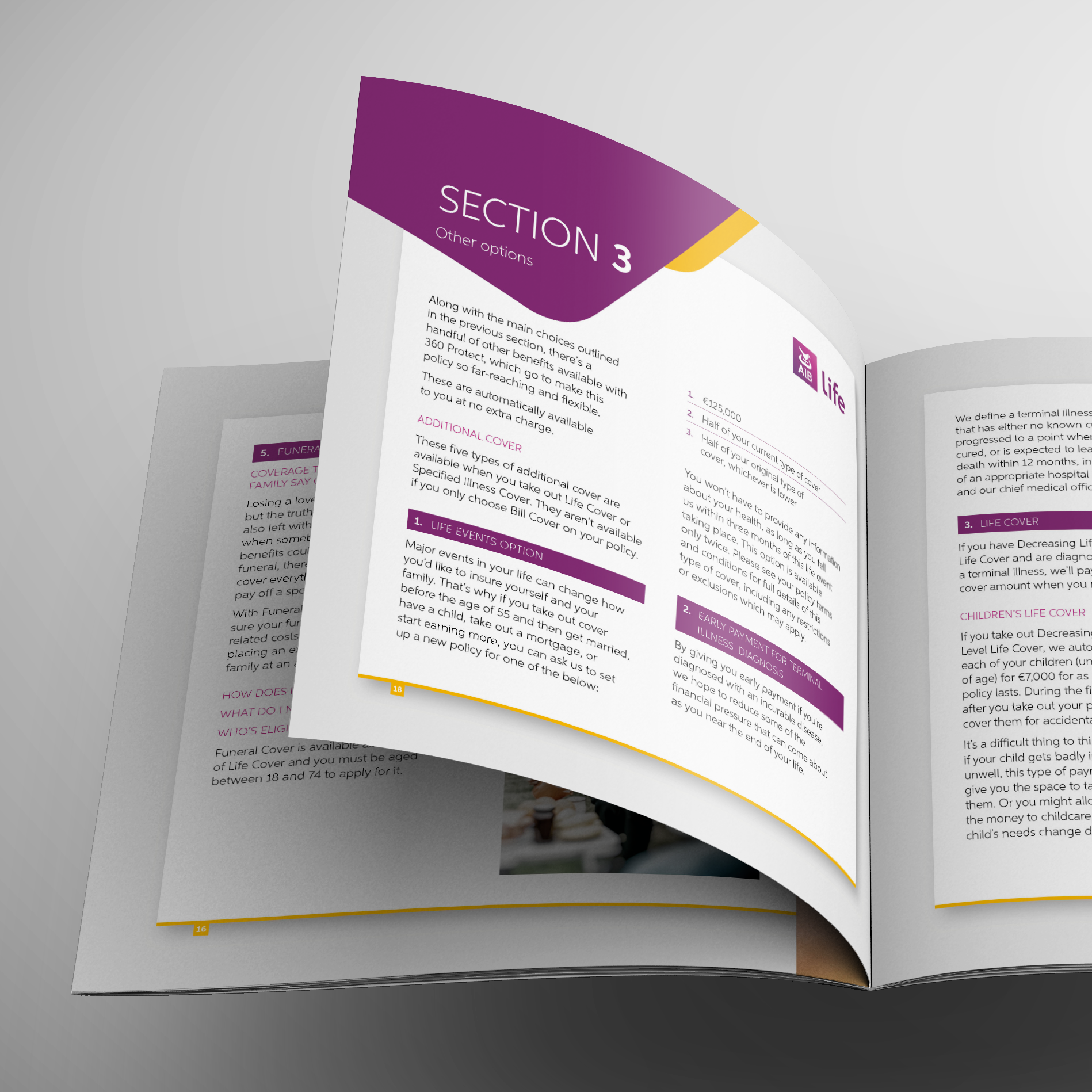
The first presentation explored two distinct routes: a traditional photographic approach and a more disruptive illustrative direction.
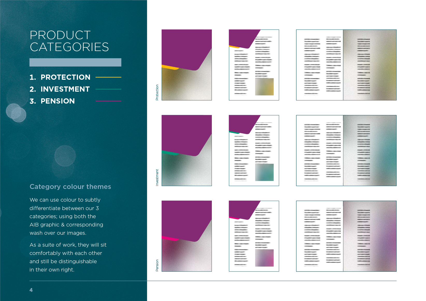
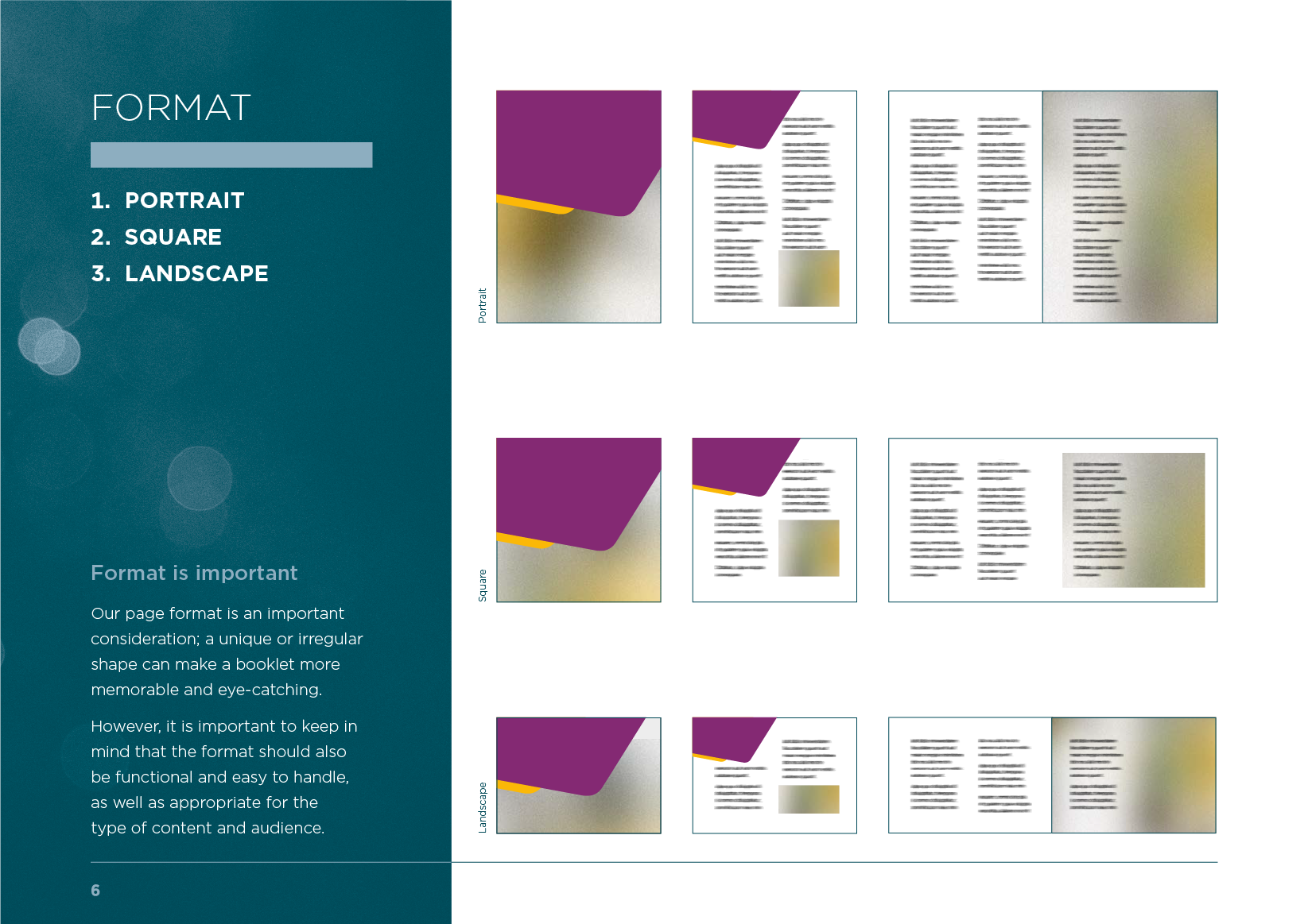
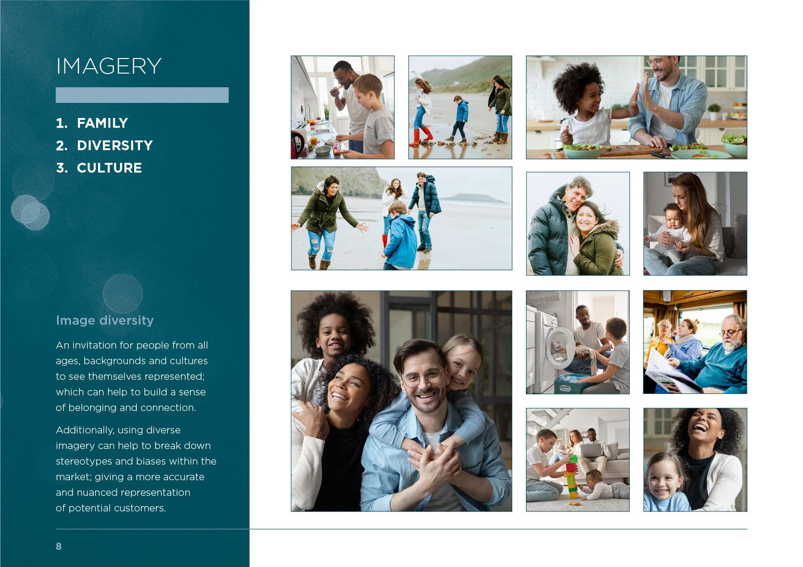
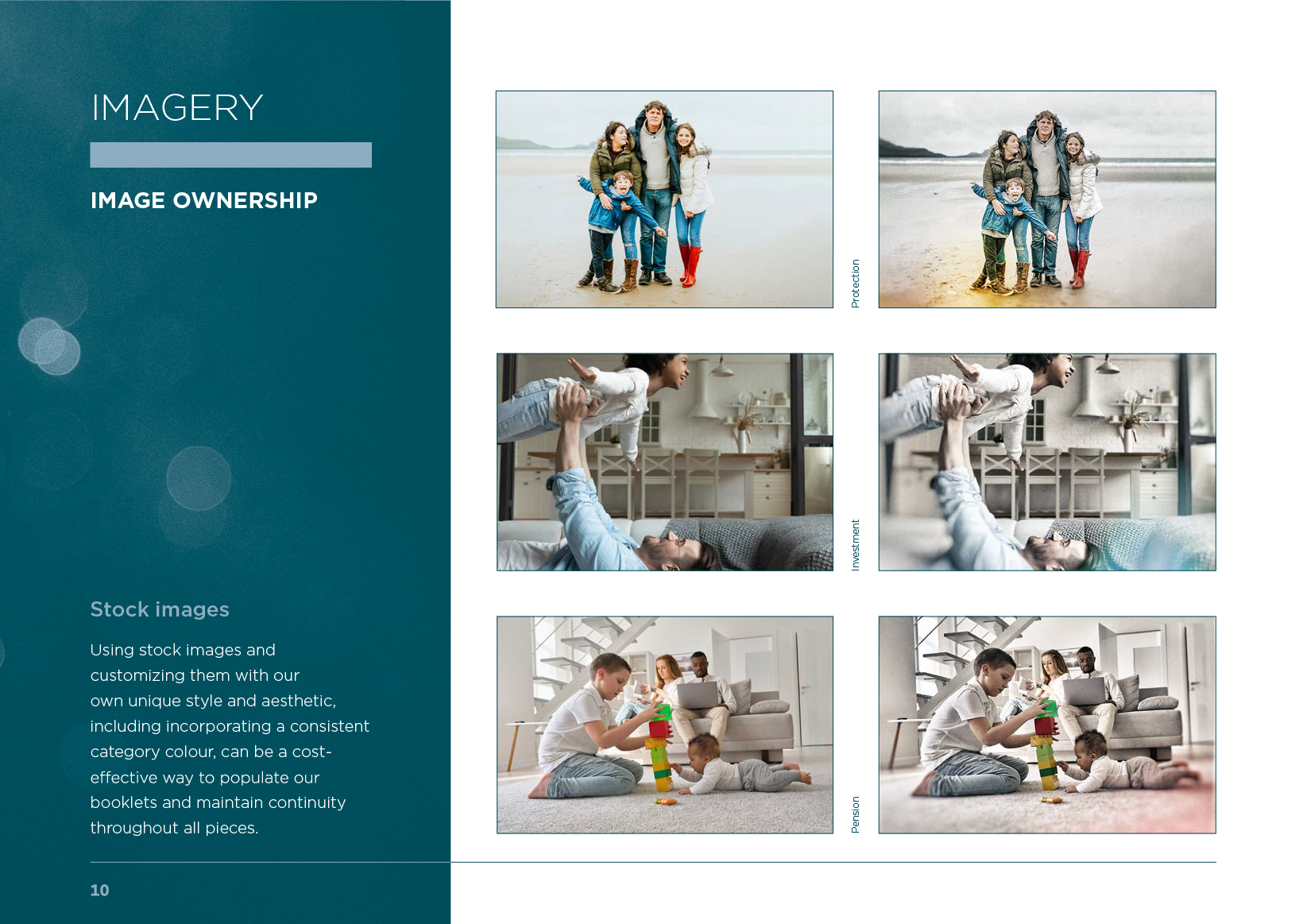
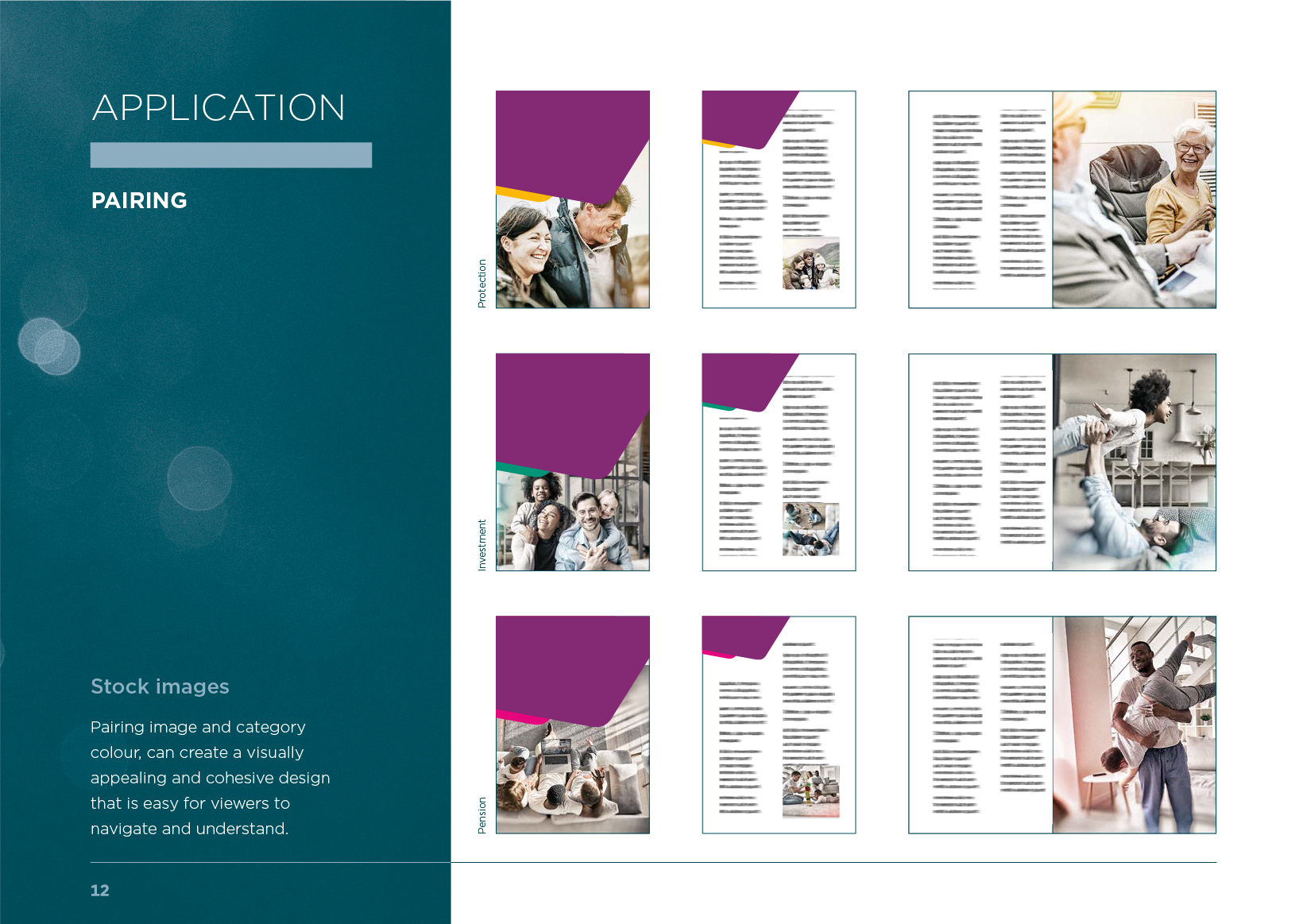
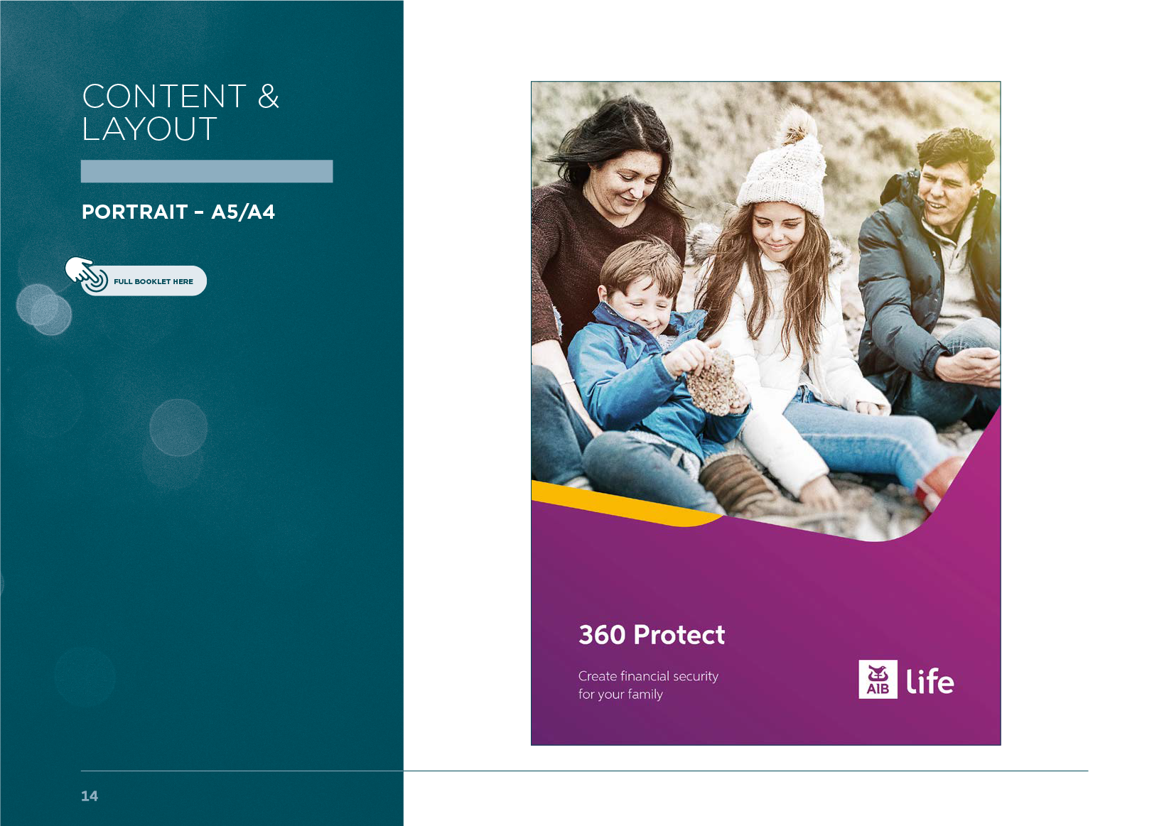
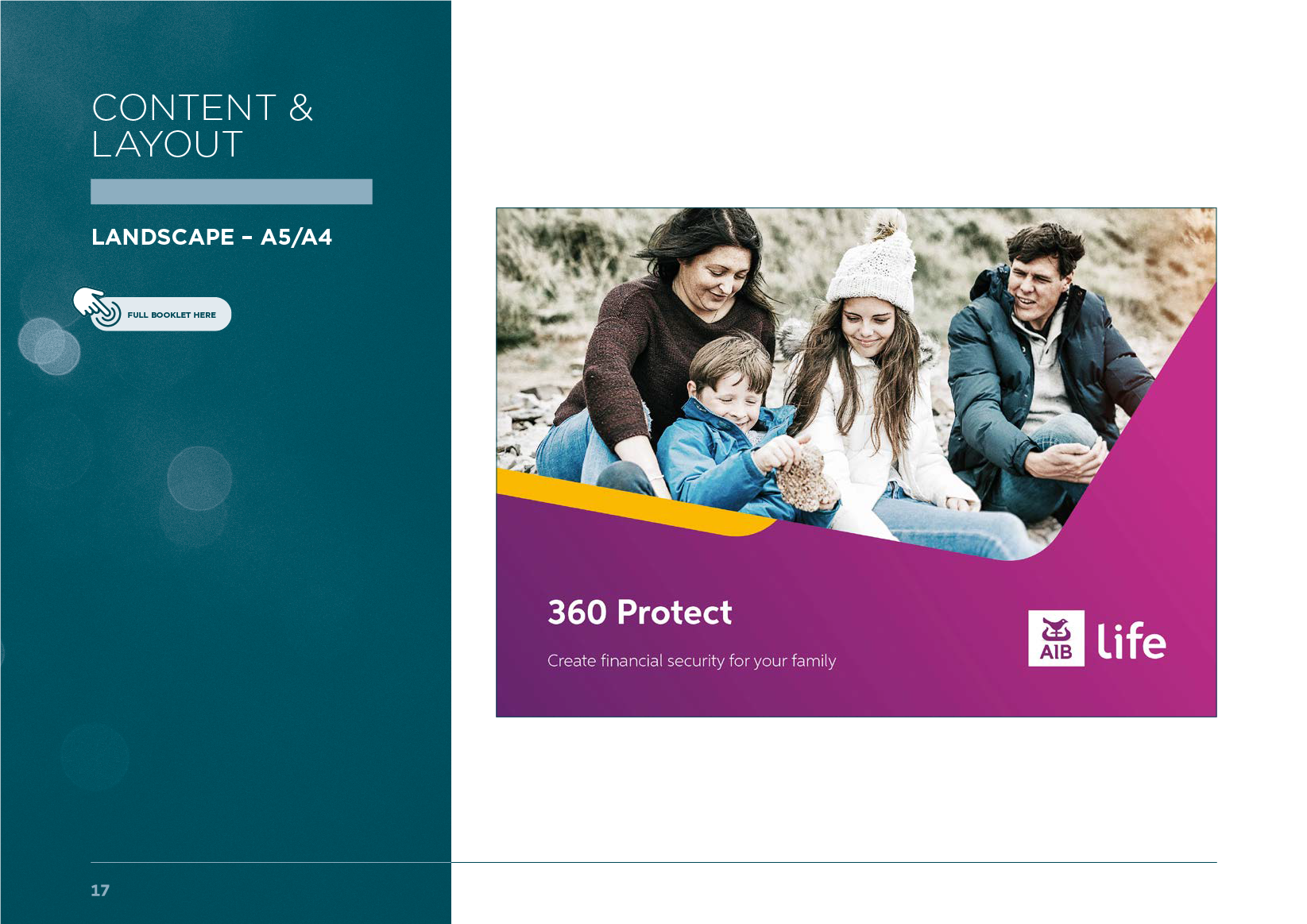
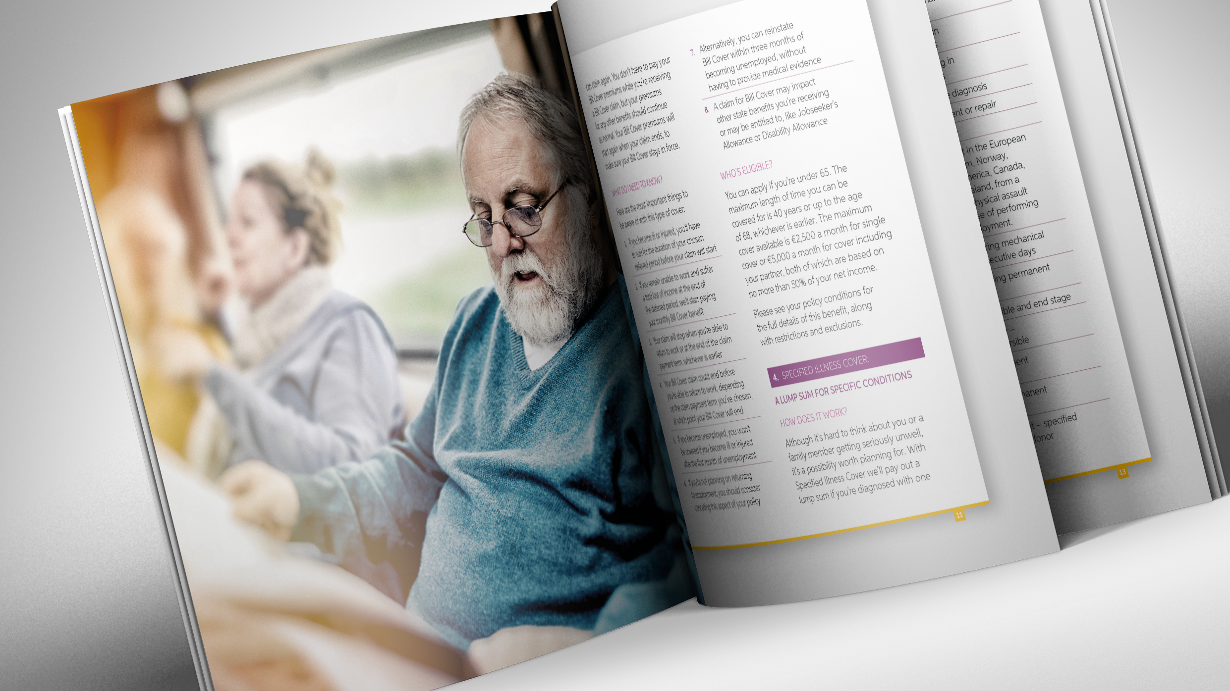
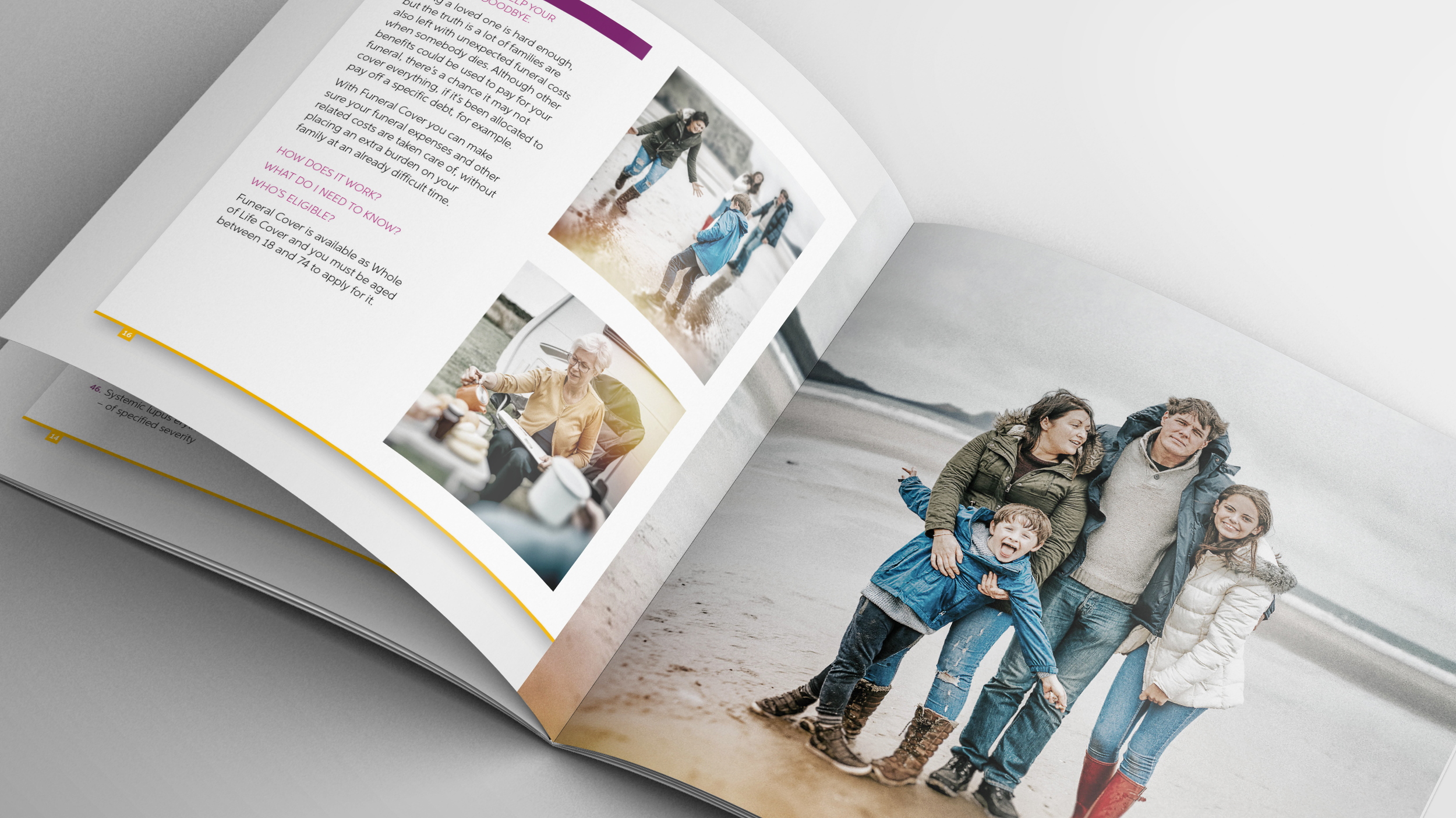
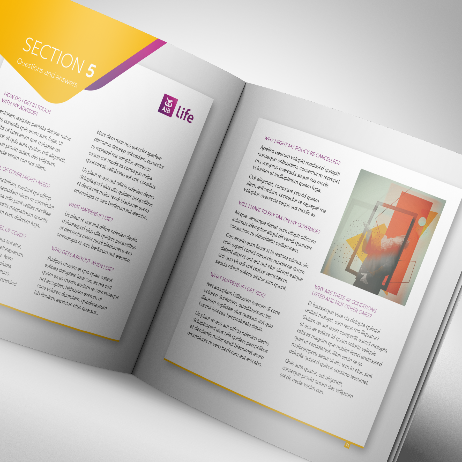
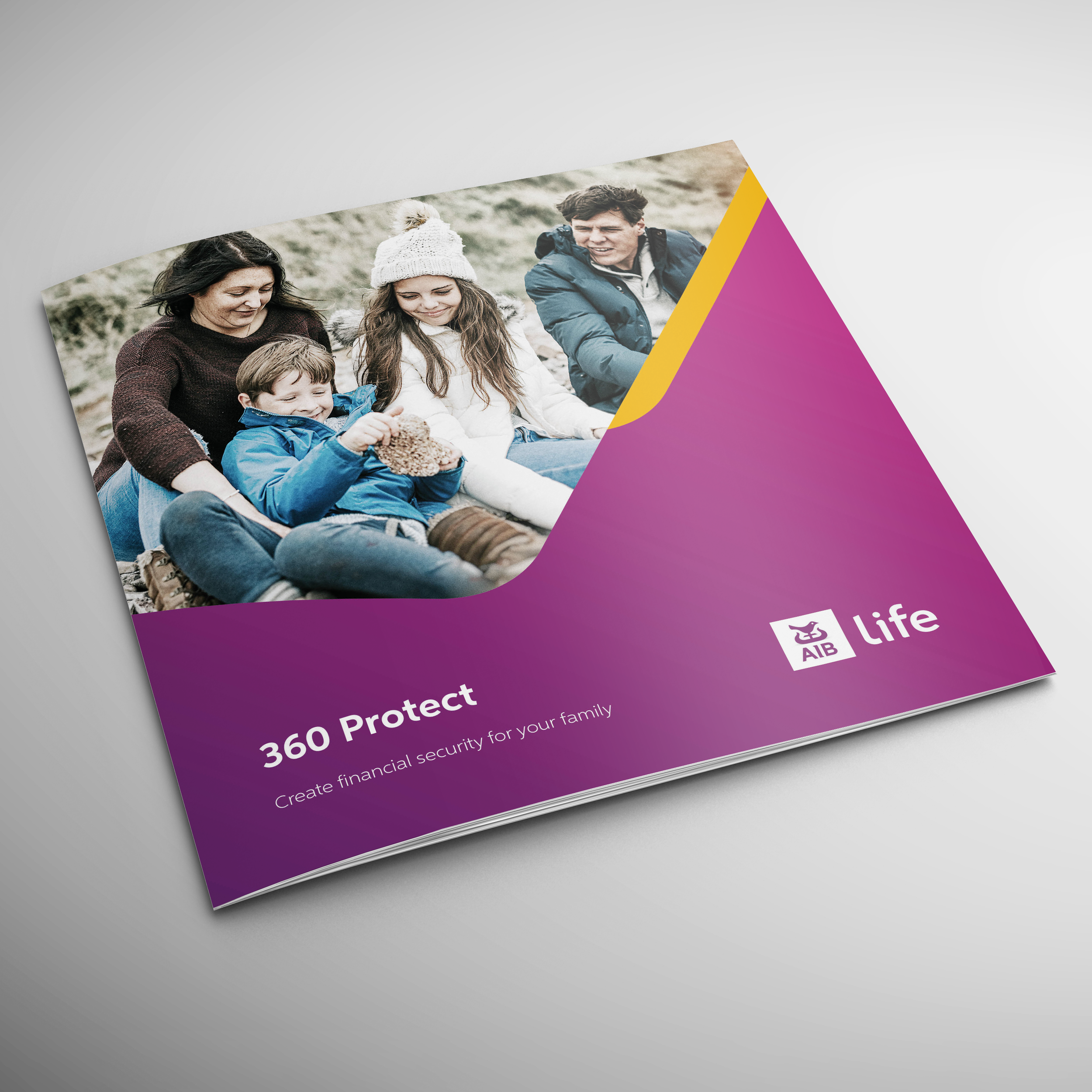
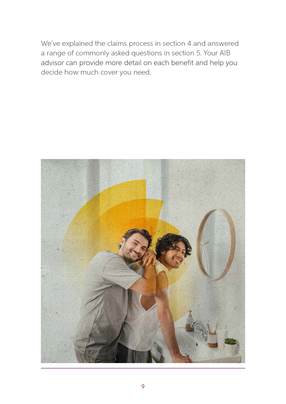
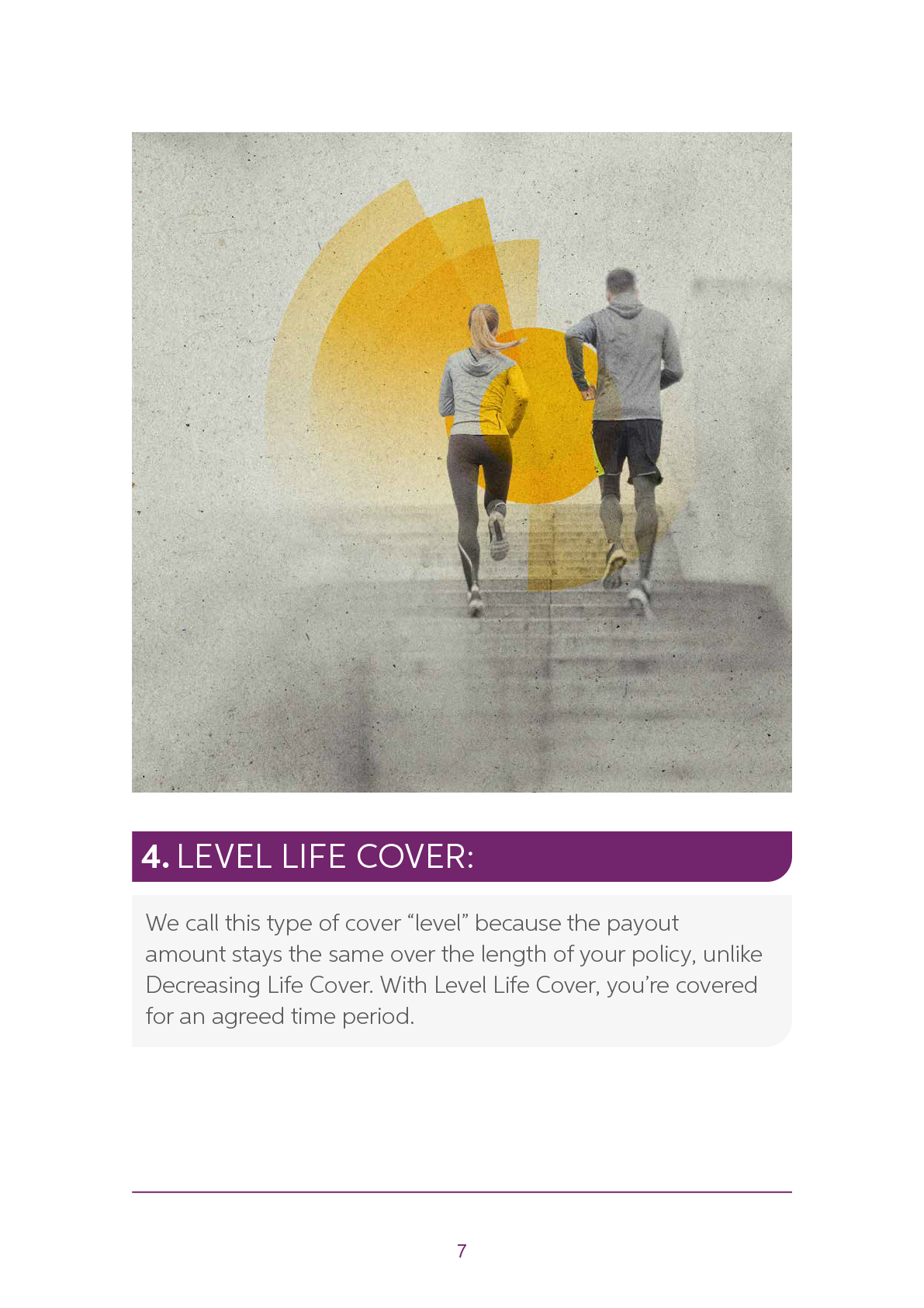
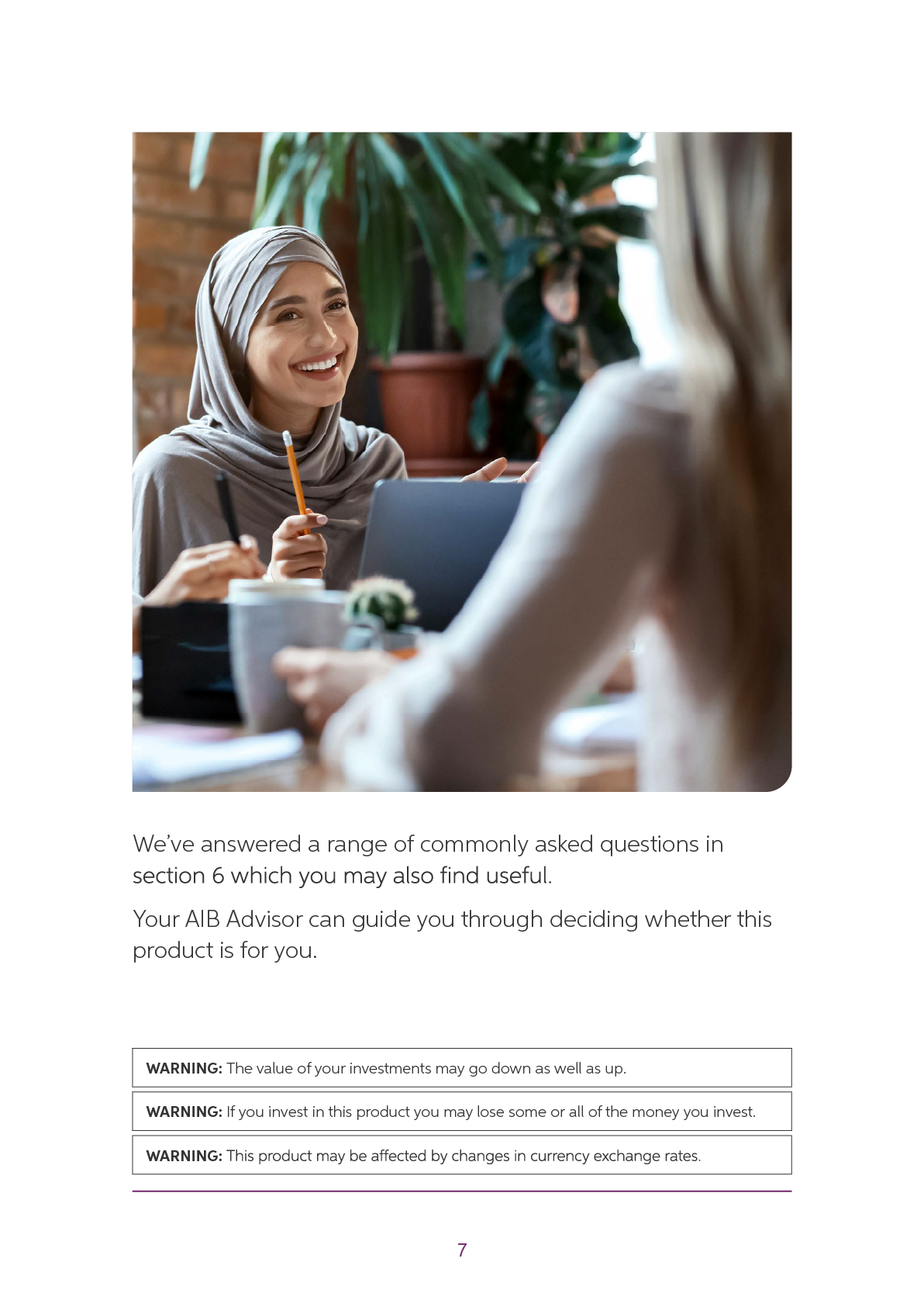
The traditional route used familiar lifestyle imagery, clear product categorisation and a structured publication framework. It provided a safe and recognisable route for regulated financial communications.
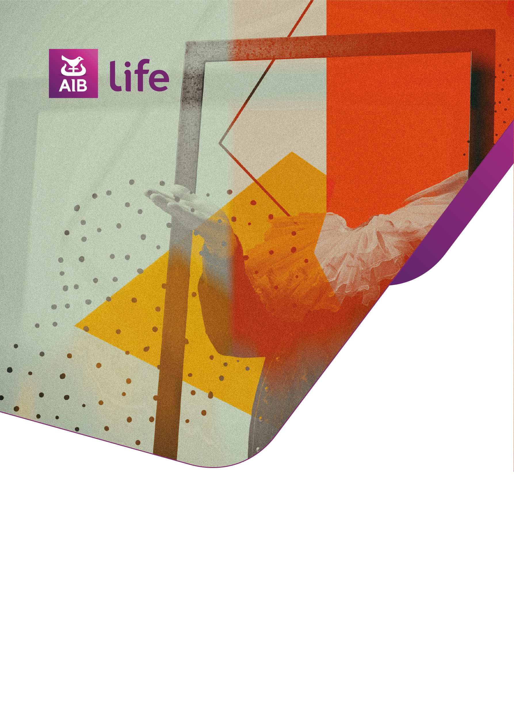
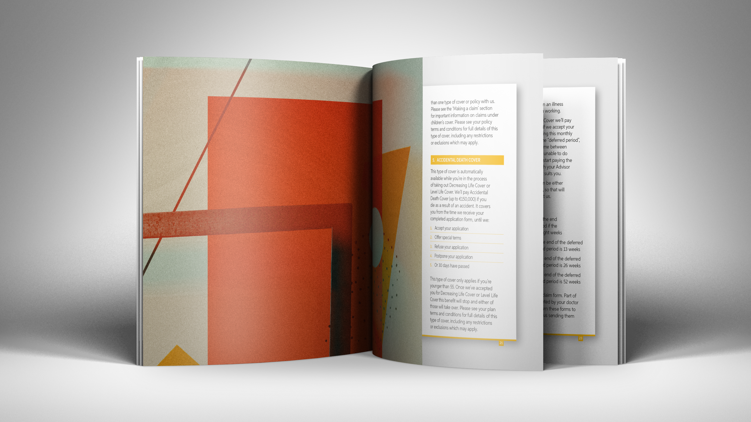
Alongside this, a more ambitious direction was introduced to challenge how life insurance literature could look and feel. This route explored the use of metaphor, illustration and a more distinctive visual language to create stronger emotional engagement. The client was intrigued by this direction and asked to see how the illustrative approach could develop further.
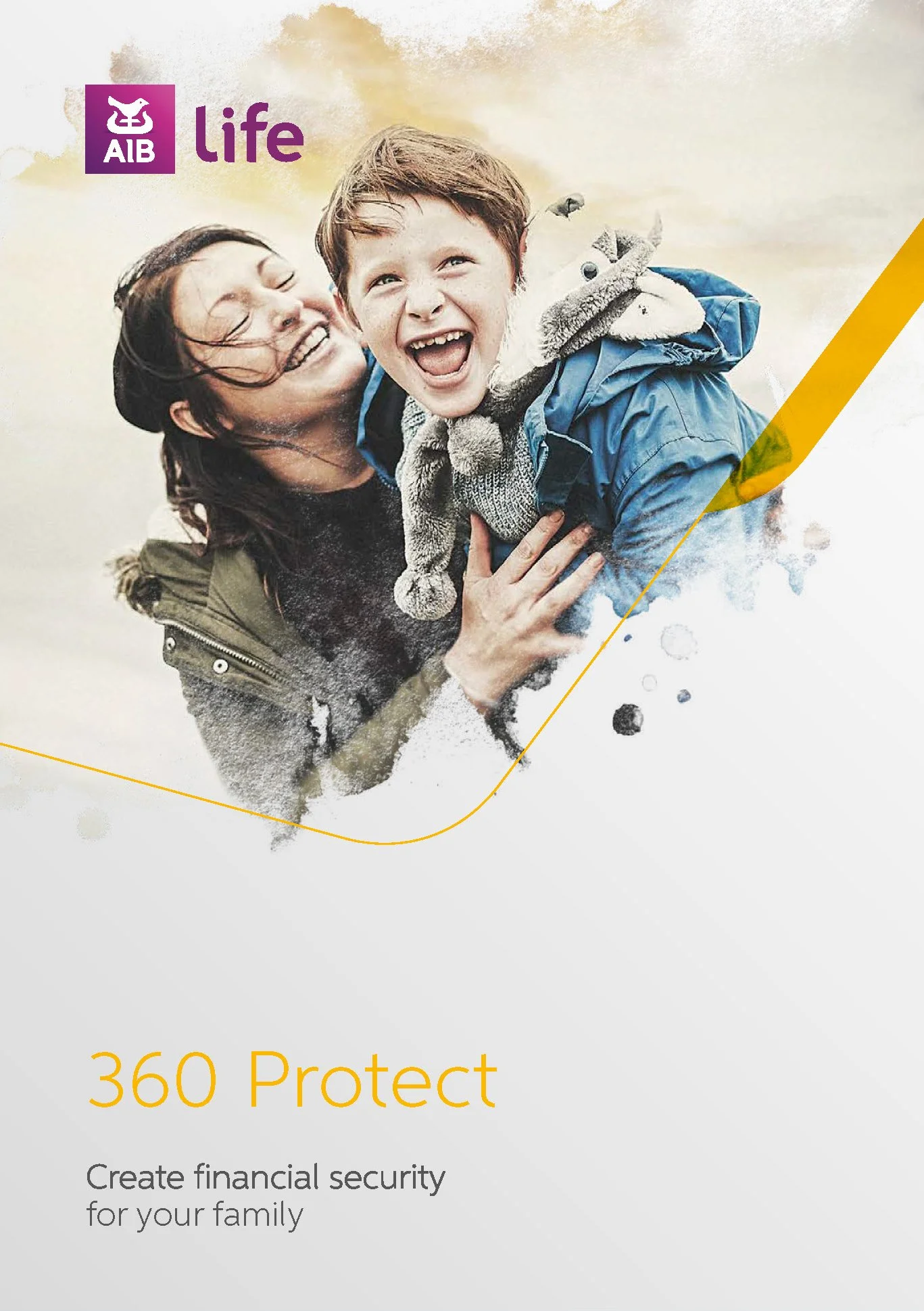






Finding the Strongest Visual Metaphor
In the second presentation, the creative exploration became more focused.
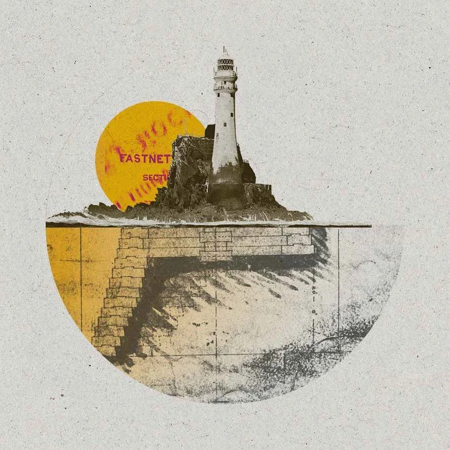
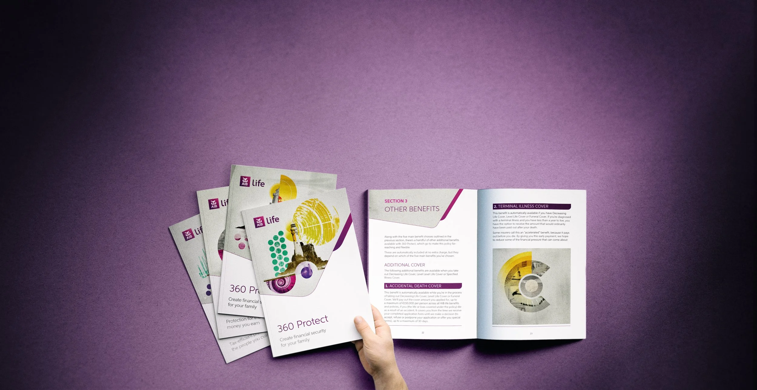
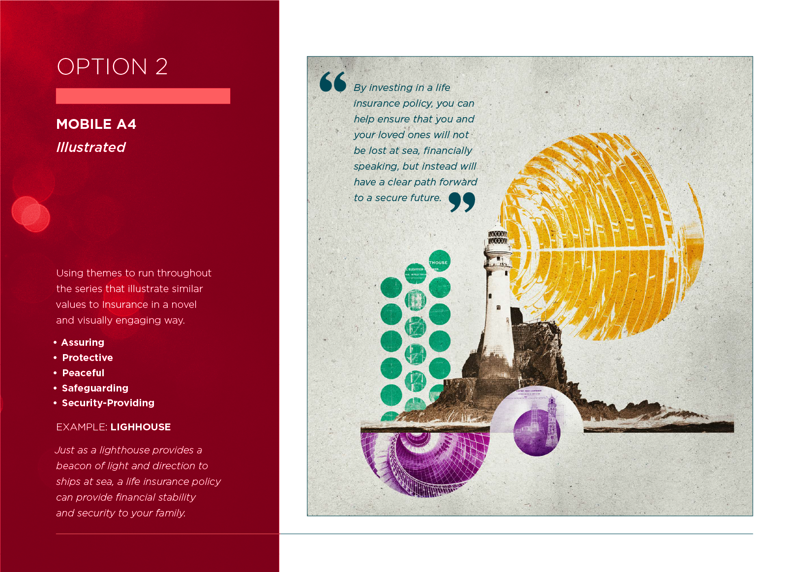
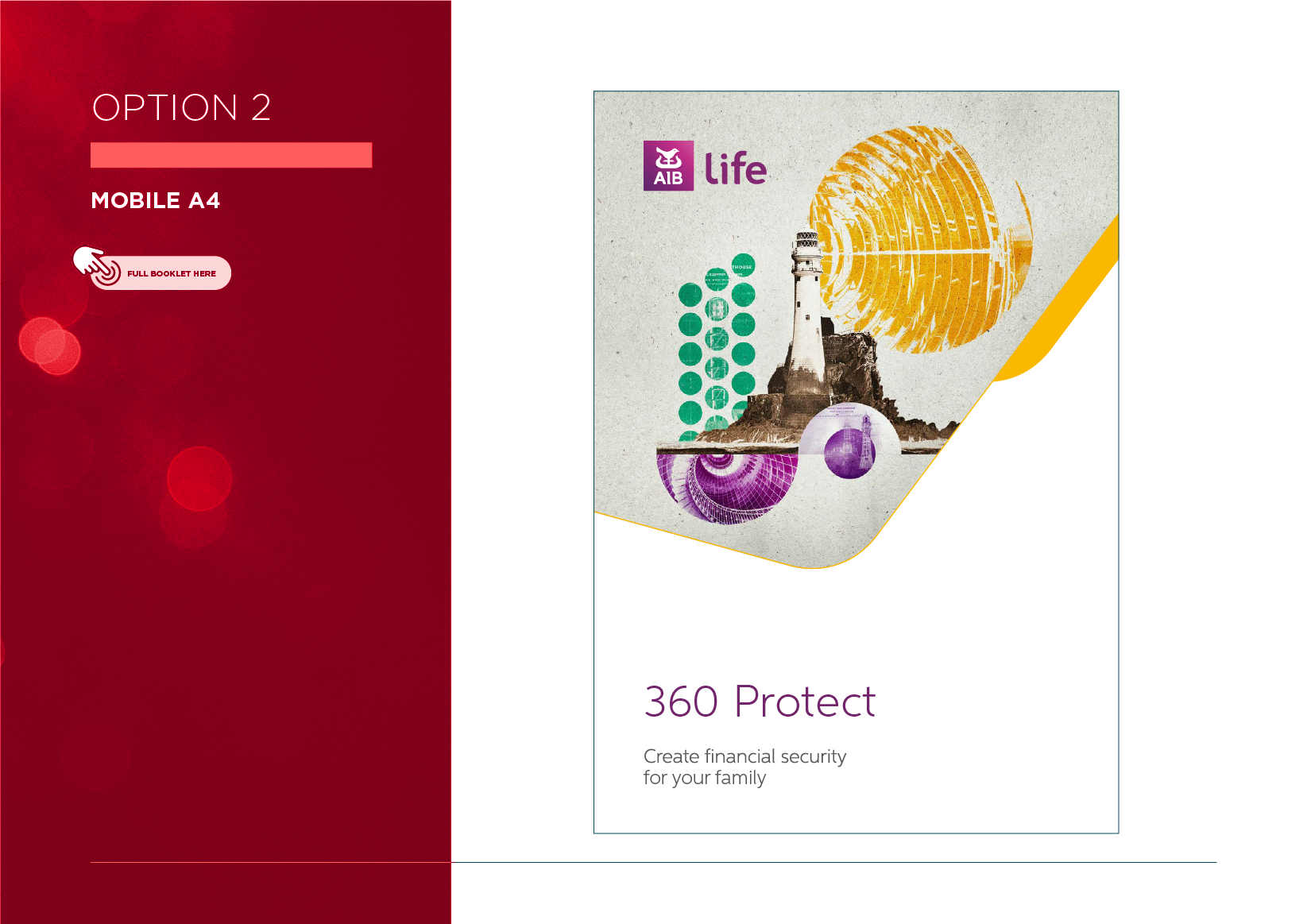
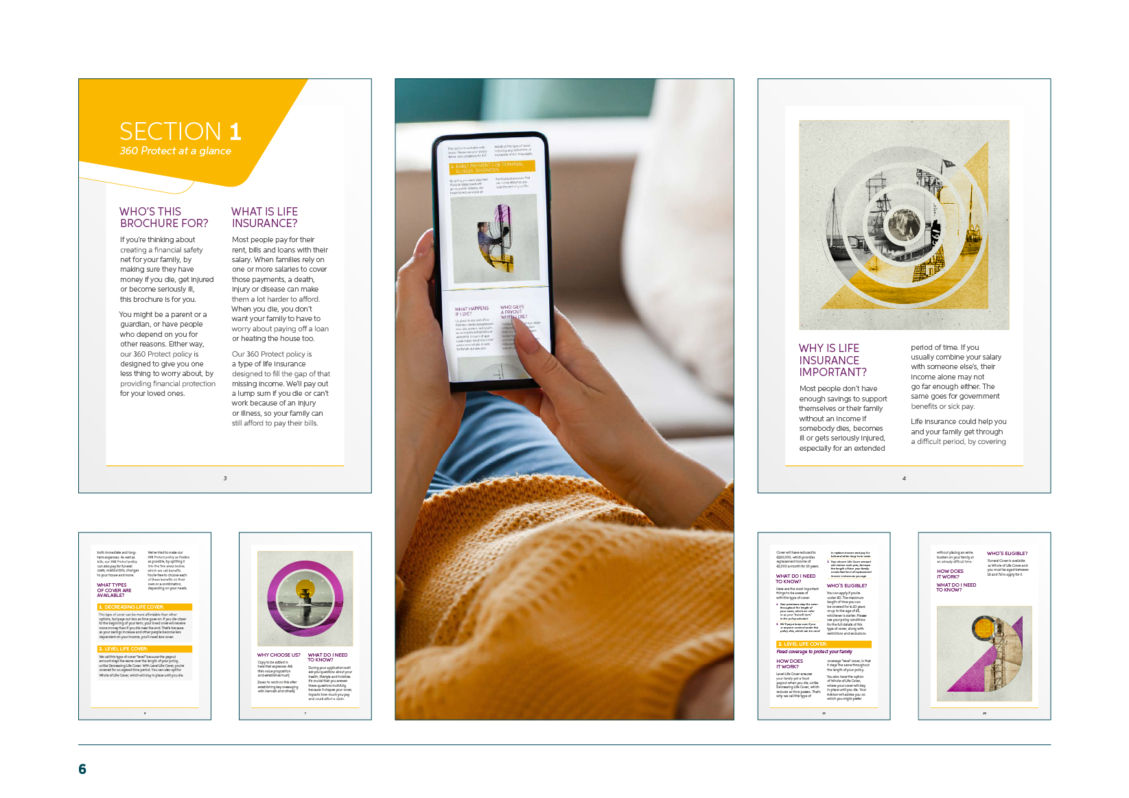
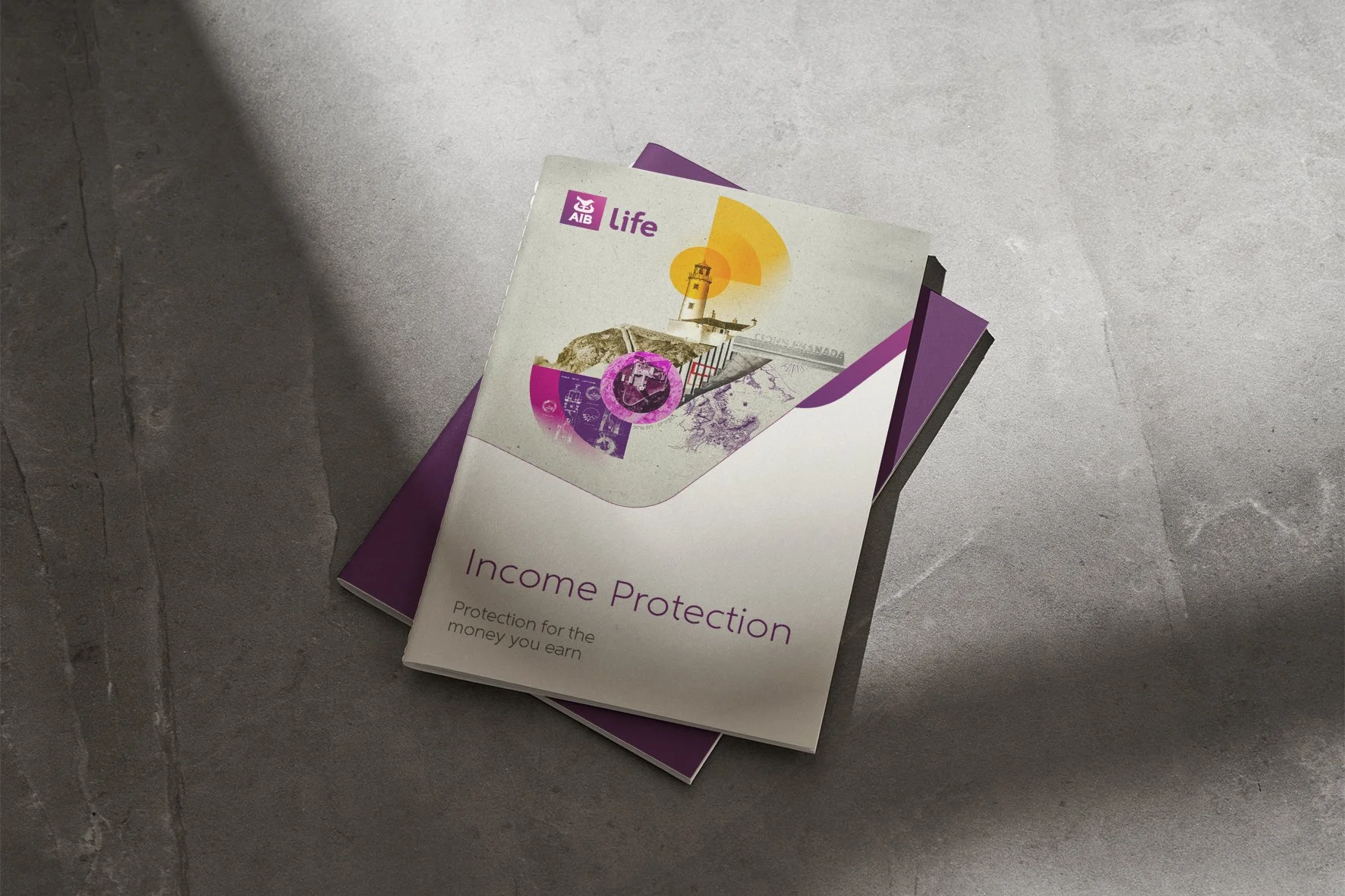
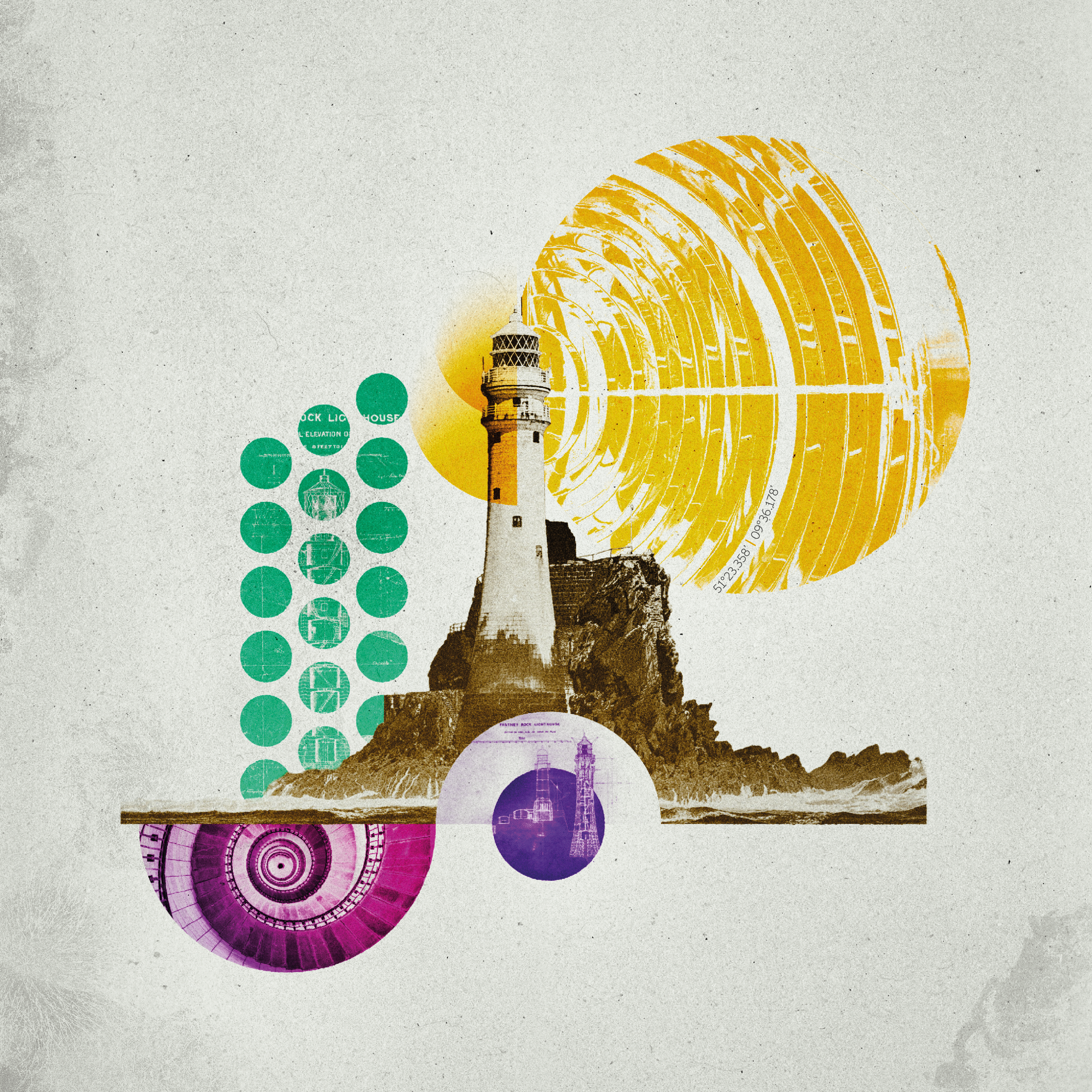
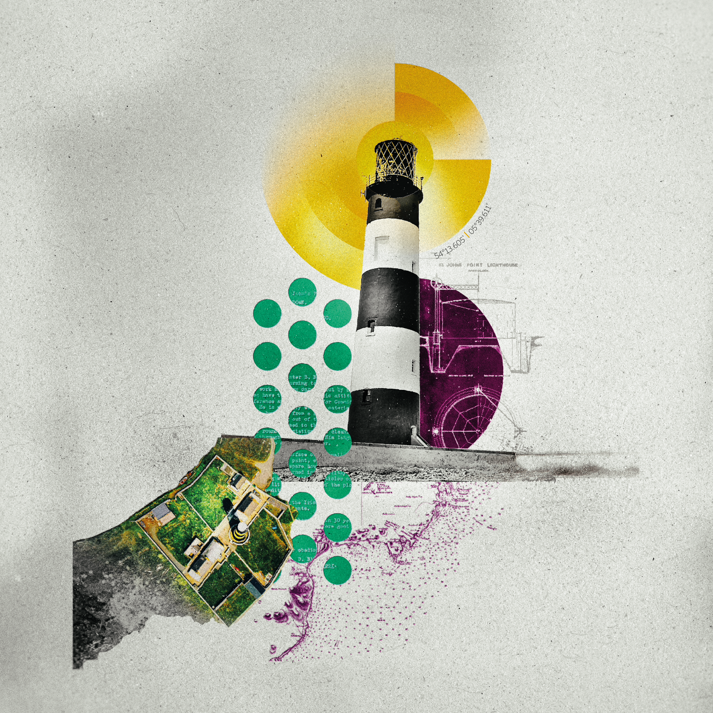
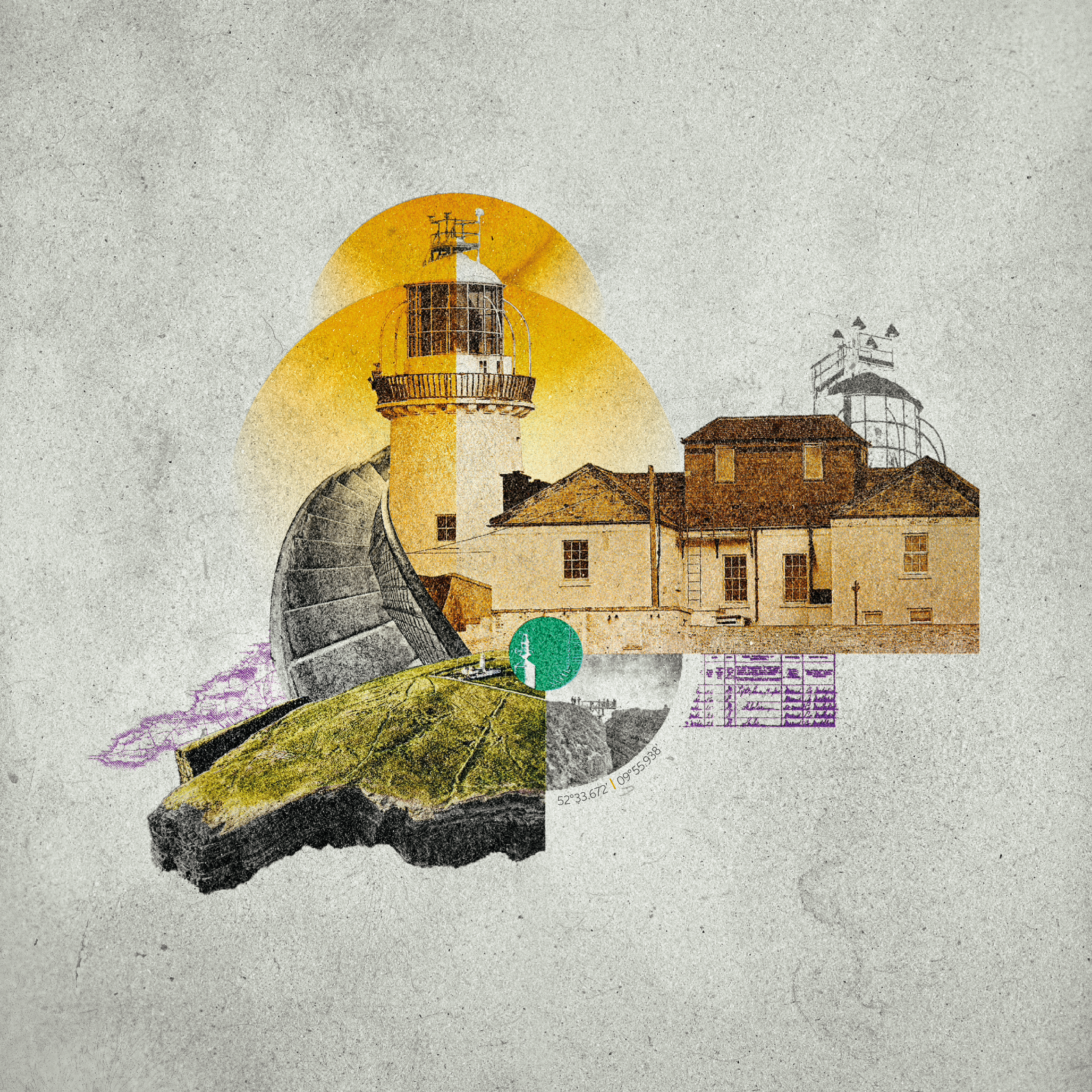
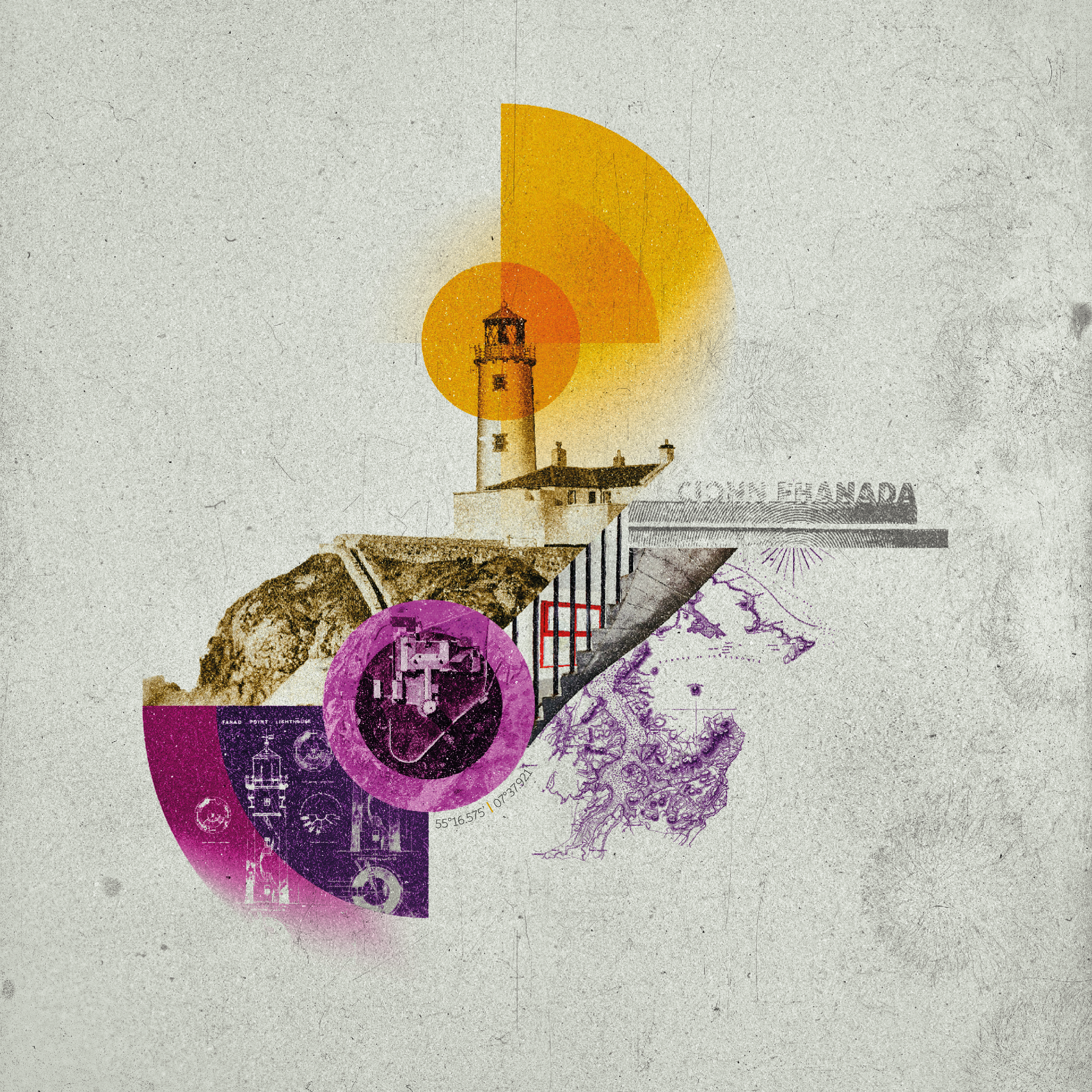
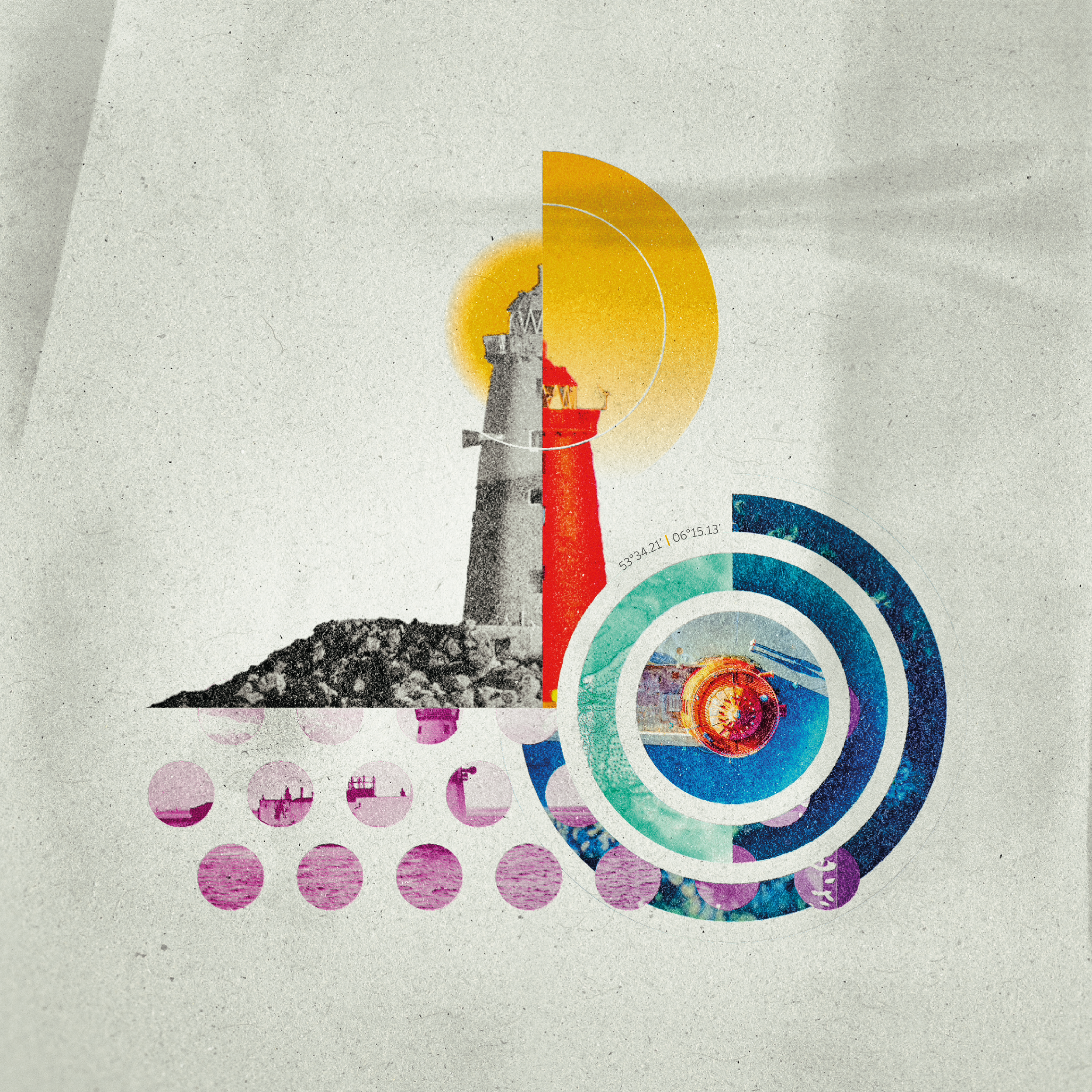
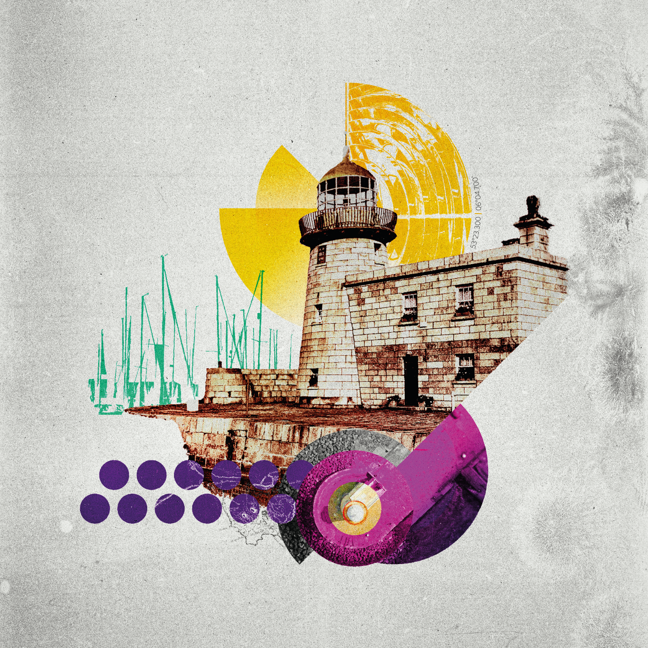
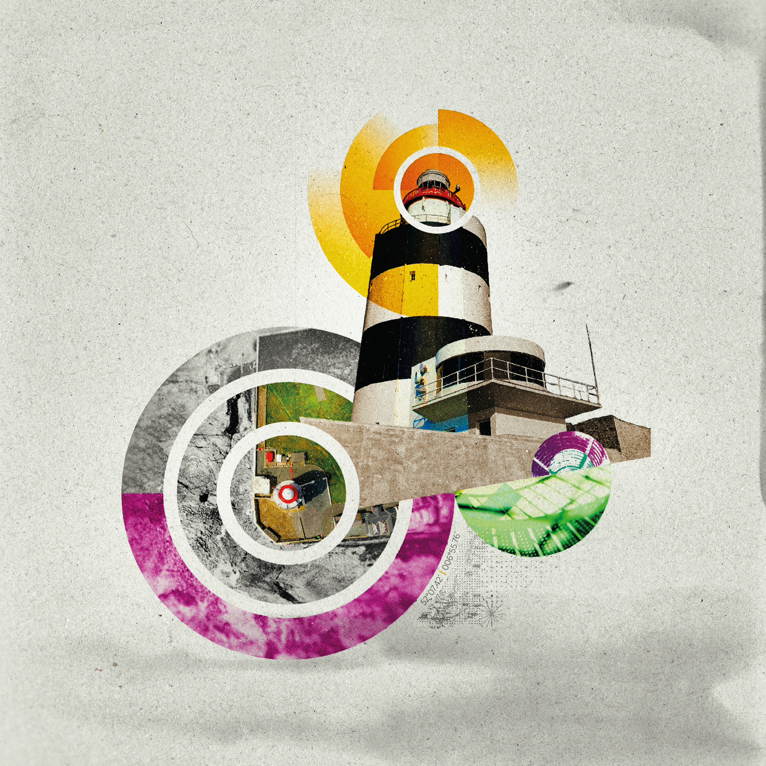
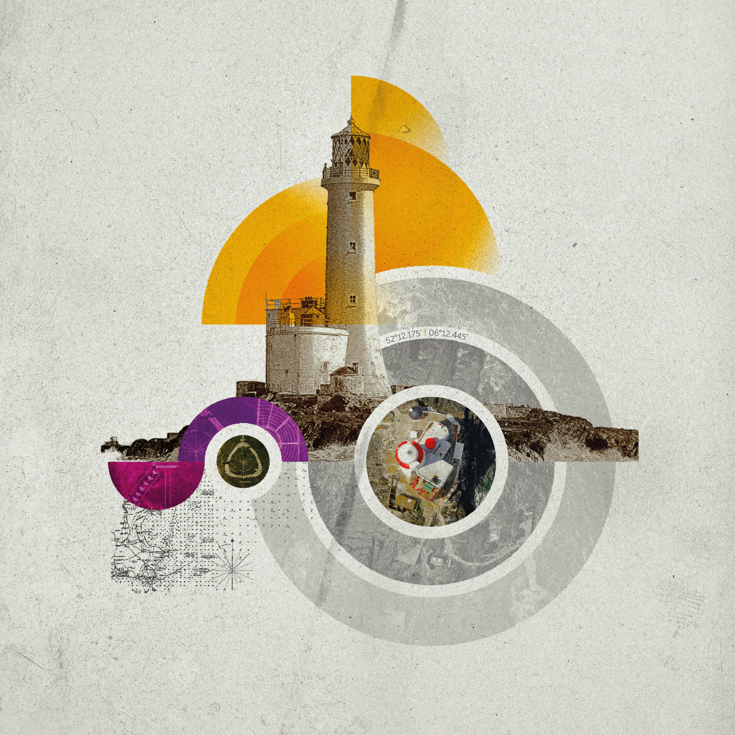
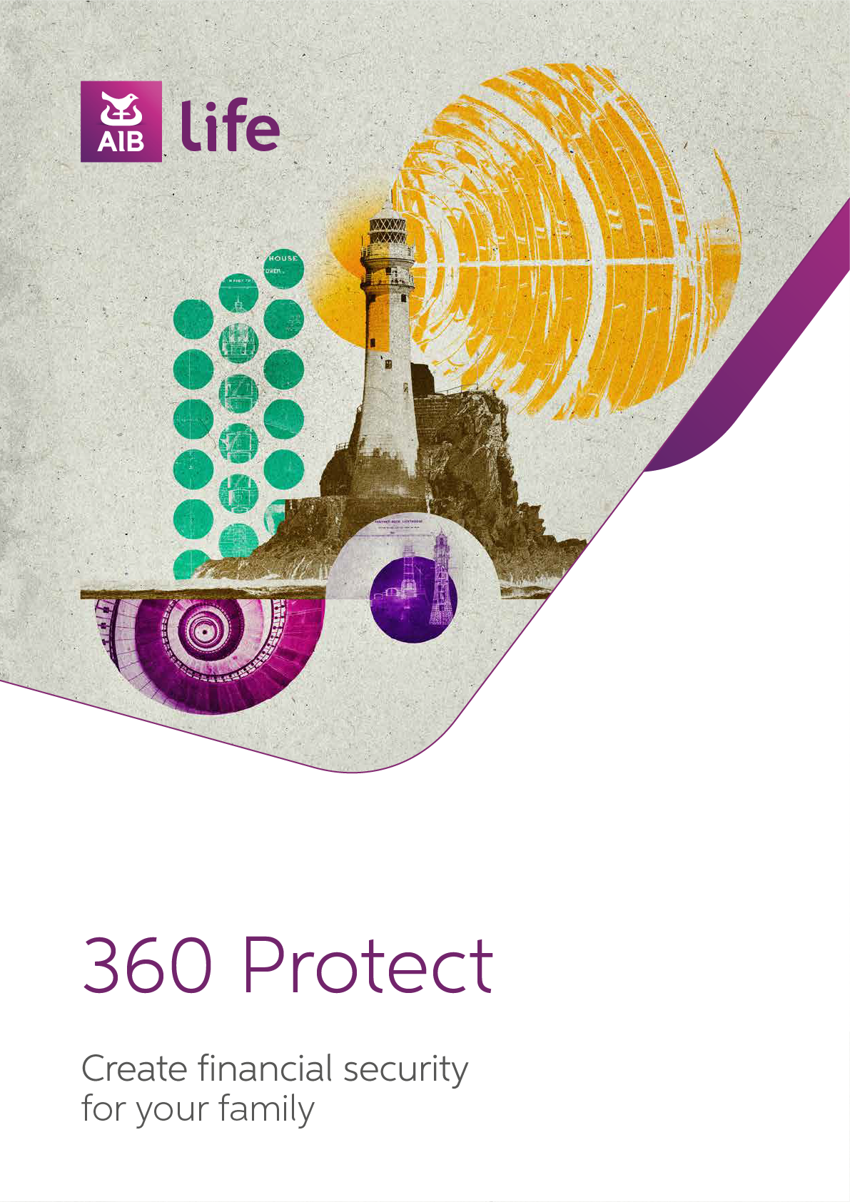
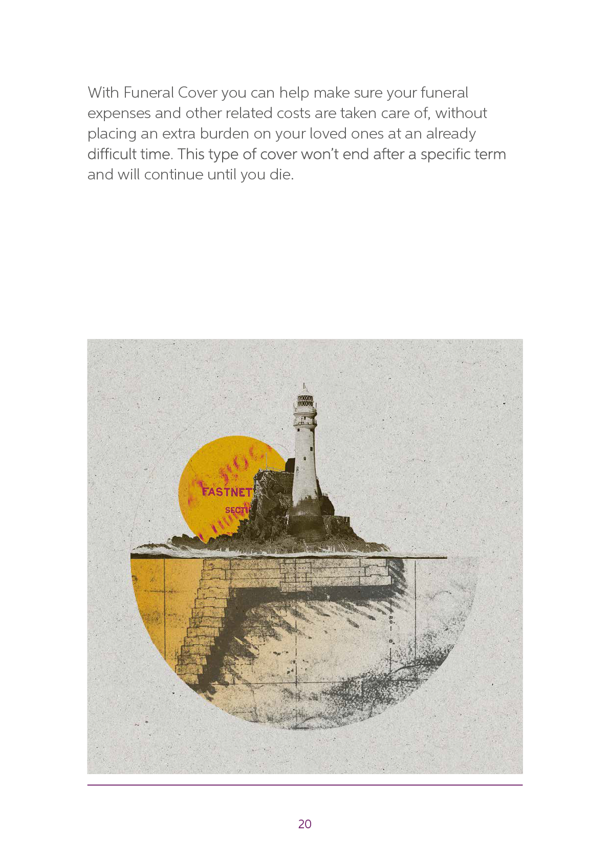
While the traditional route continued to refine the photographic system, the illustrative route began to centre around a stronger, more ownable visual idea: the lighthouse.
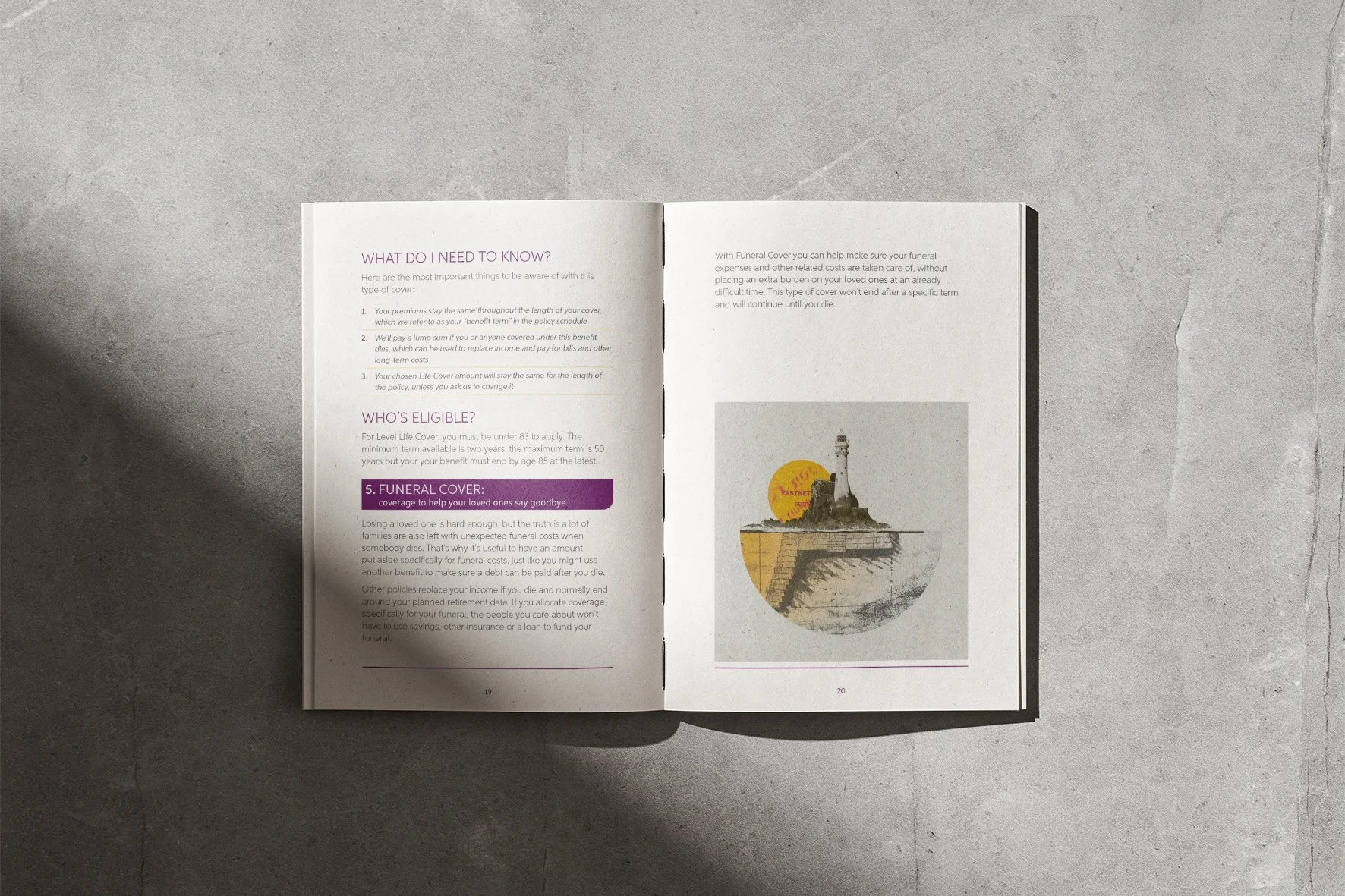
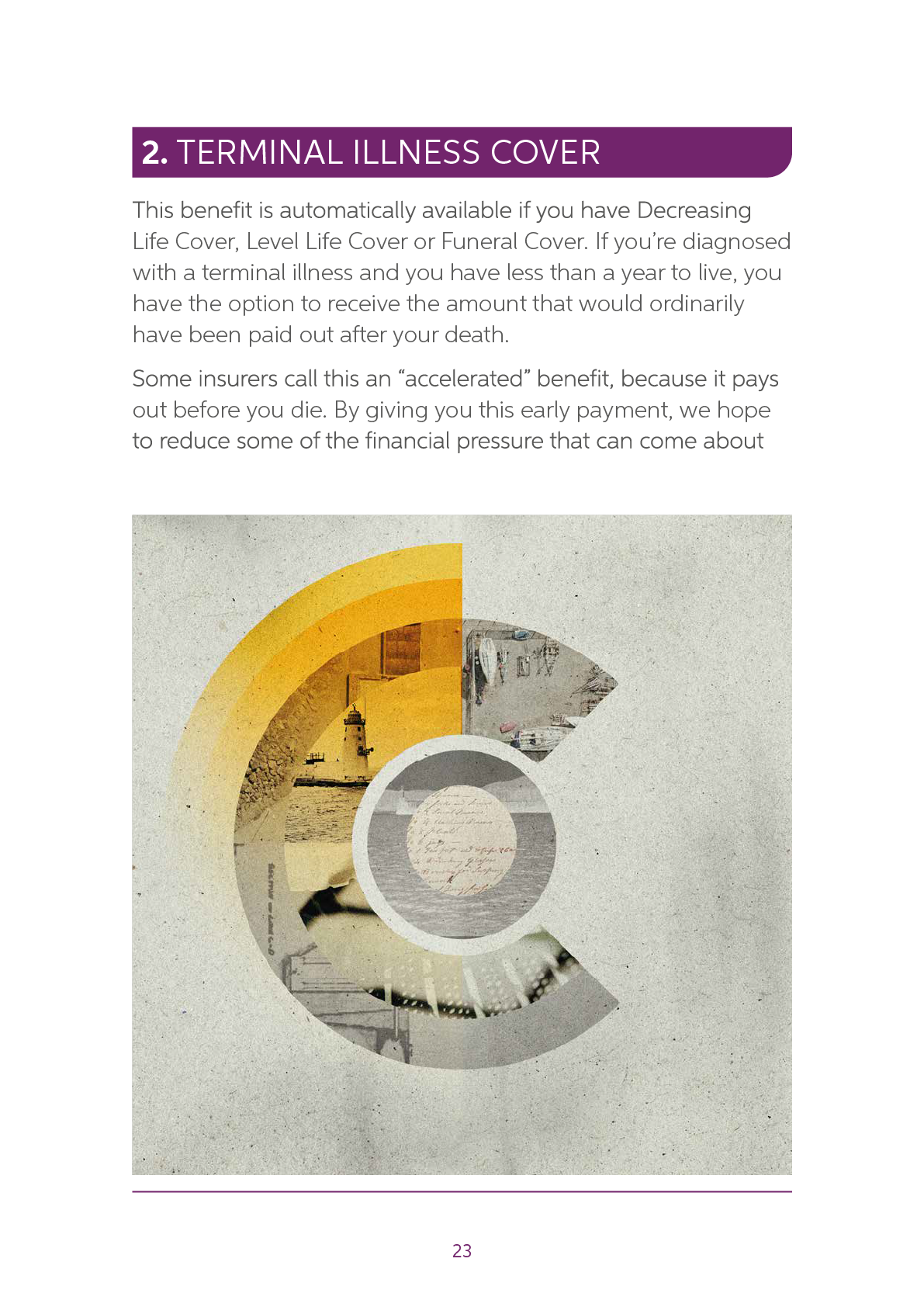
The lighthouse stood out as a natural fit for AIB life, suggesting guidance, protection, reassurance and security. It offered a way to communicate complex financial products through a more emotional and memorable visual language.
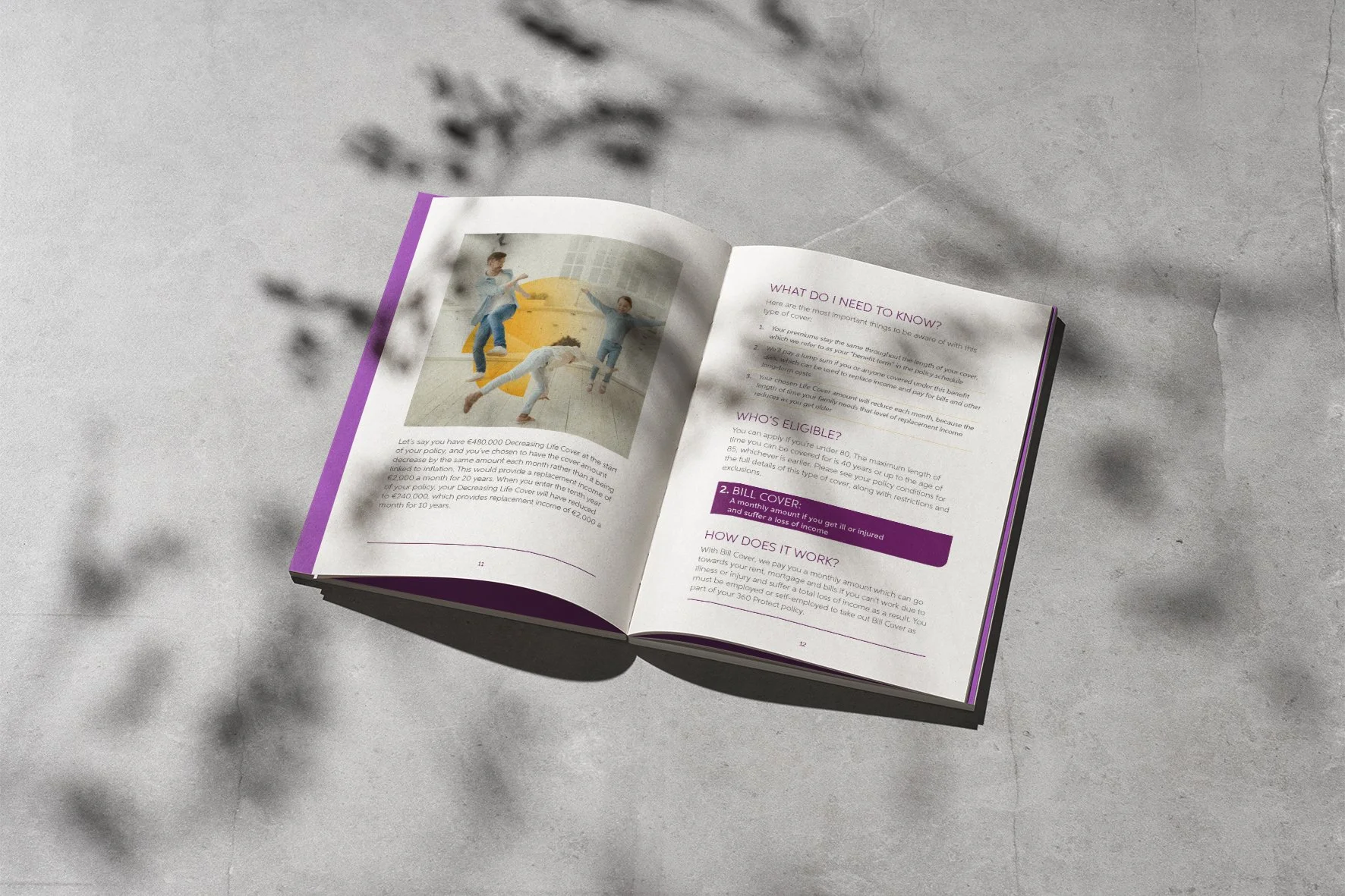
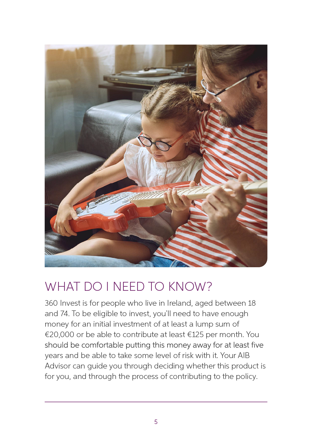
As the route developed, the lighthouse illustration became the anchor of the system, supported by lifestyle imagery of ordinary people and families. This helped keep the work warm, relatable and human, while still giving the literature suite a distinctive, concept-led visual identity.



Final Direction and Rollout
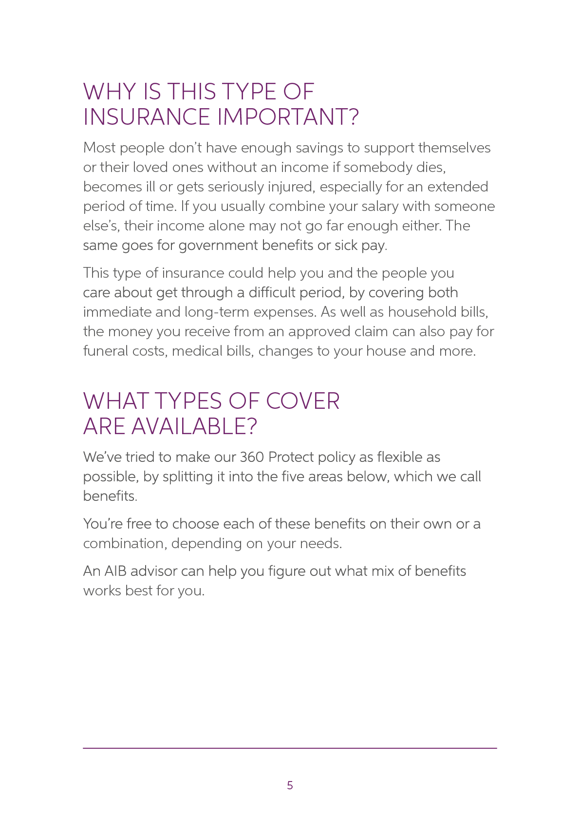
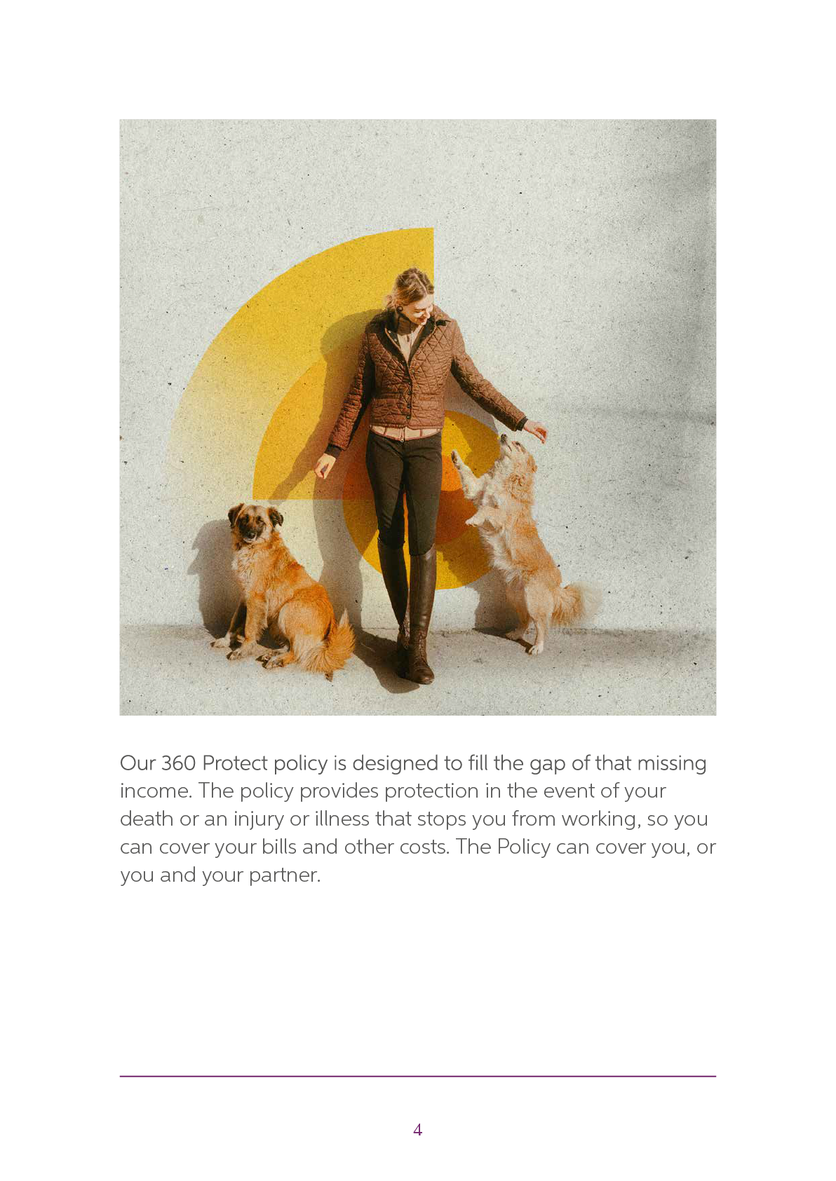
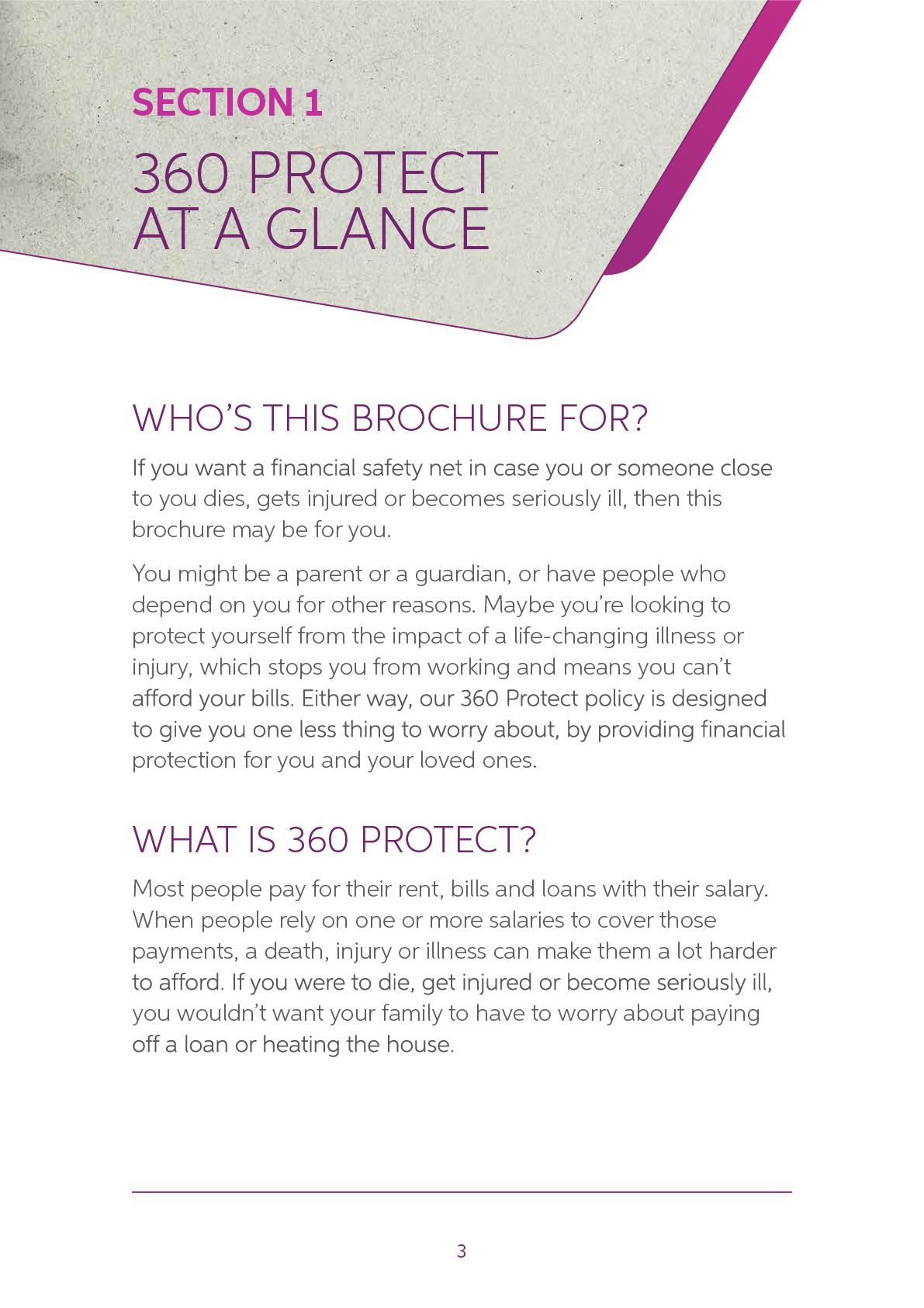
At the eleventh hour, the client chose to step back from the illustrative route and return to a more familiar photographic approach.
The lighthouse concept had created a more ownable and distinctive visual world for AIB Llife, but as the work moved closer to launch, the client became more cautious about moving too far from the established expectations of regulated financial literature.
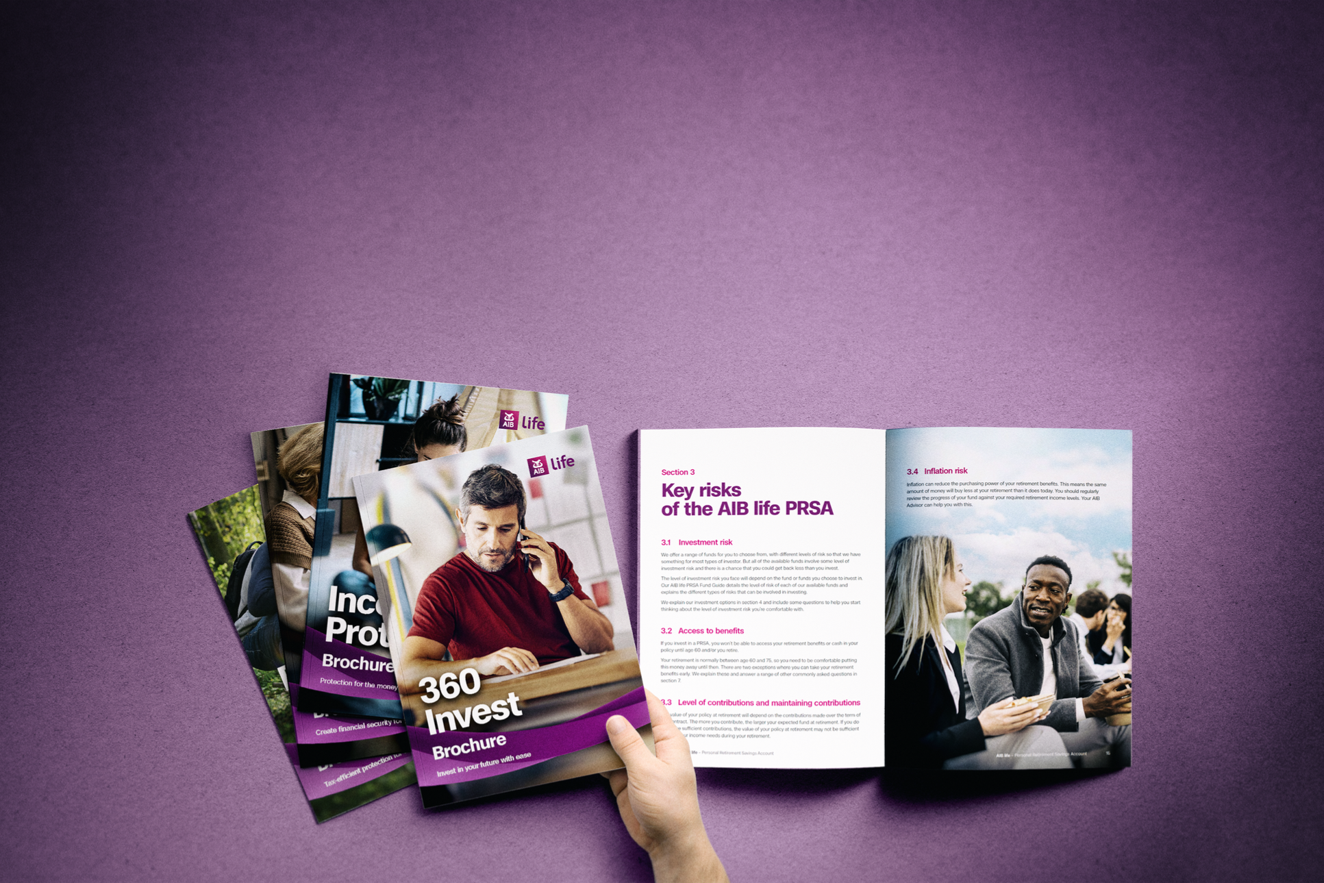
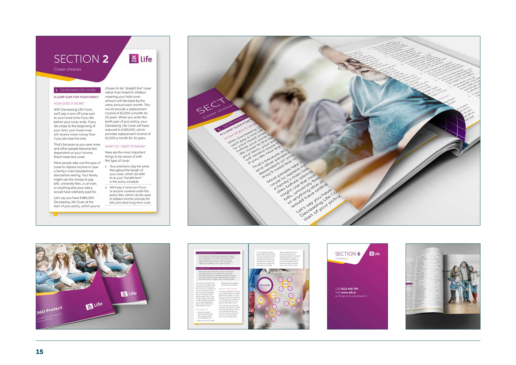
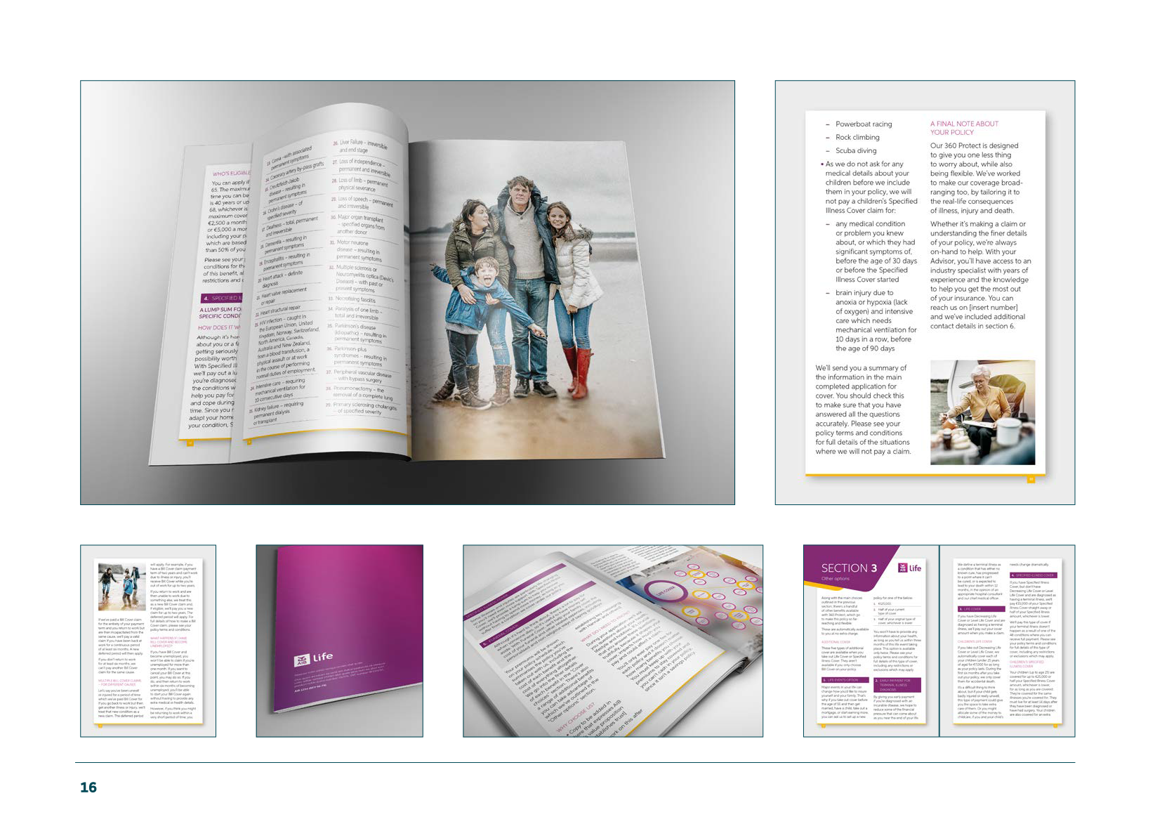
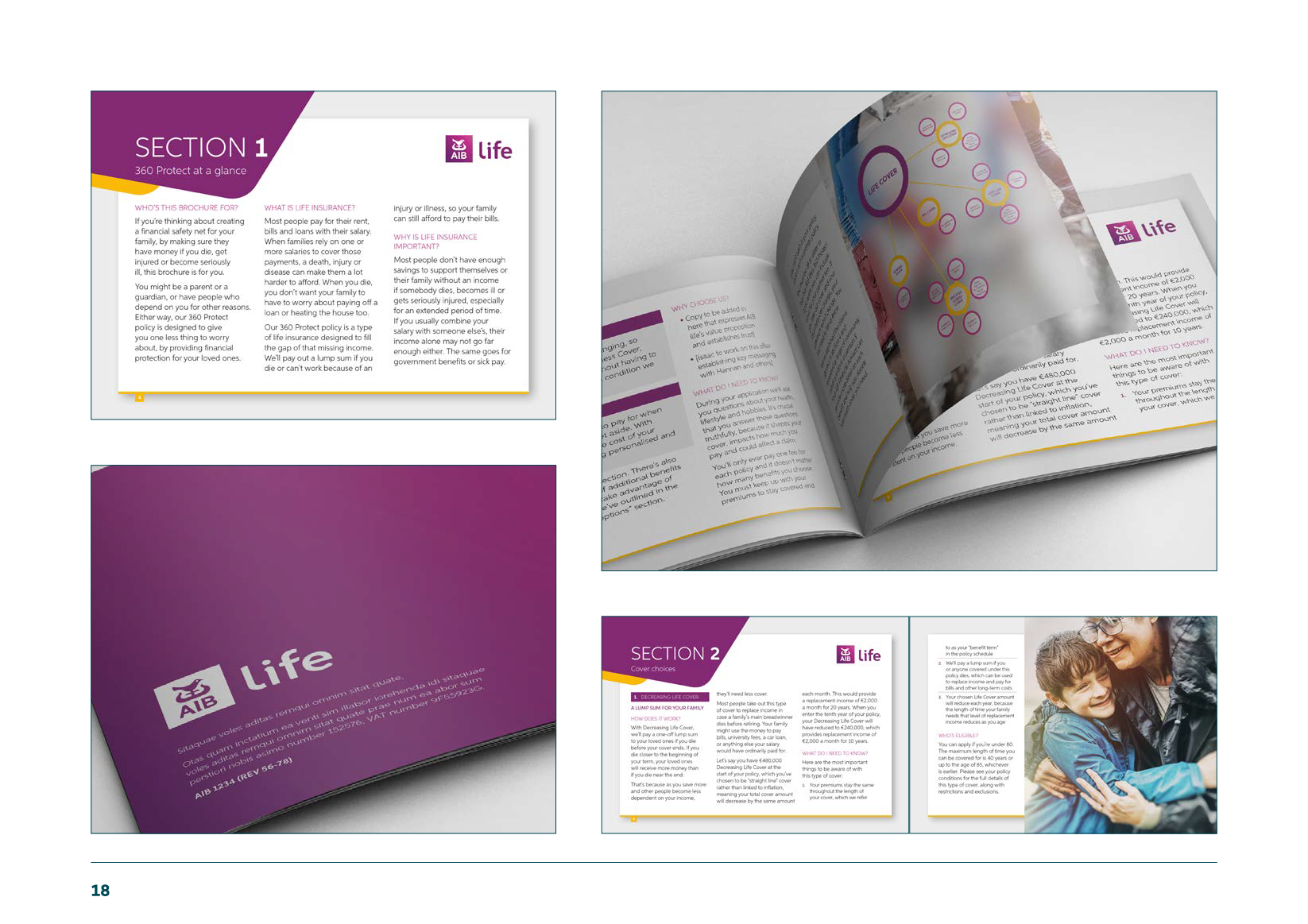
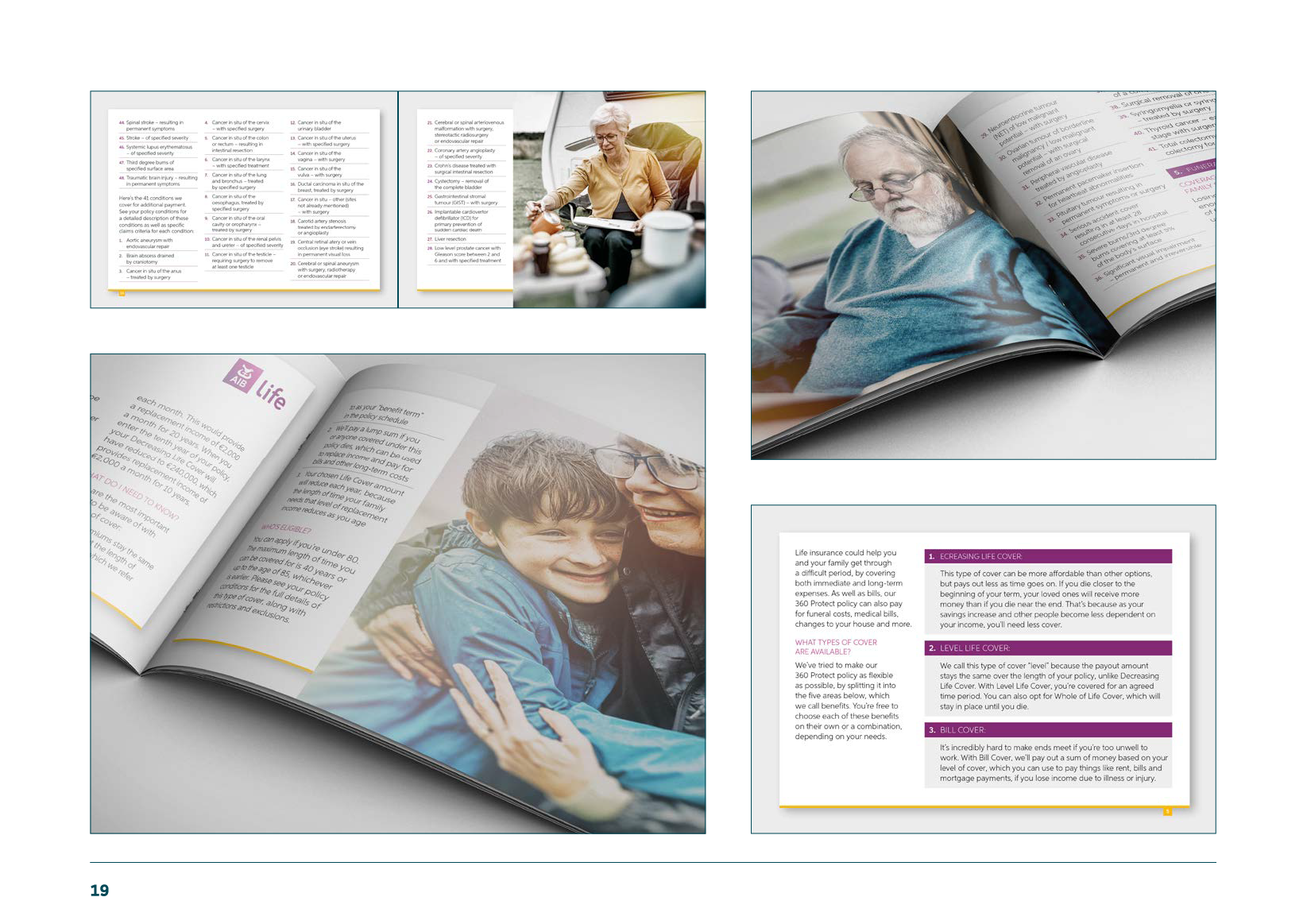
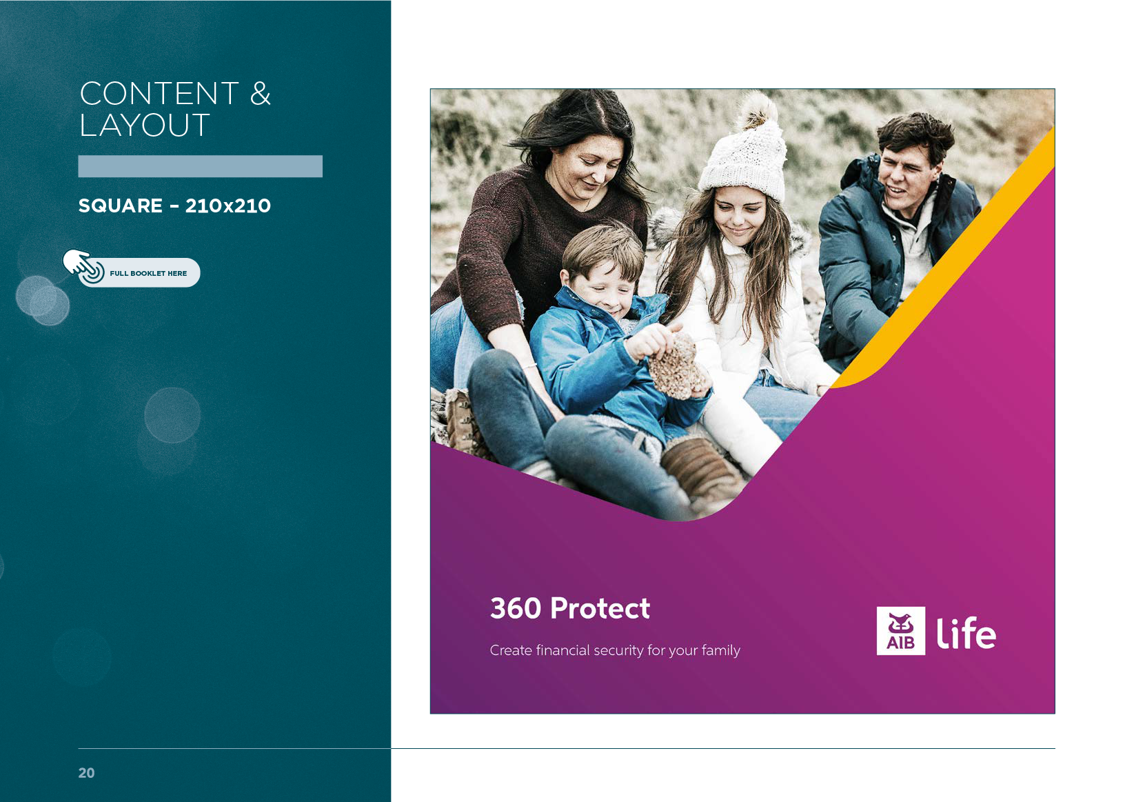
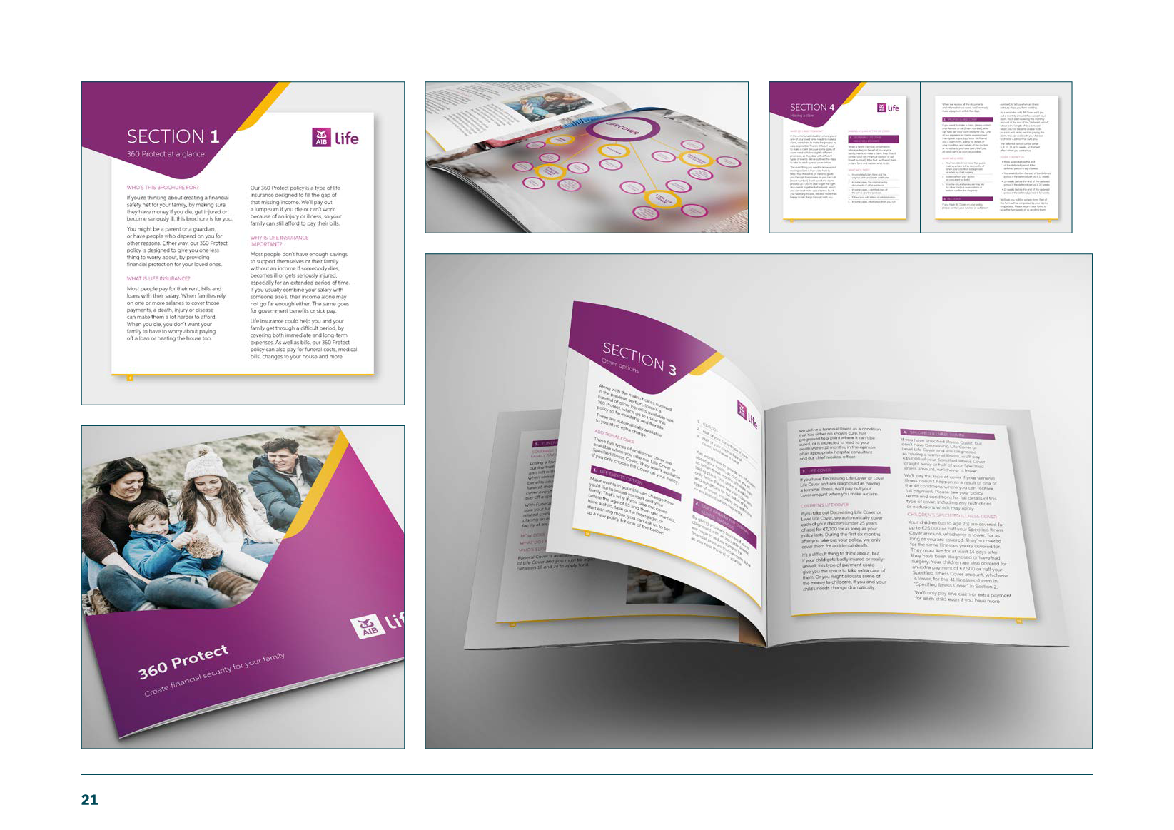
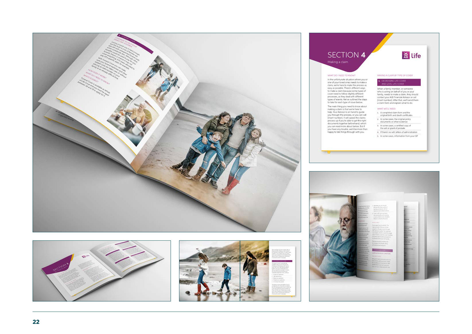
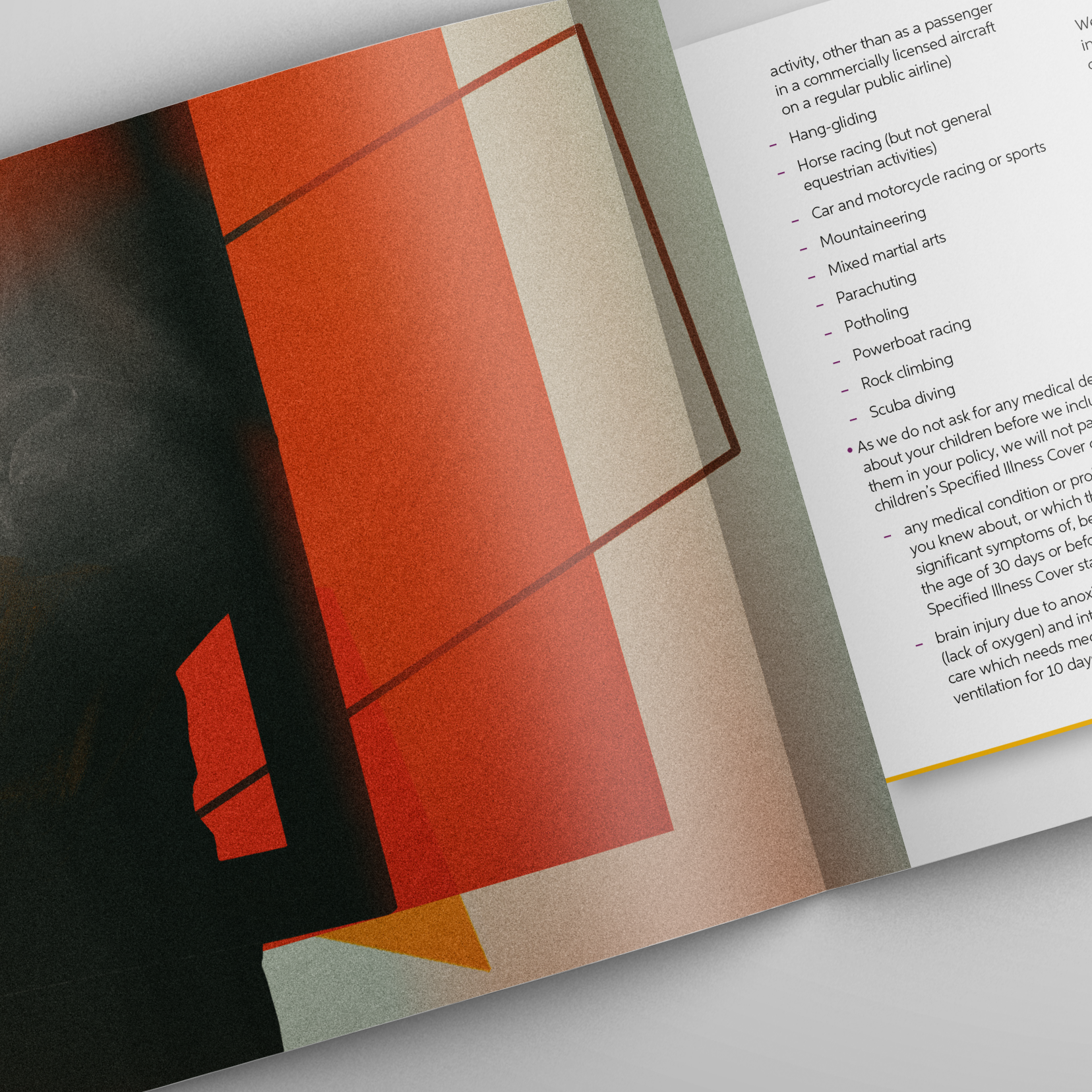
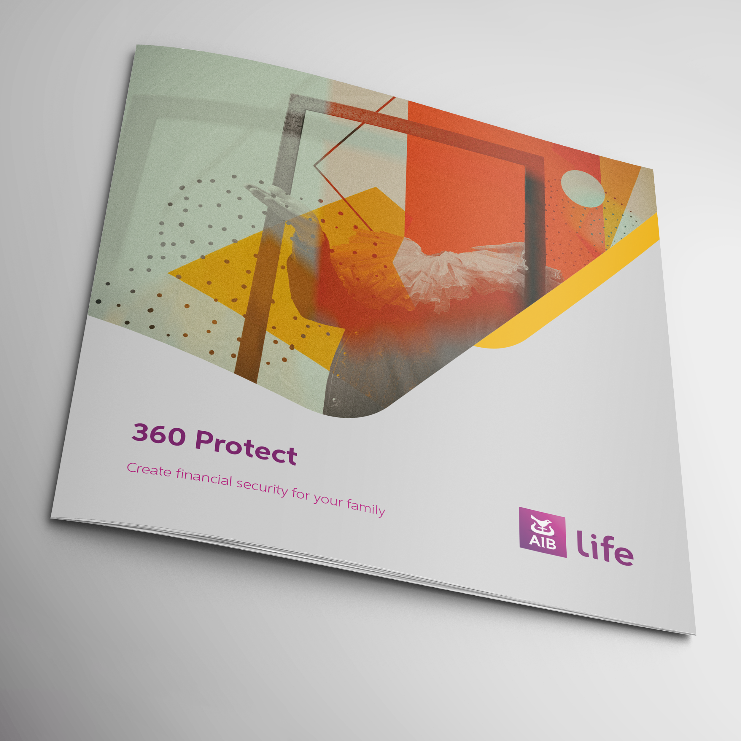
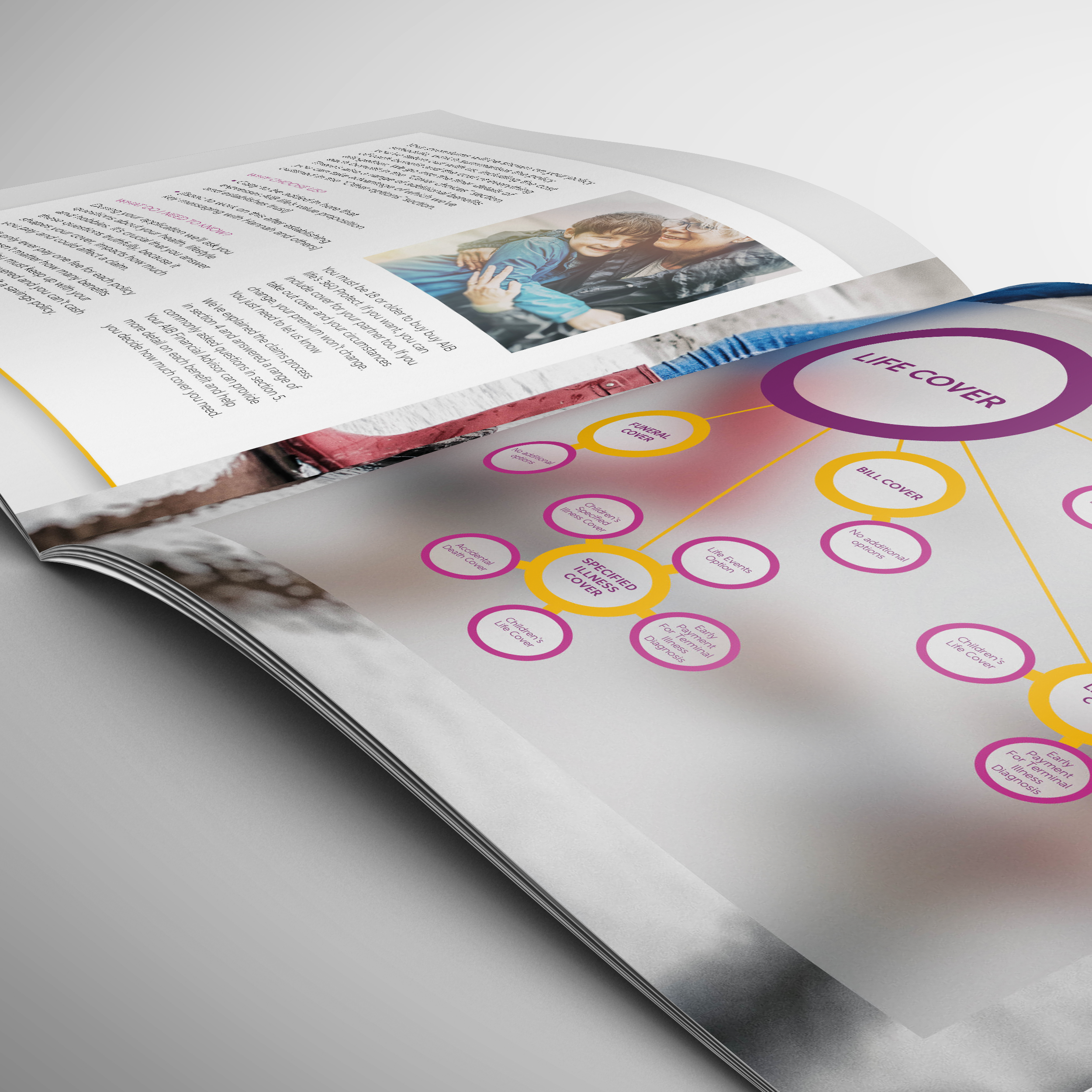
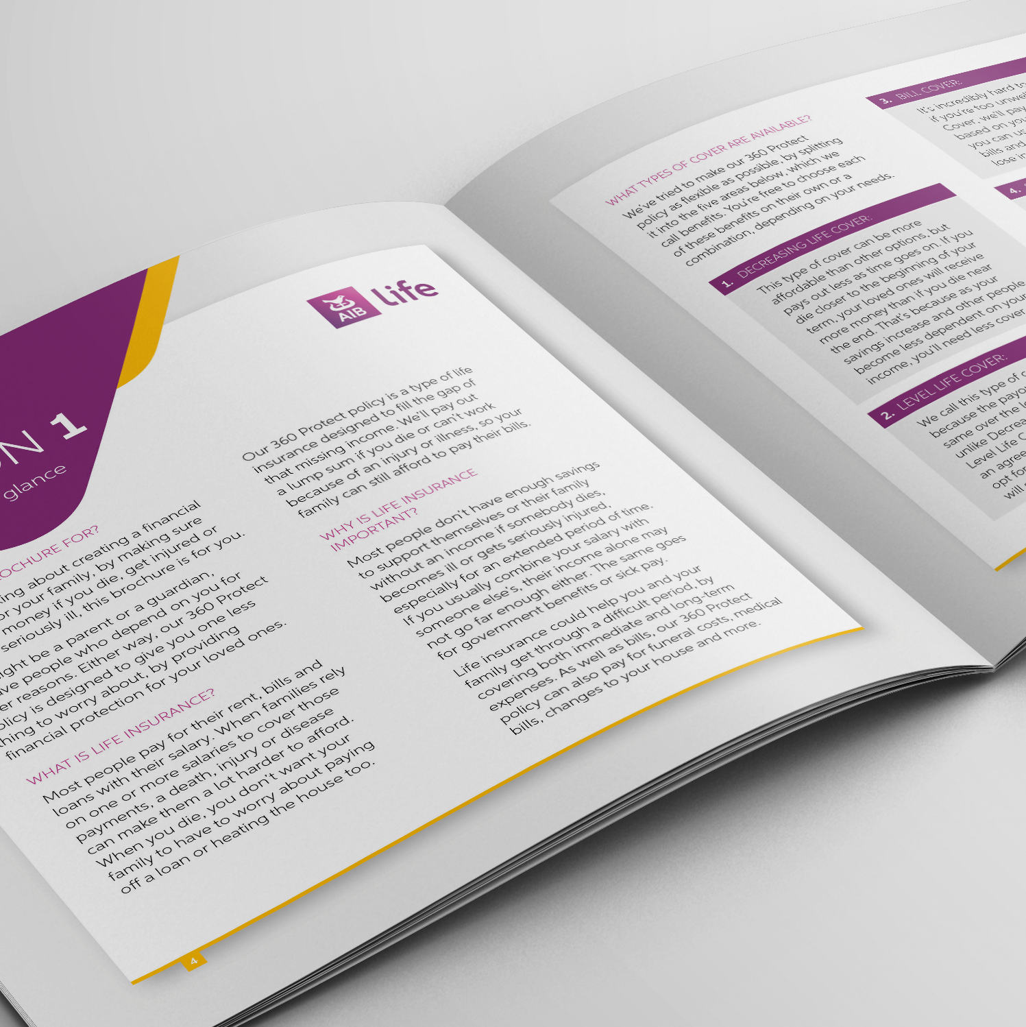
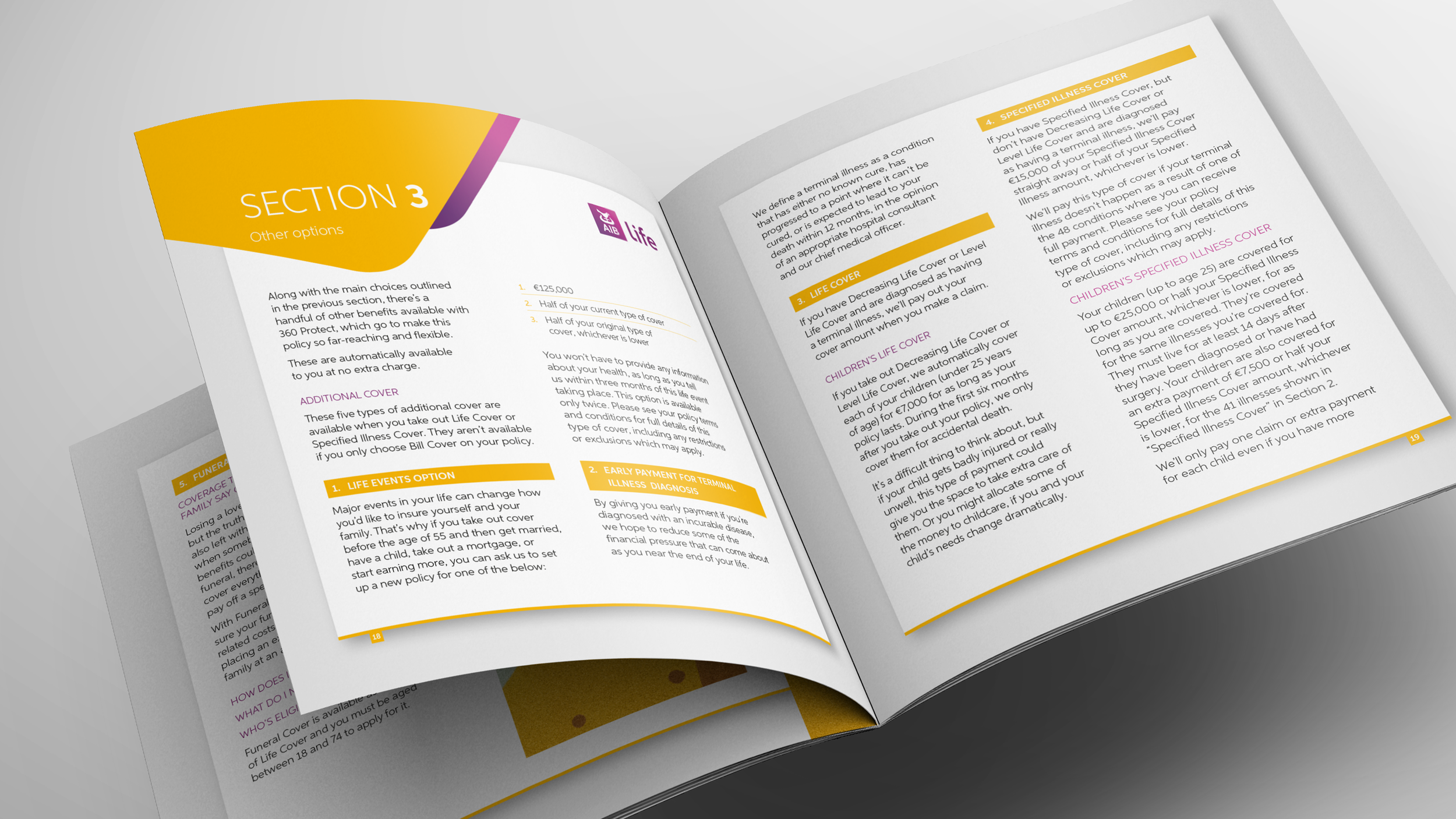
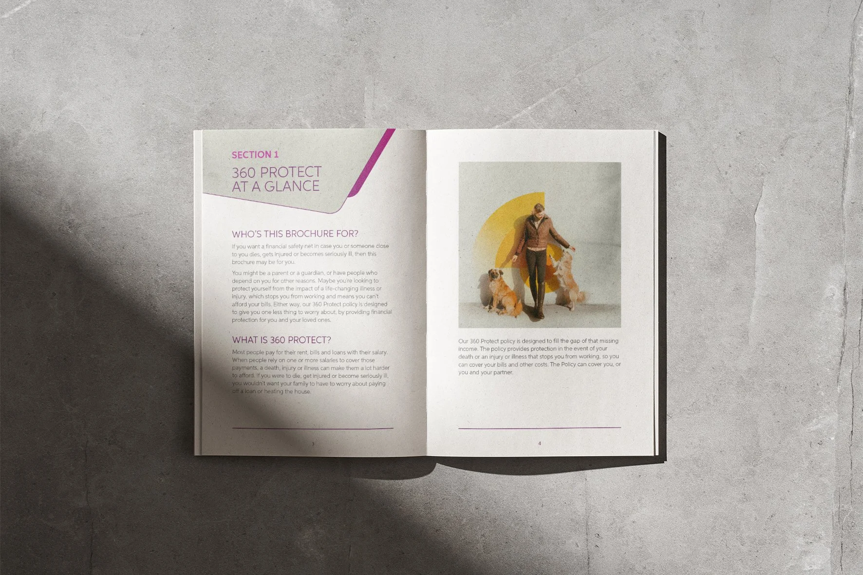
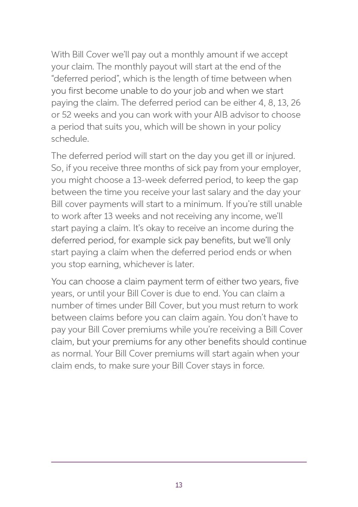
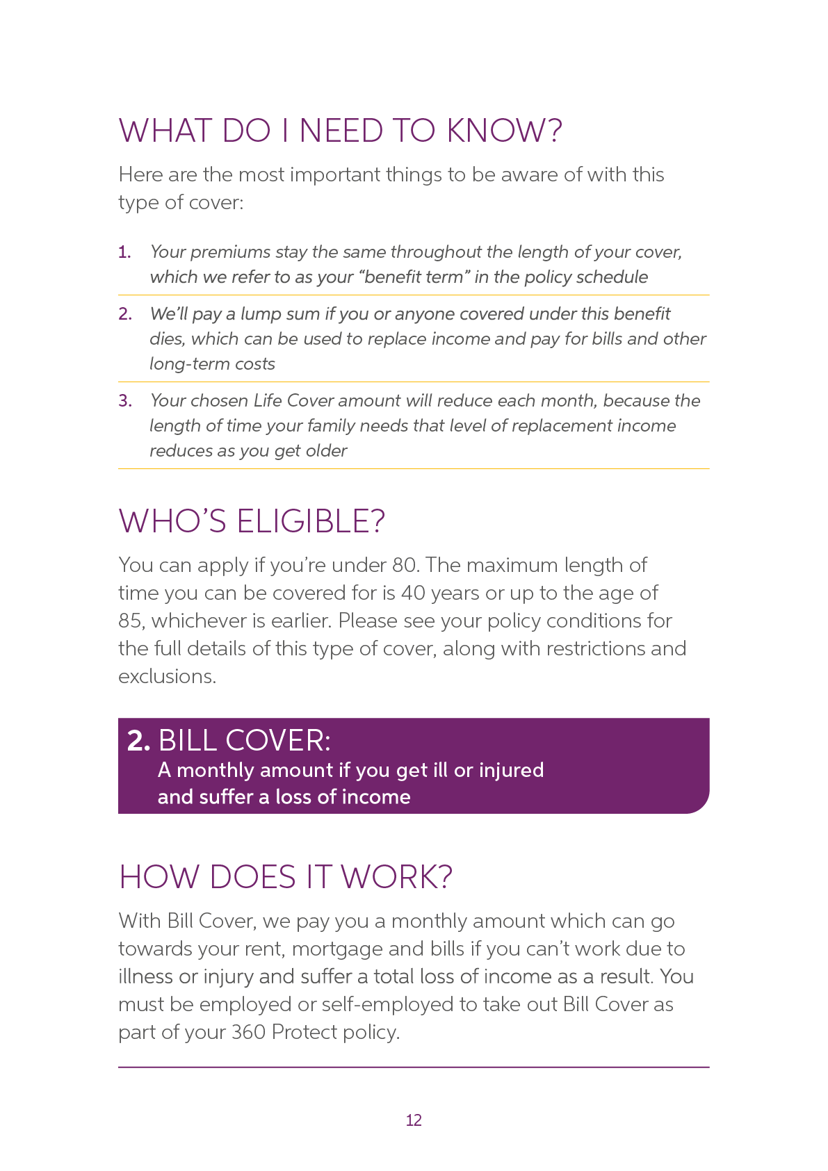
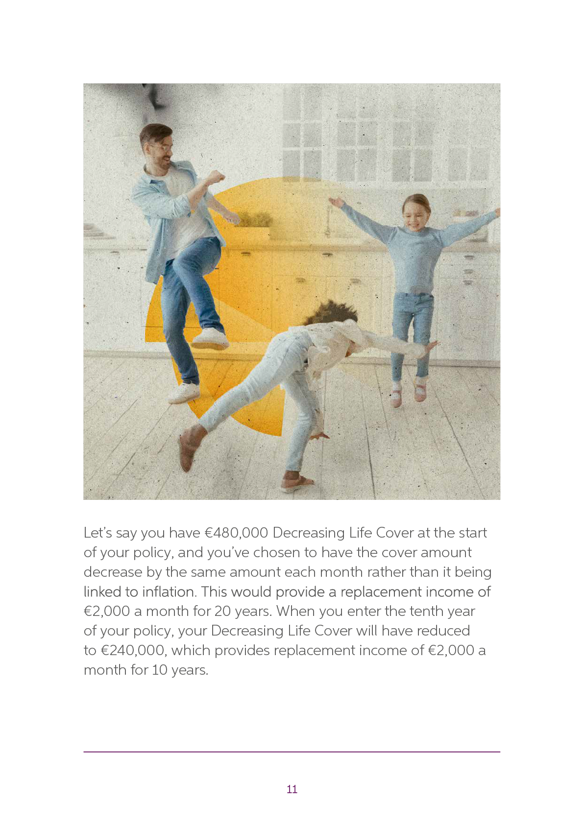
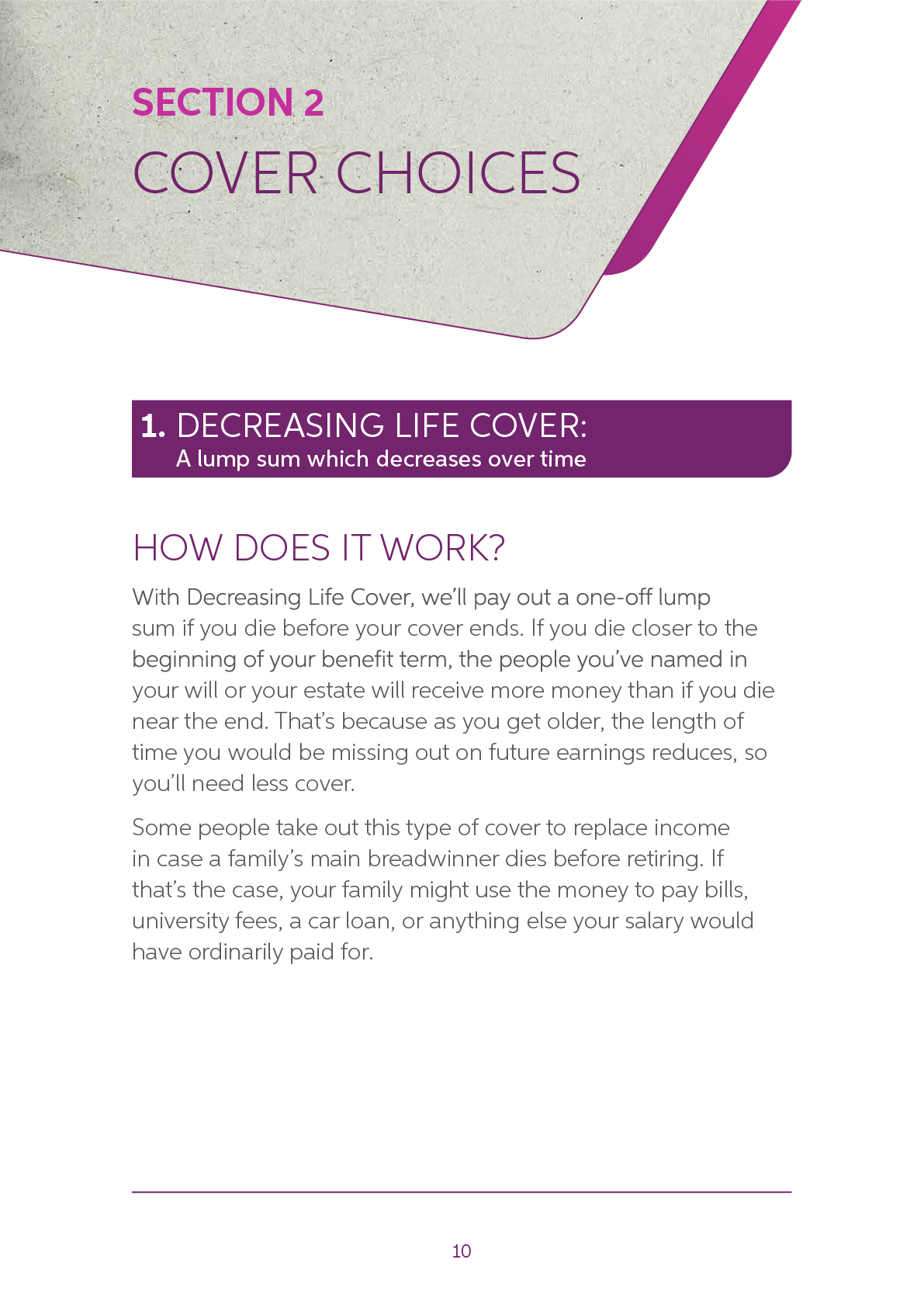
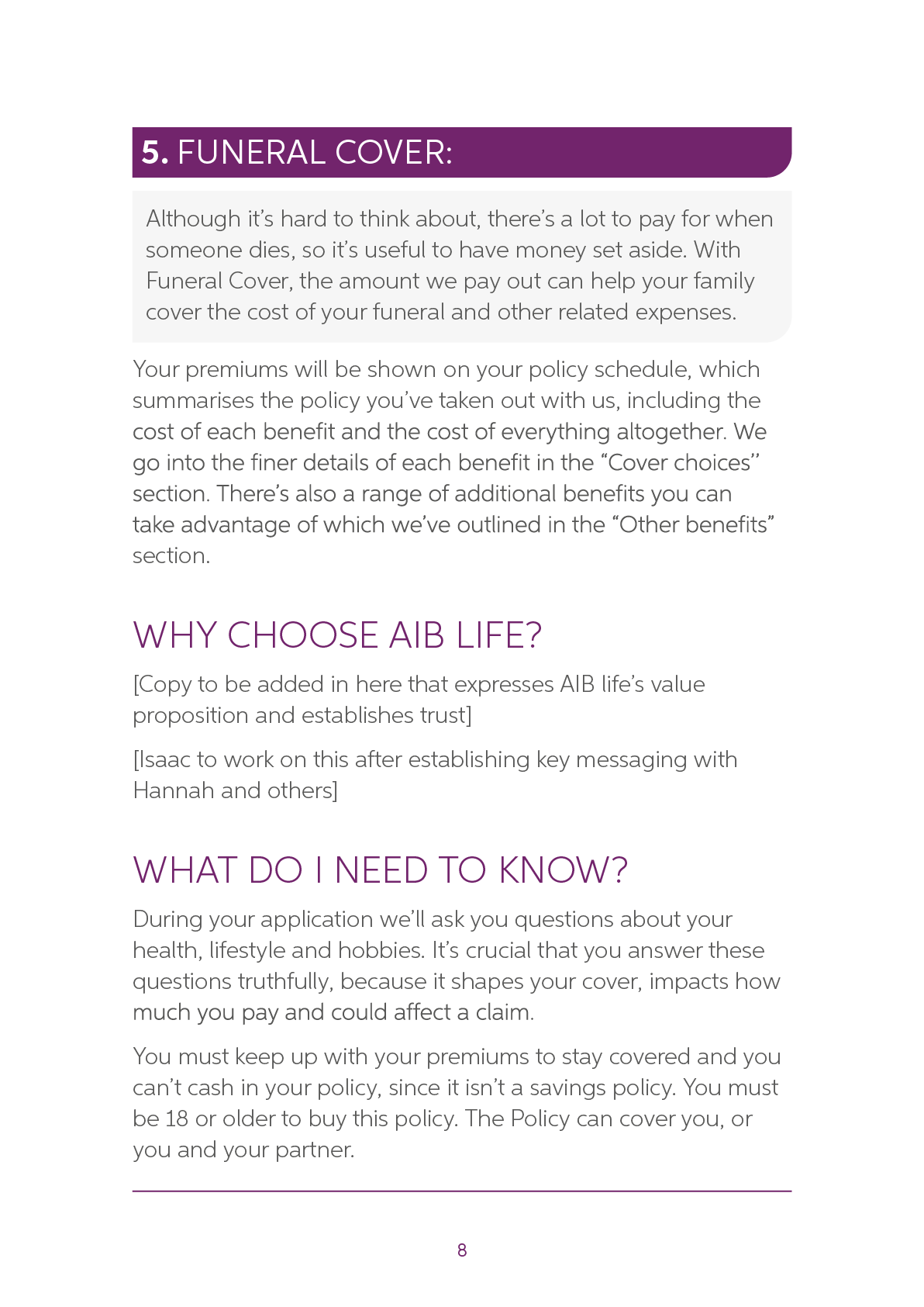
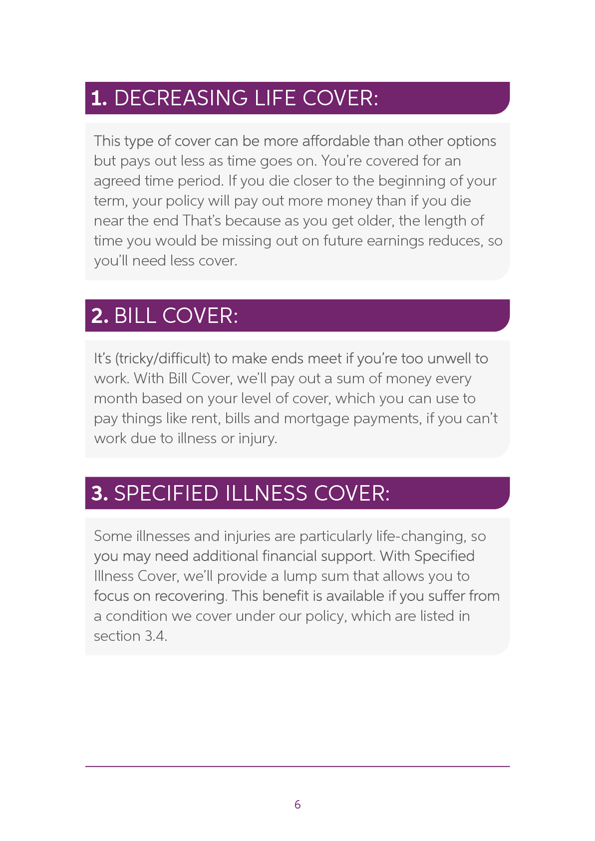
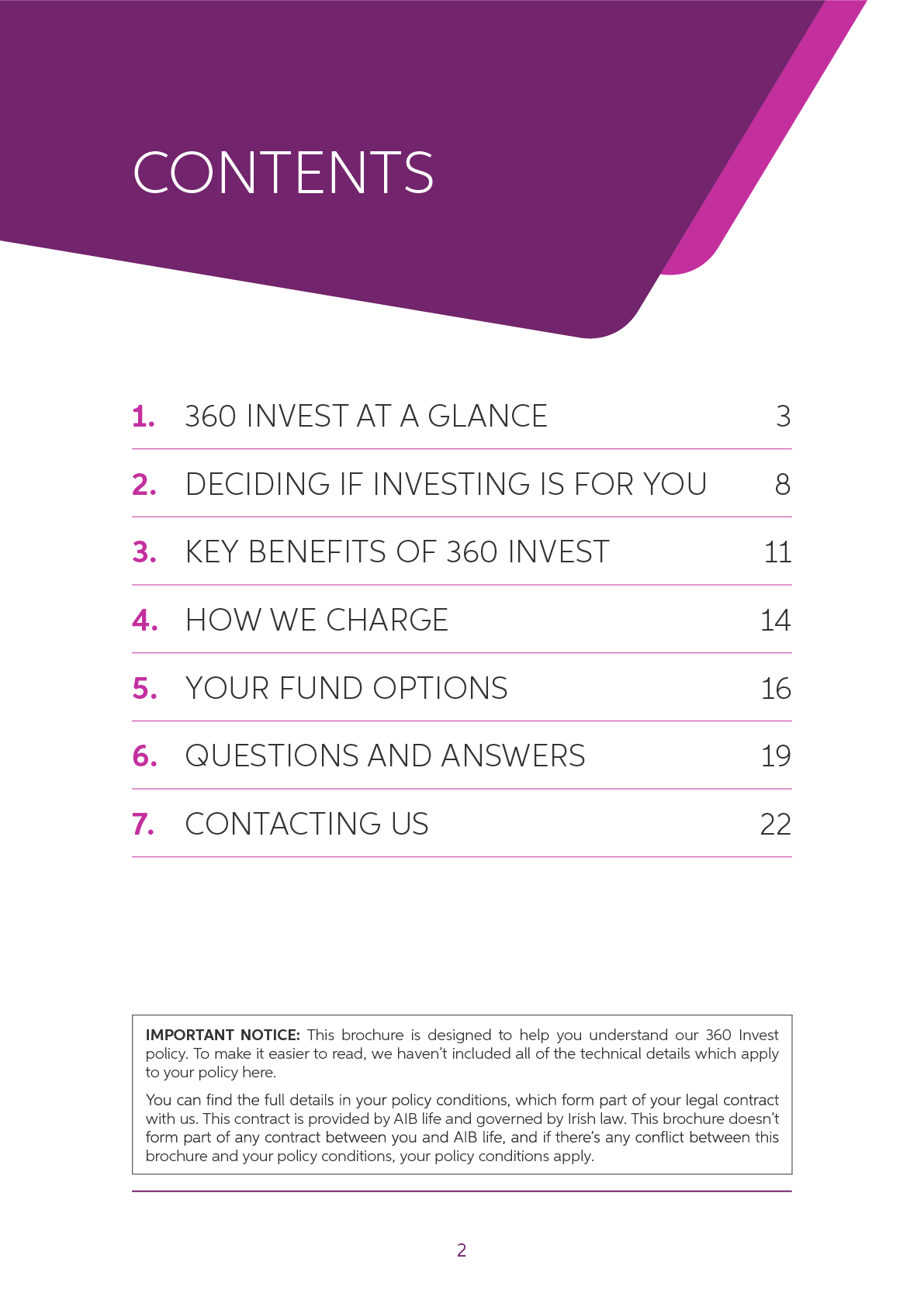
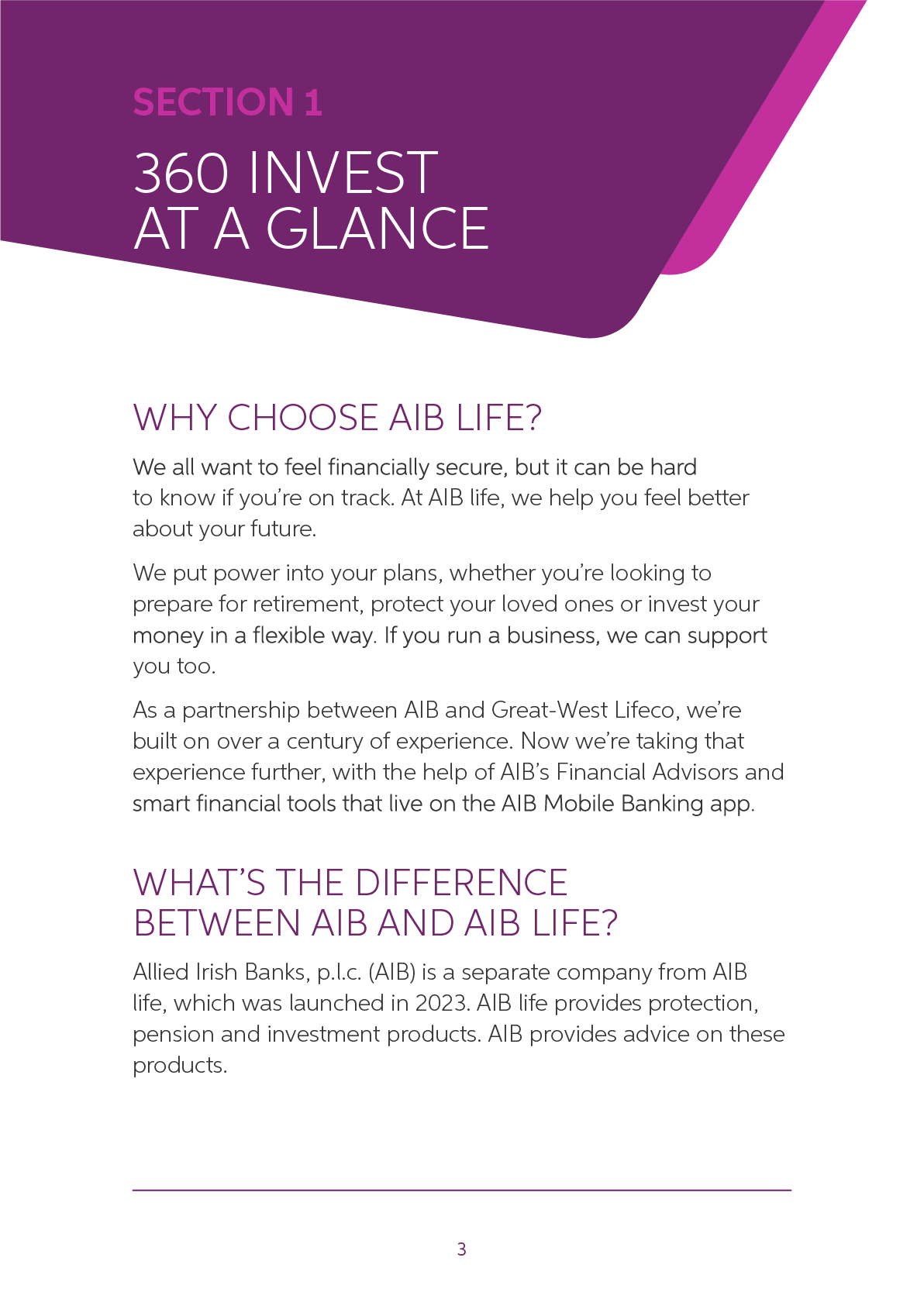
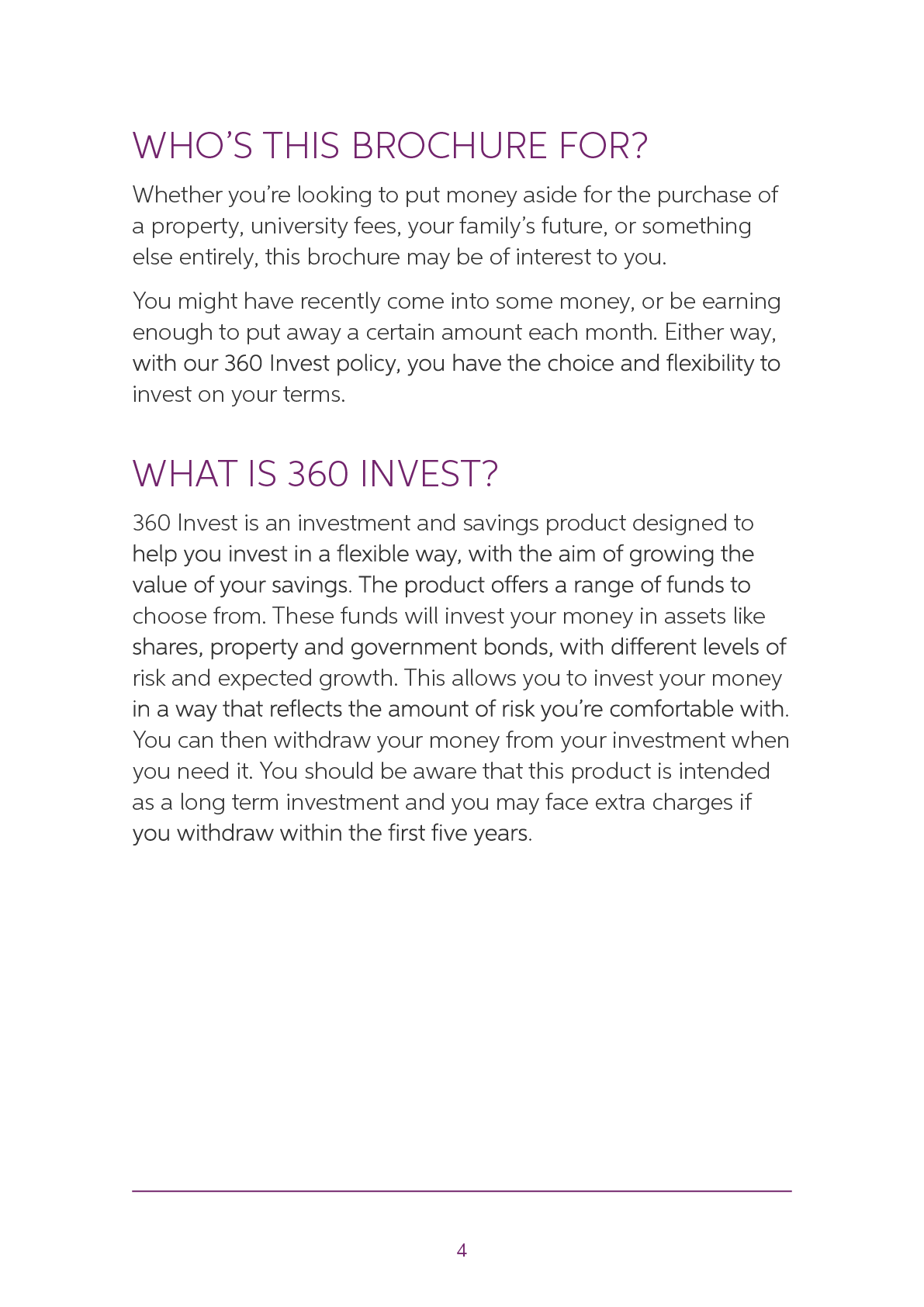
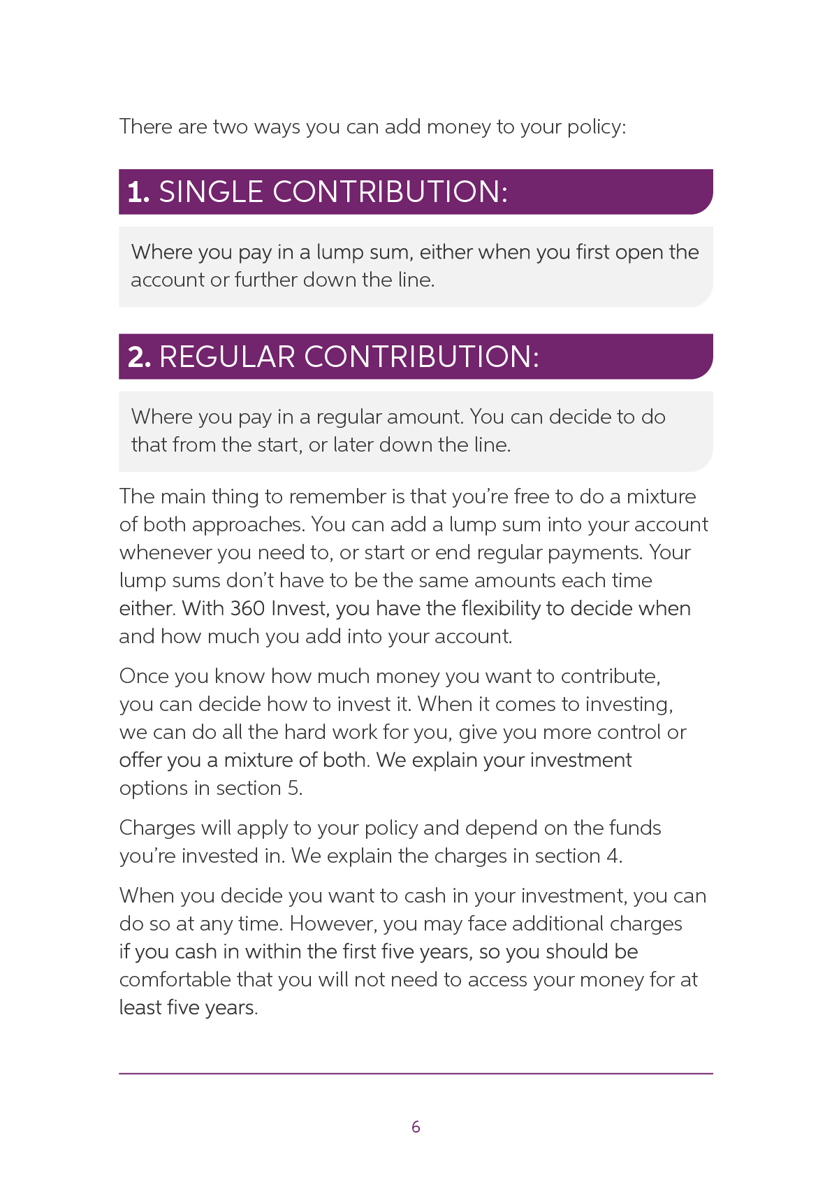
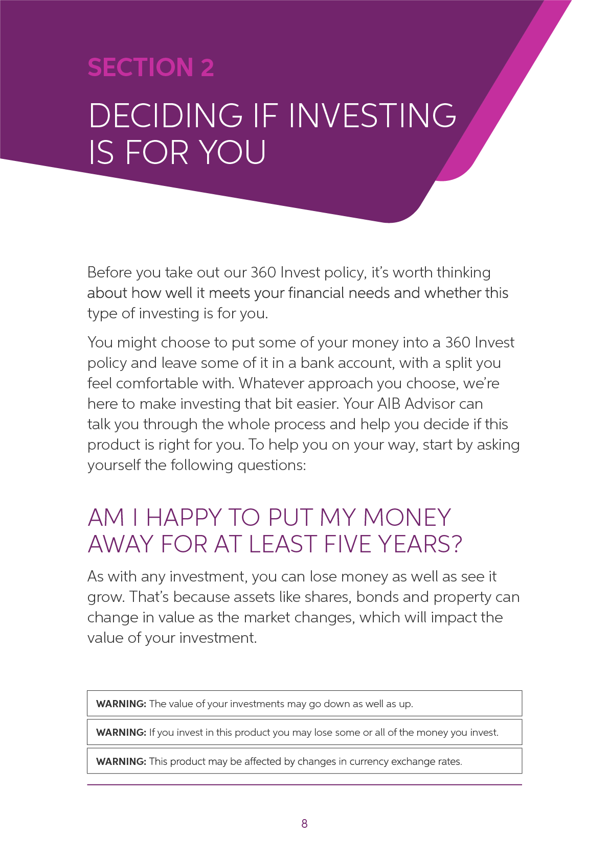
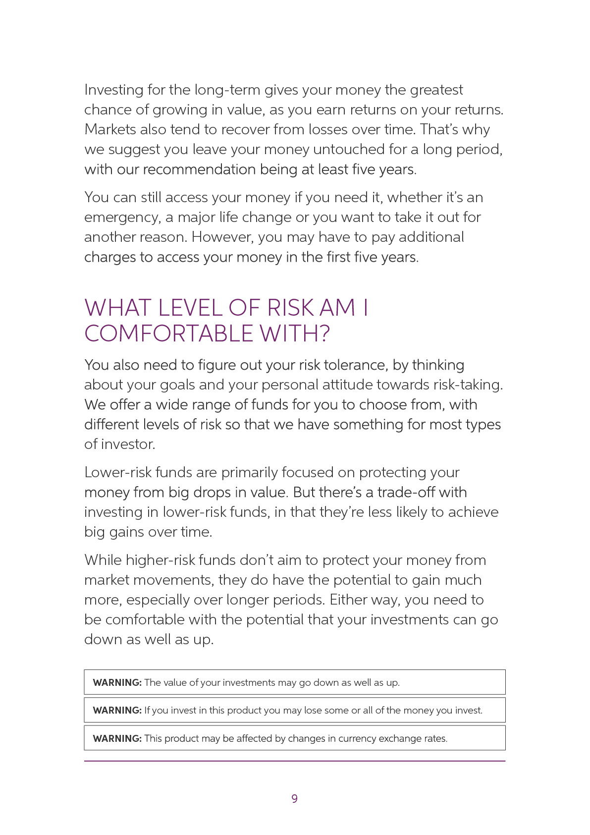
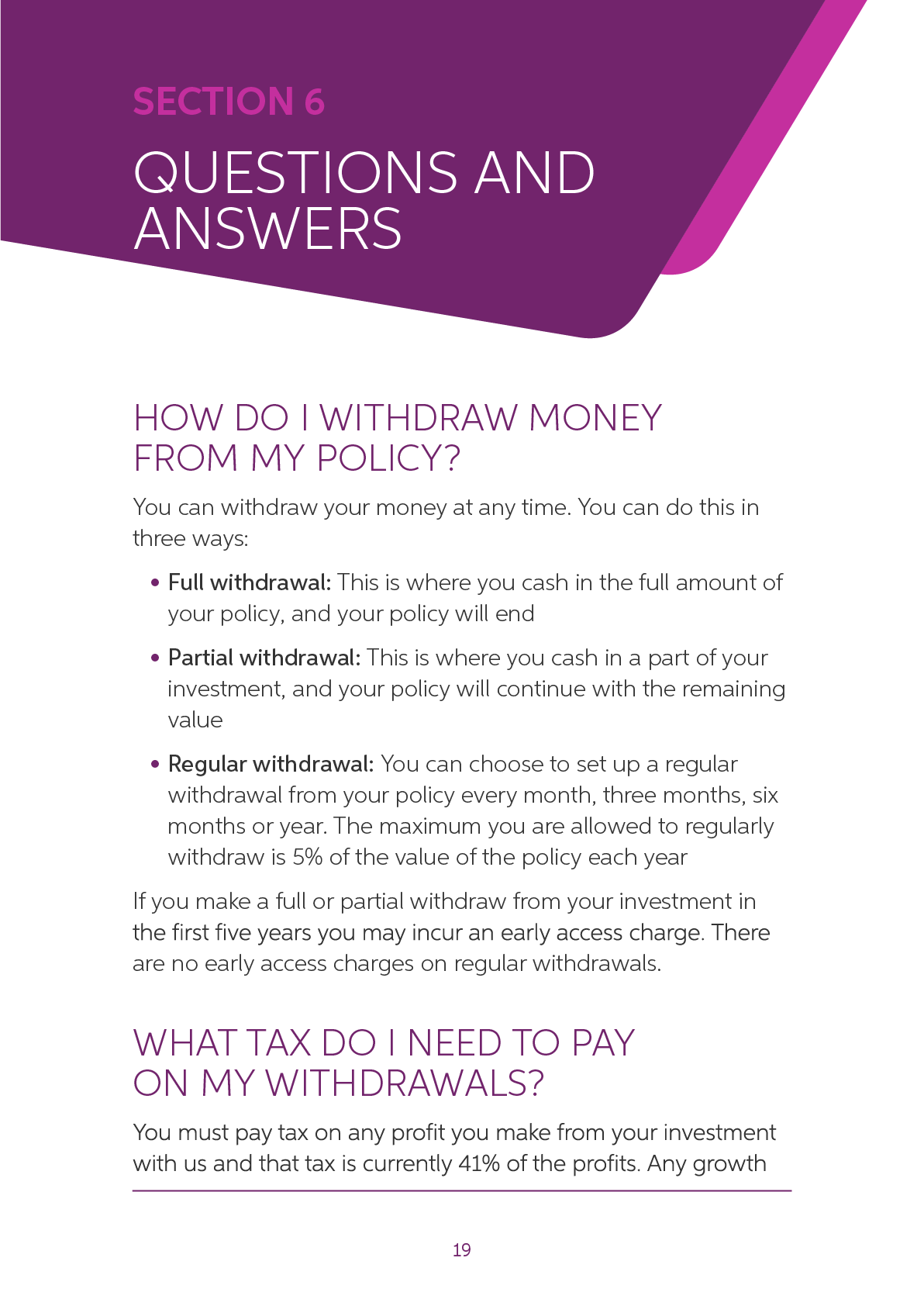
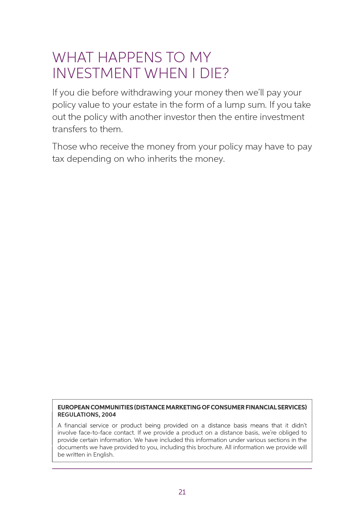
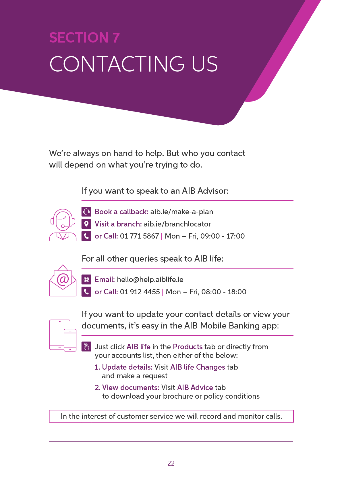
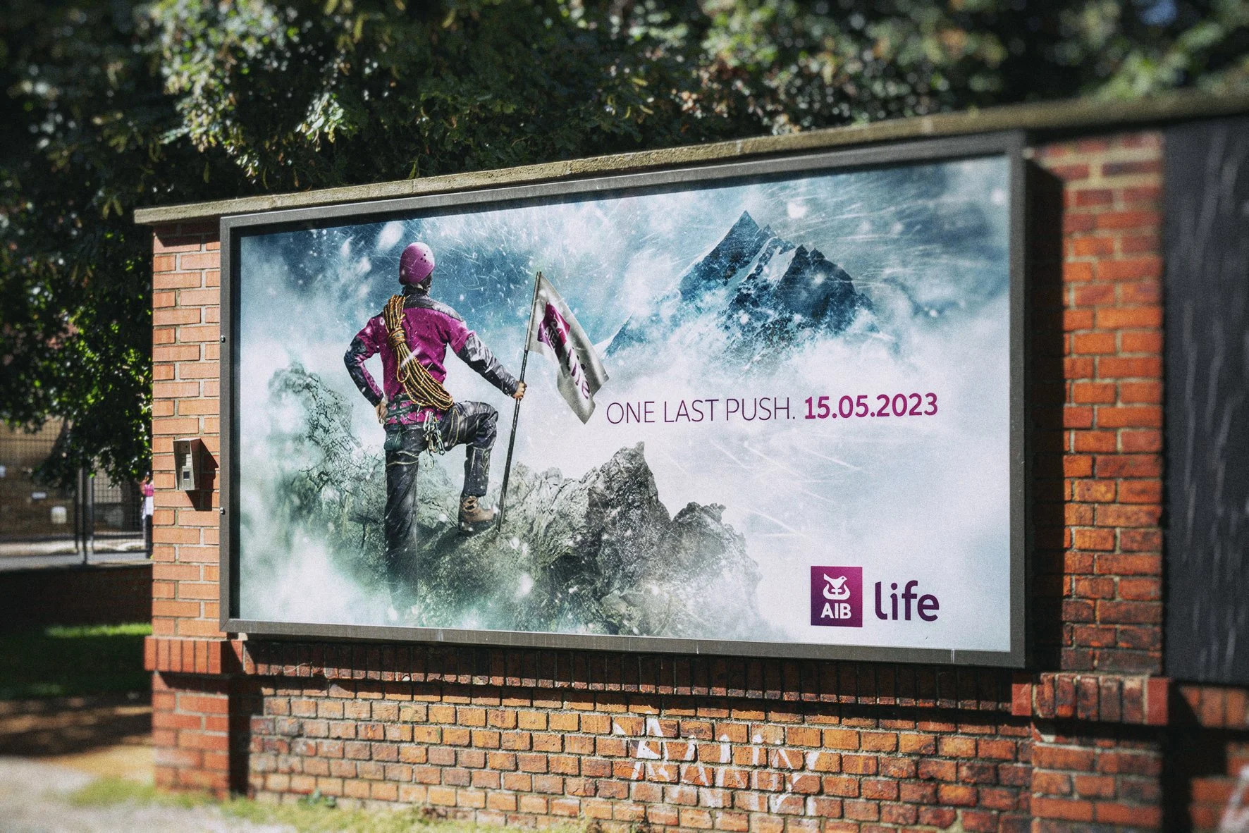
The project therefore returned to type: a safer, more recognisable AIB life system built around lifestyle photography, clear product structure and a more conventional brochure format.
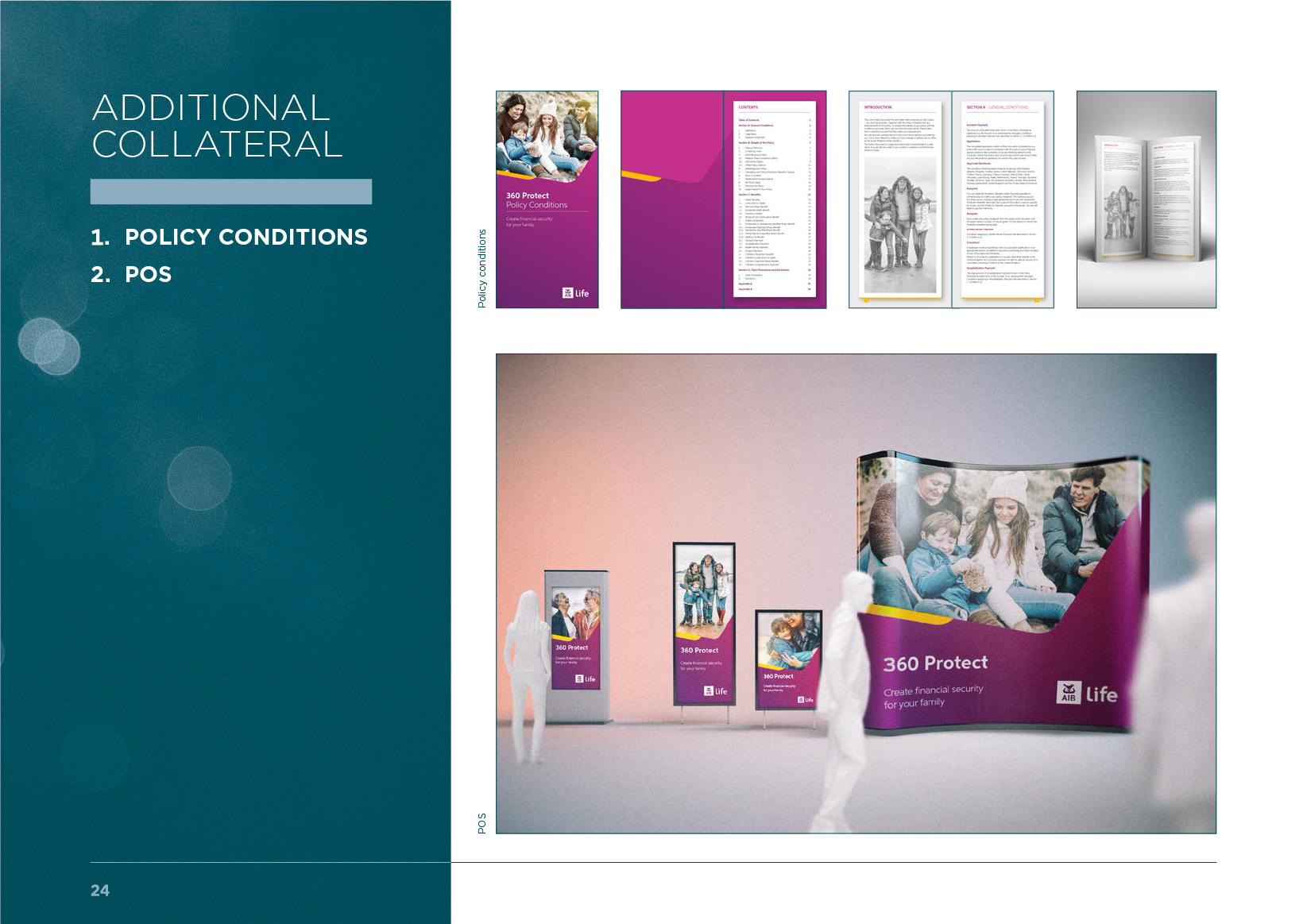
This direction was then rolled out across the brochure suite and supporting point-of-sale materials.

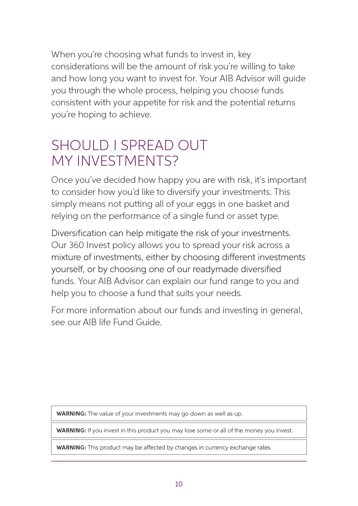
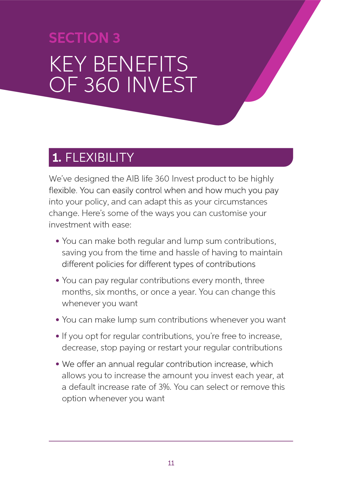
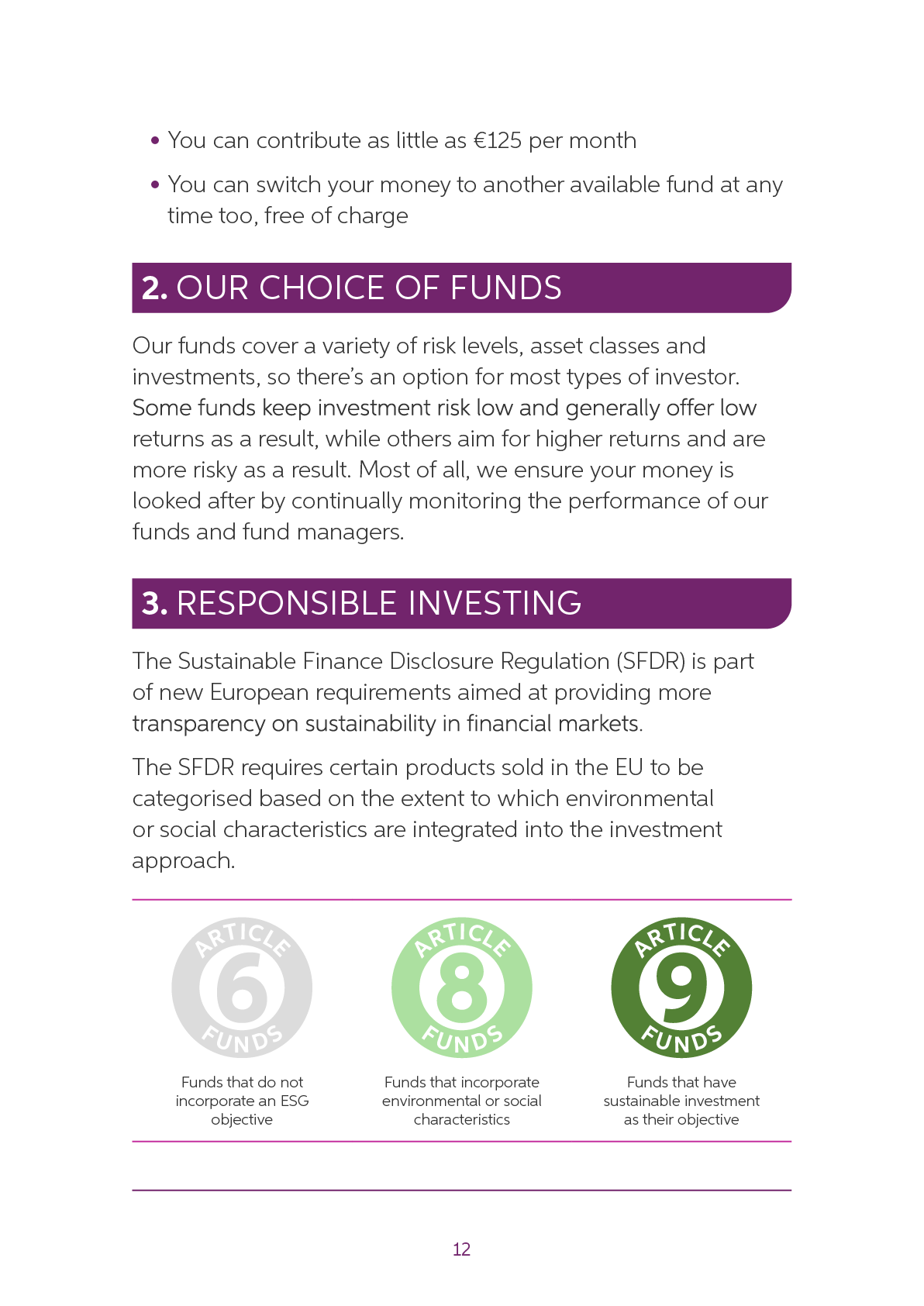
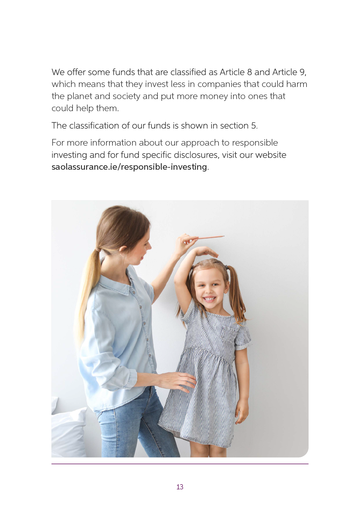



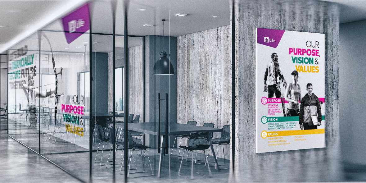
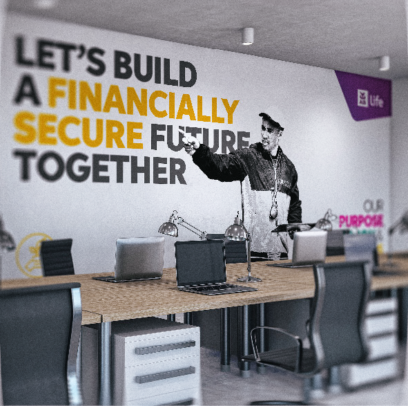
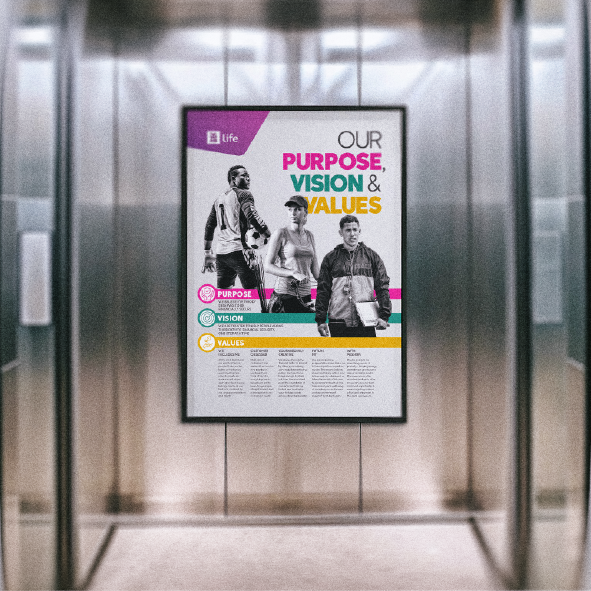
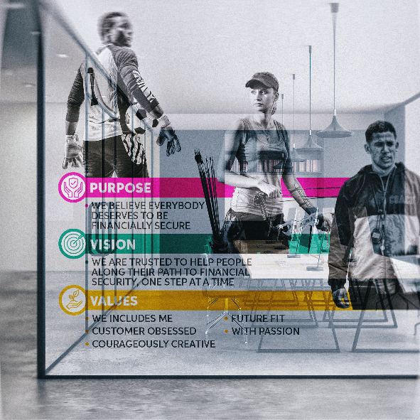
AIB life Call Centre, Letterkenny
While the customer-facing literature ultimately returned to a more familiar photographic direction, the Letterkenny call centre offered a different opportunity.
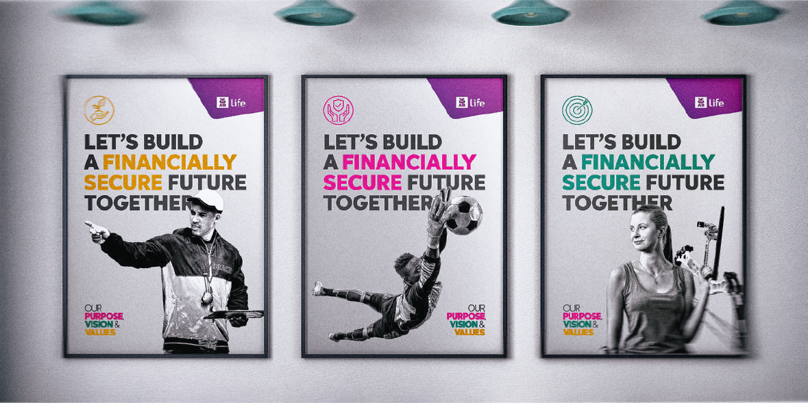
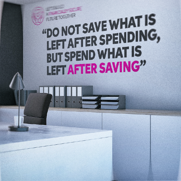
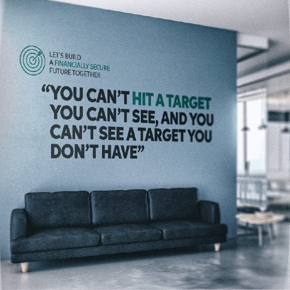
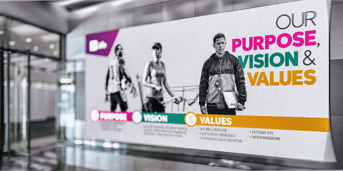
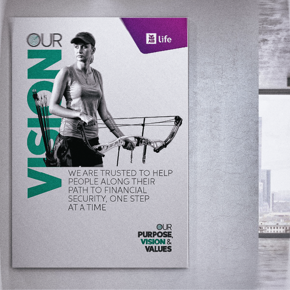
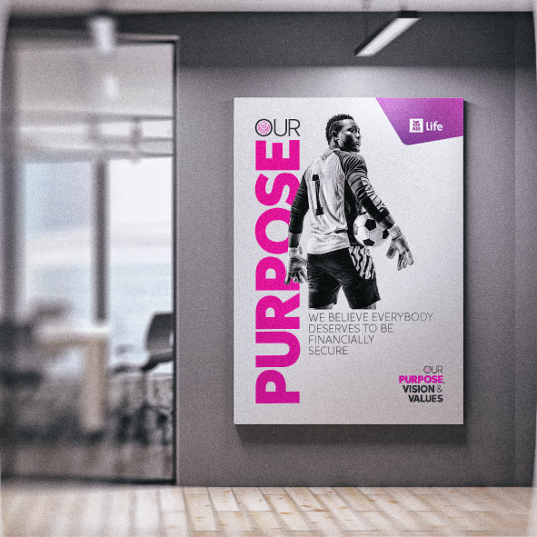
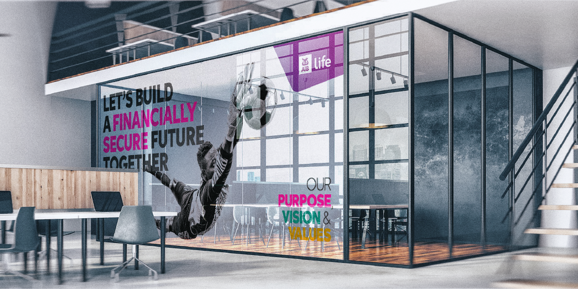
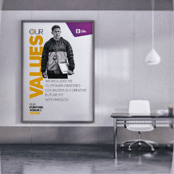
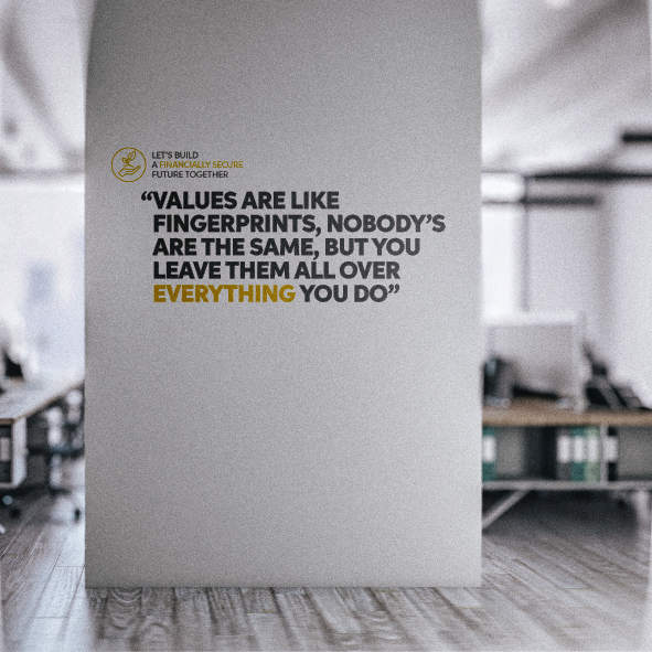
Because the space was internal rather than public-facing, there was more freedom to bring energy, personality and momentum into the AIB life visual world. The final route used sporting metaphors to connect the team’s daily work with ideas of focus, performance, teamwork and shared ambition.
Black-and-white sporting imagery, bold typographic statements and the AIB life colour palette were used across walls, glass panels and breakout areas, creating a workspace that felt motivating without becoming overly corporate.
The result was a more expressive brand environment: one that still carried the core message of building financial security together, but translated it into a more active, team-led visual language for the people delivering that promise every day.


AIB life – 2026 update
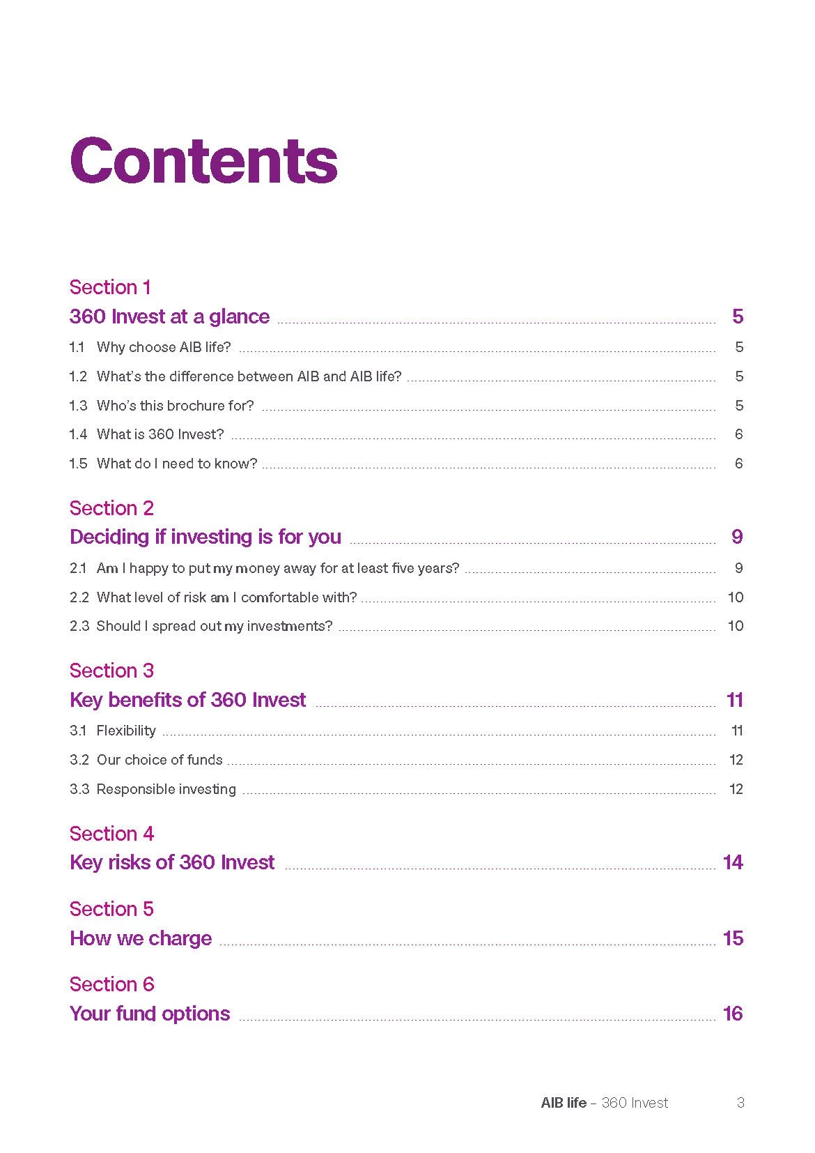
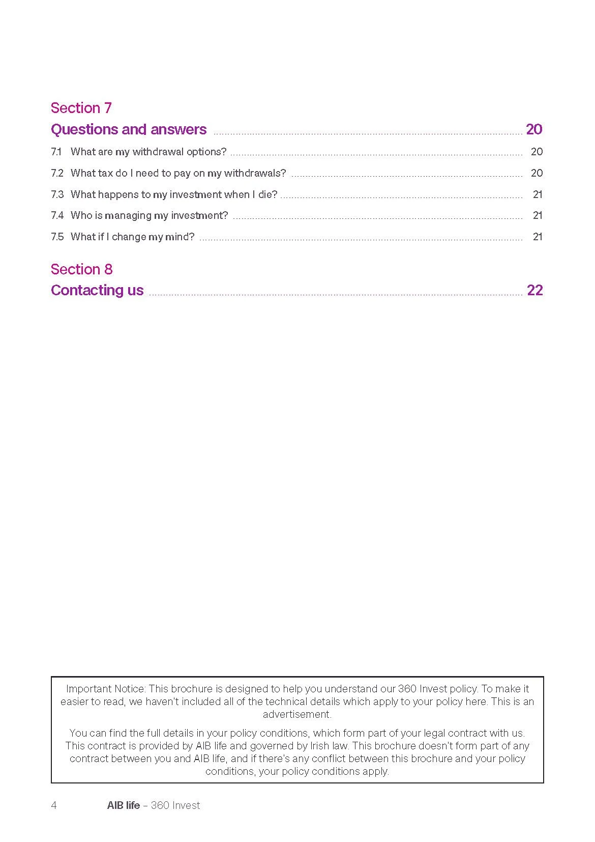
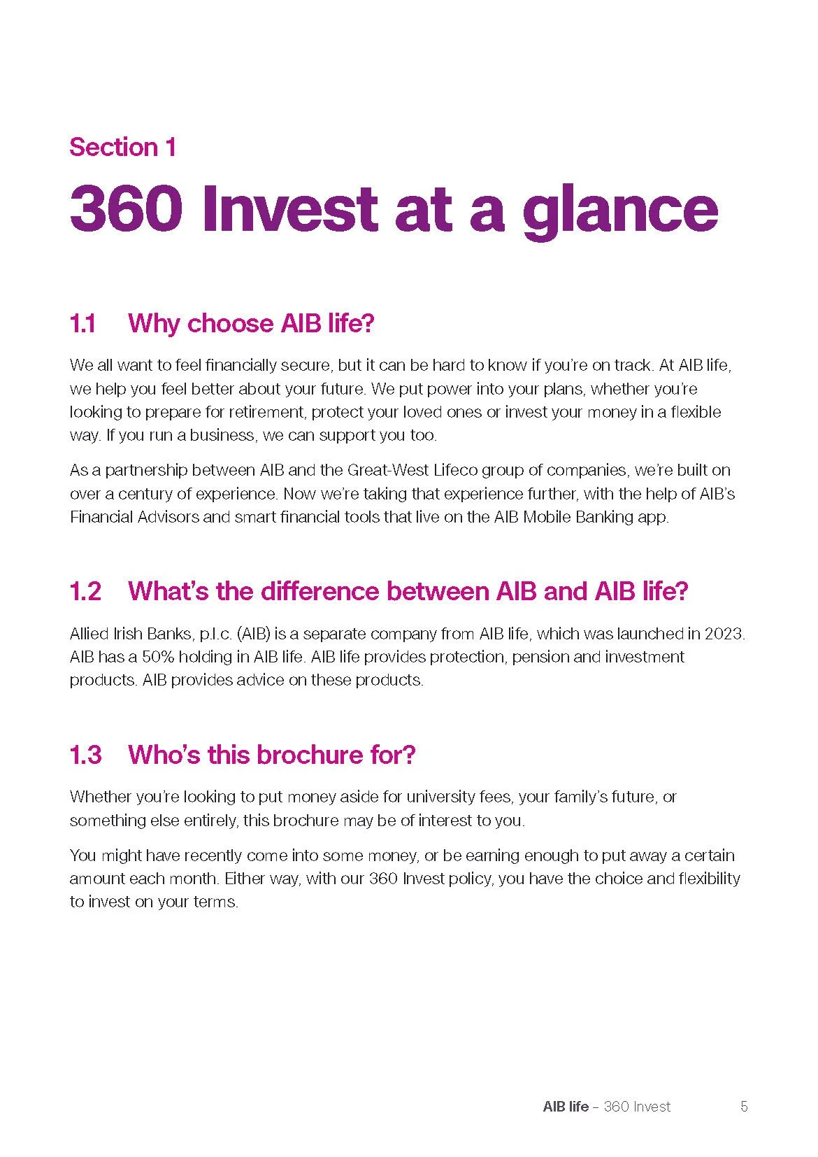
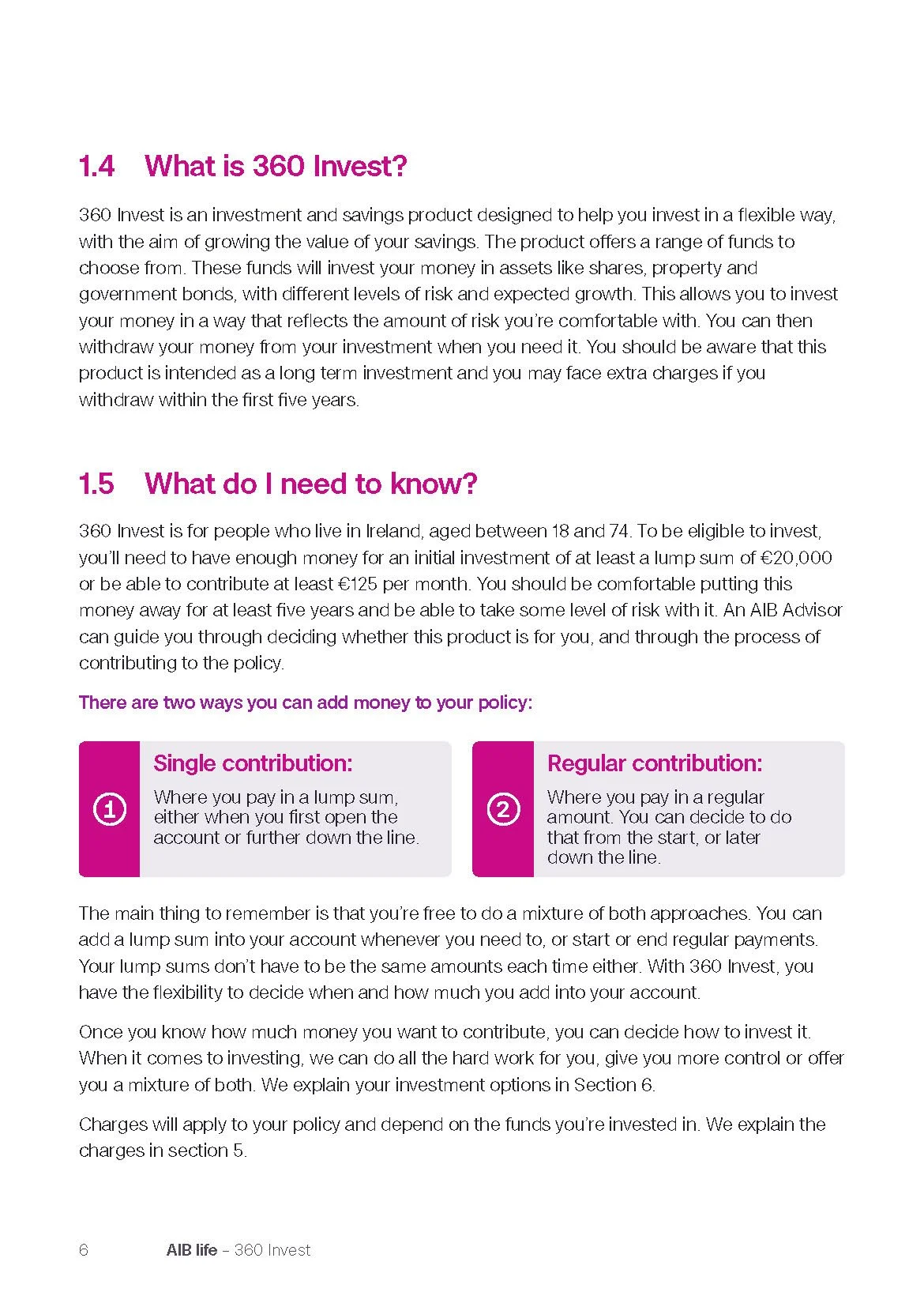
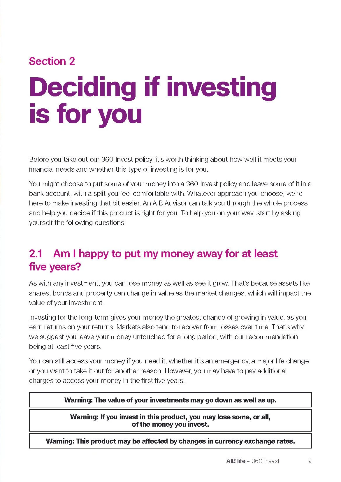
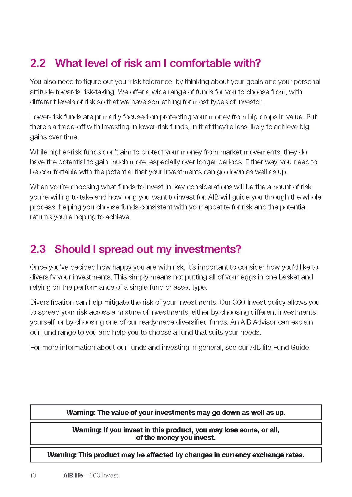
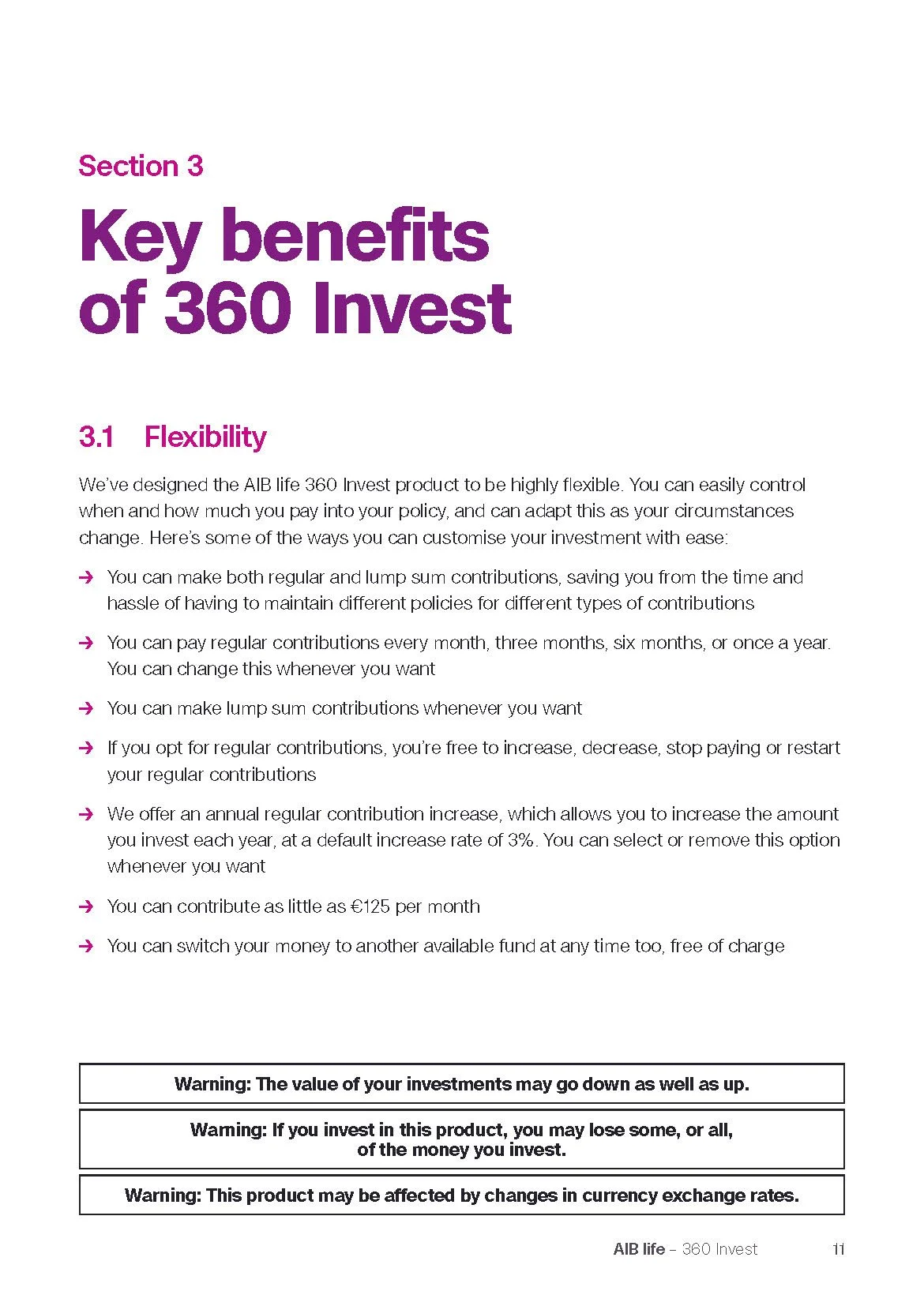
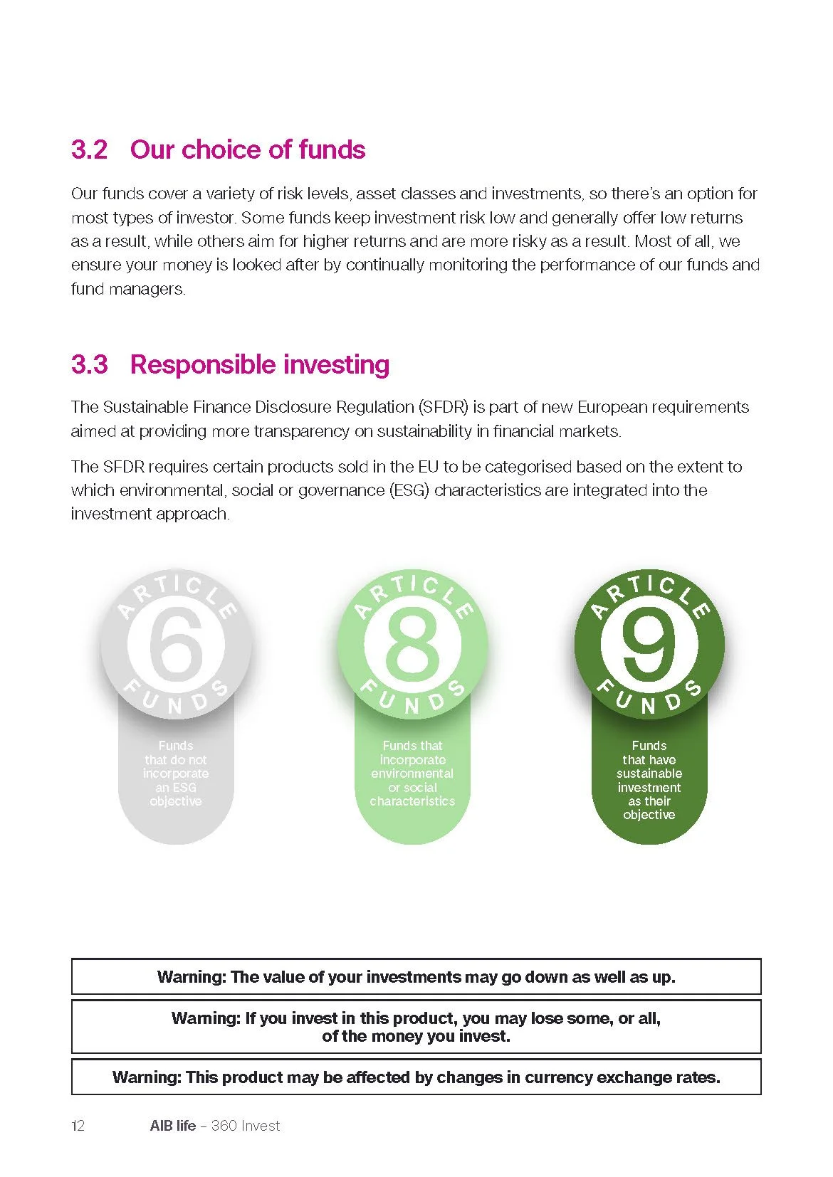
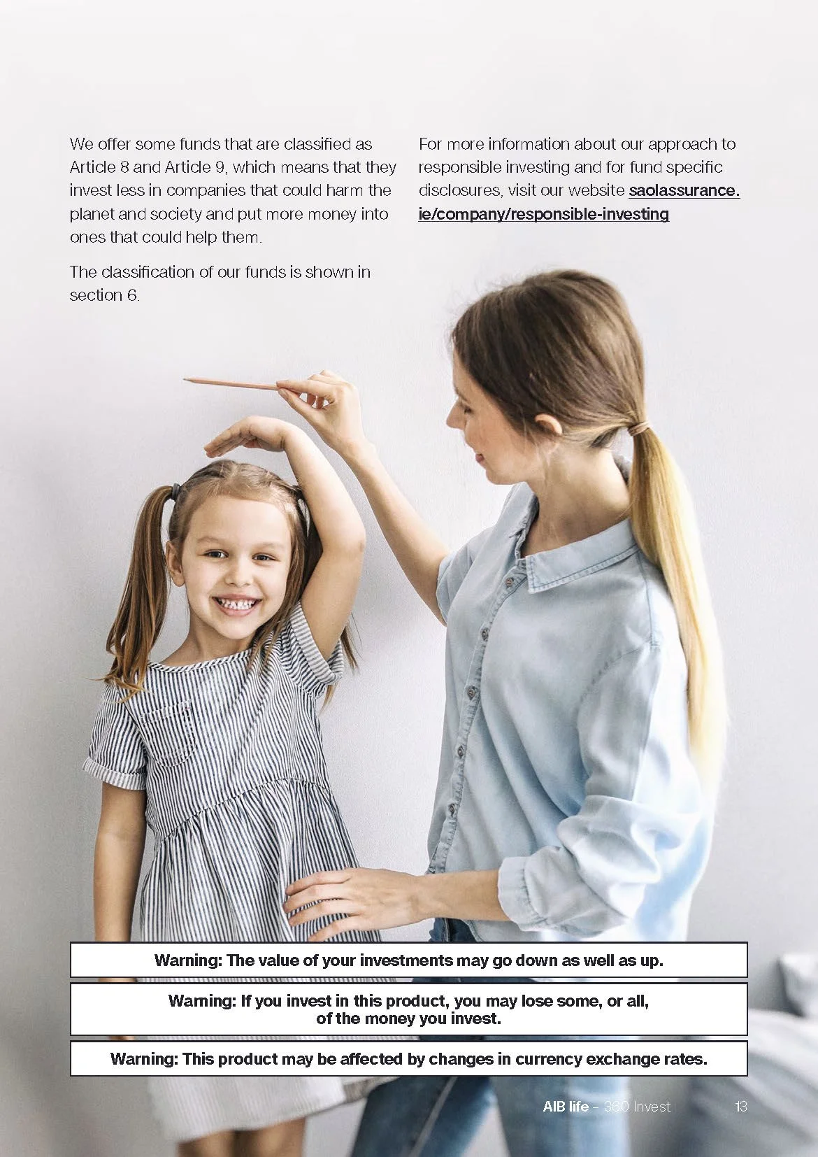
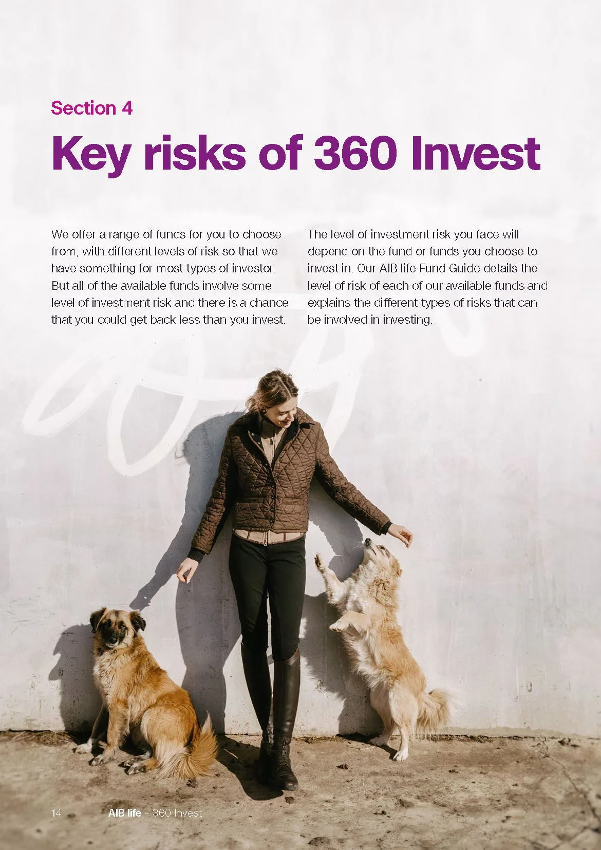
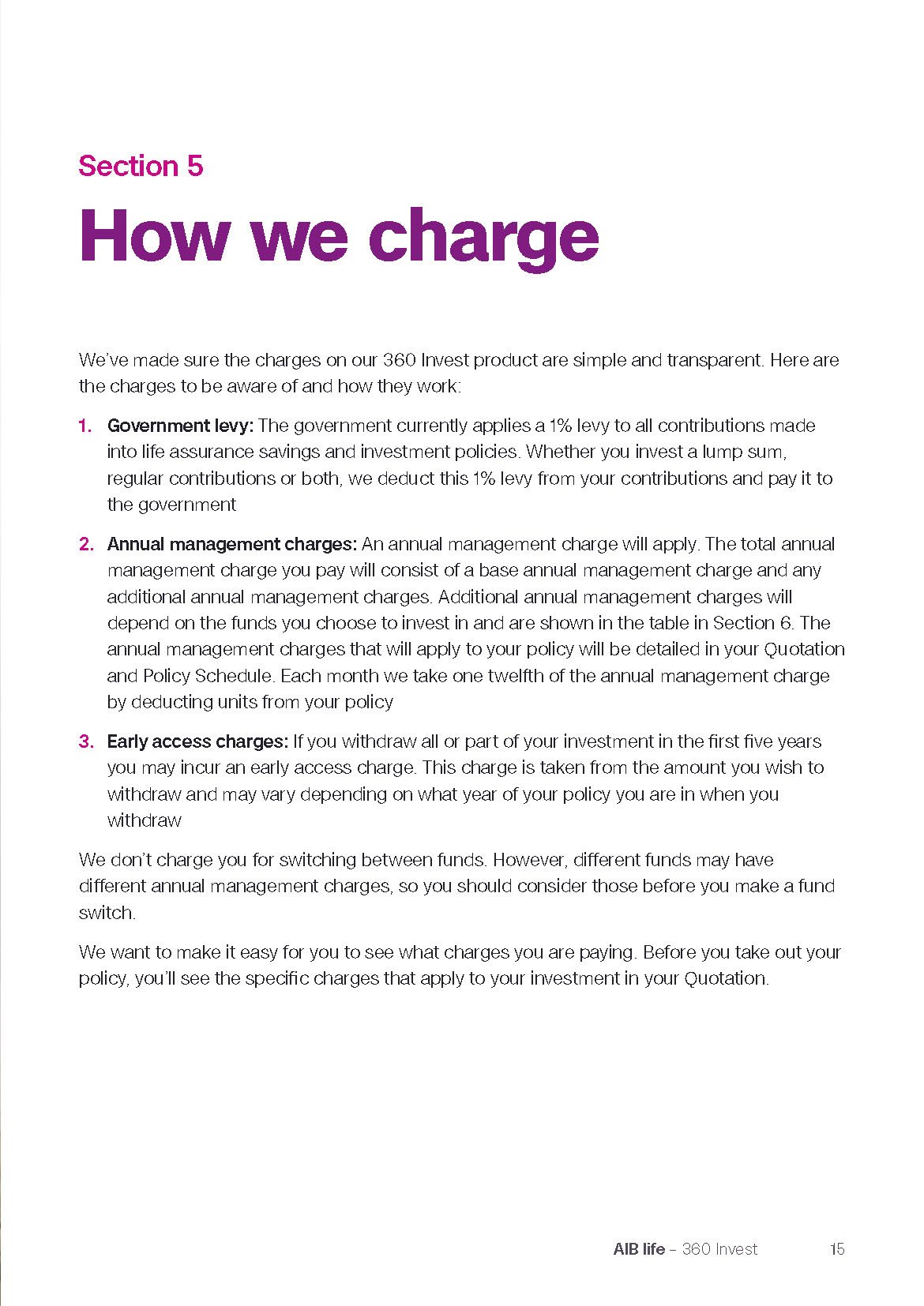
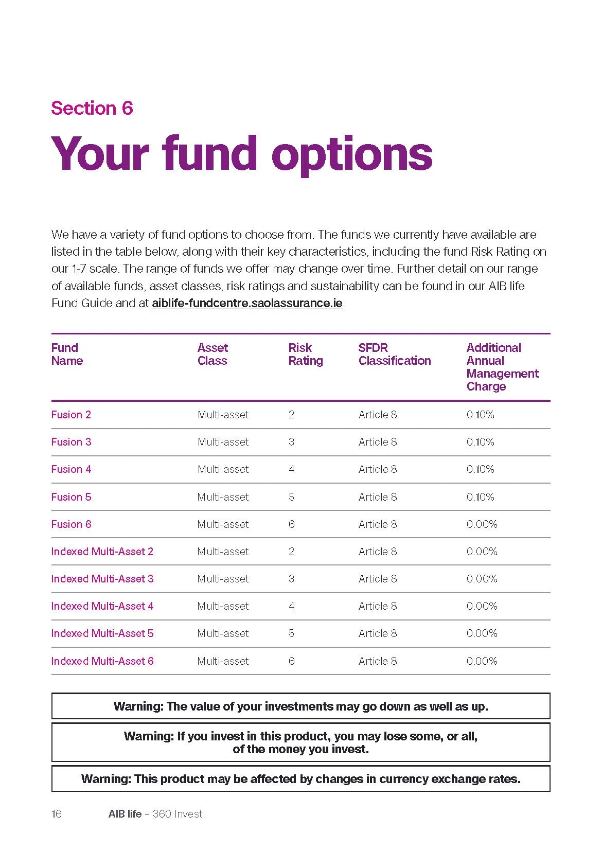
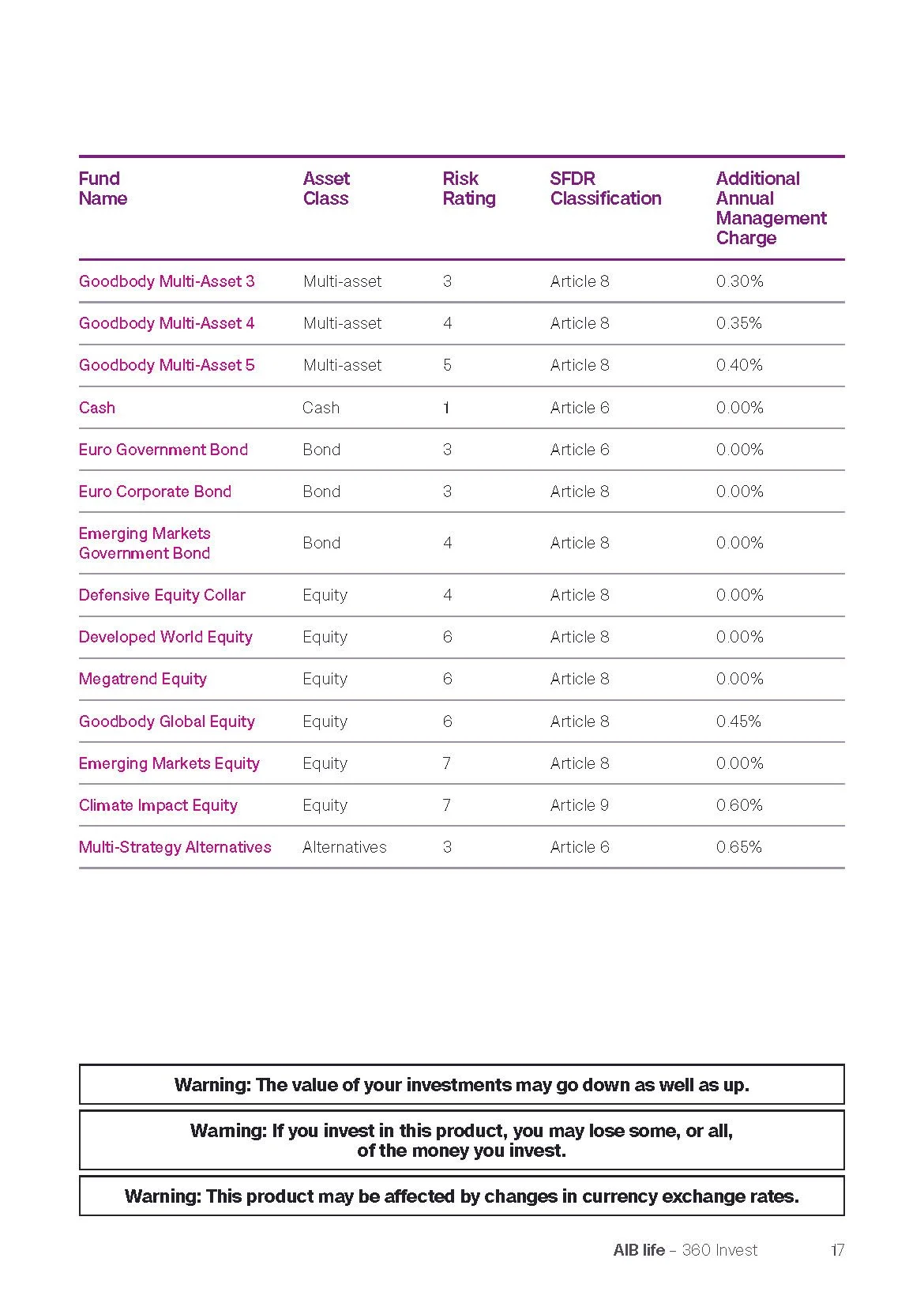
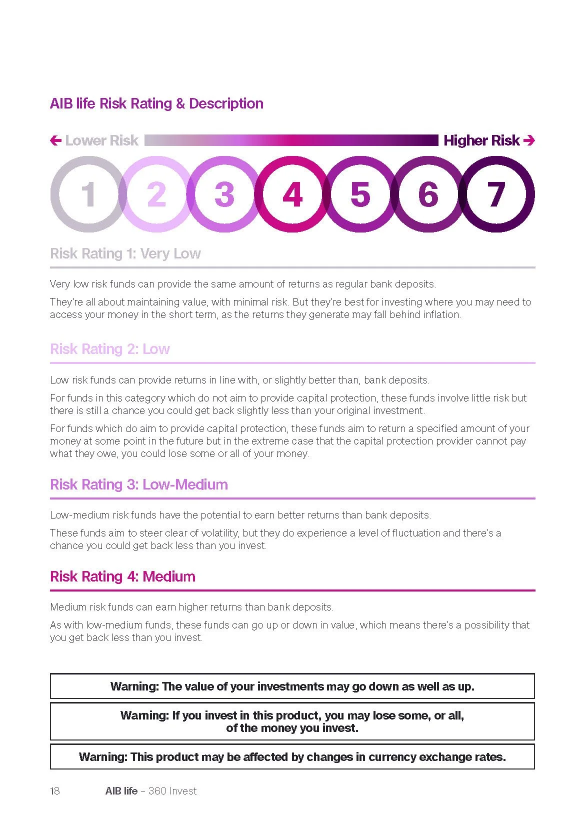
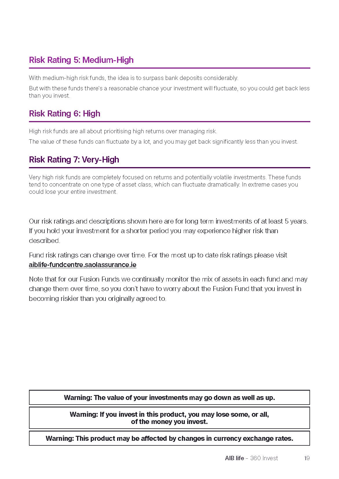
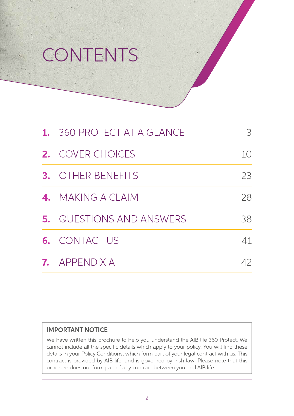
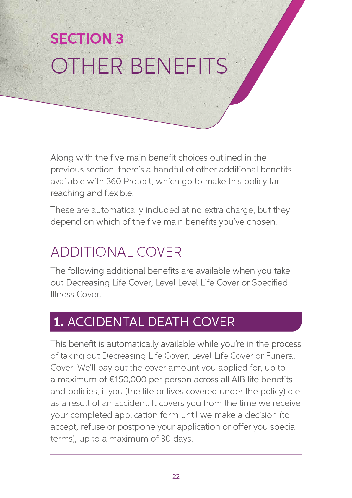
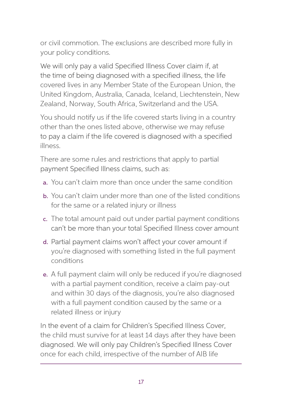
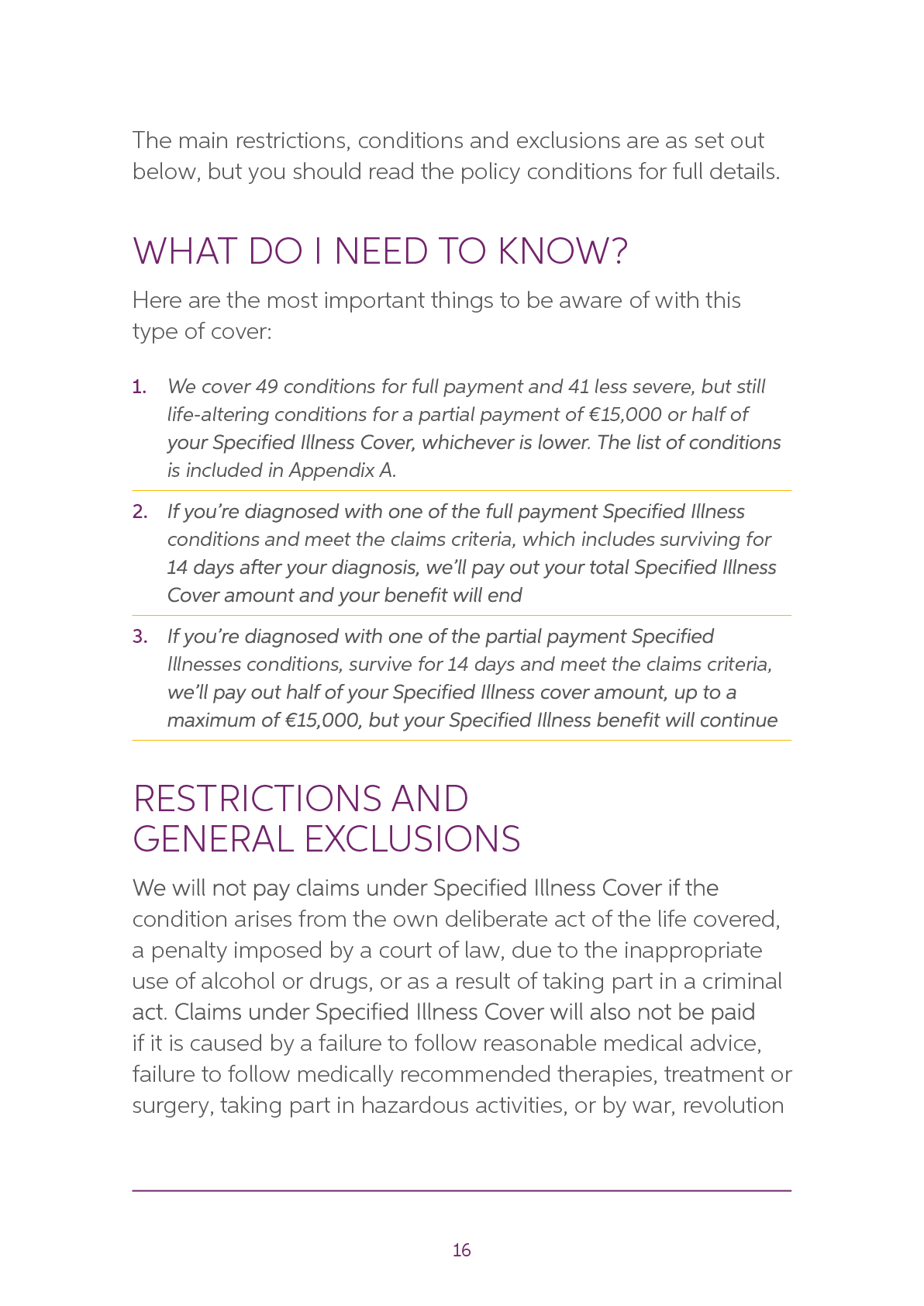
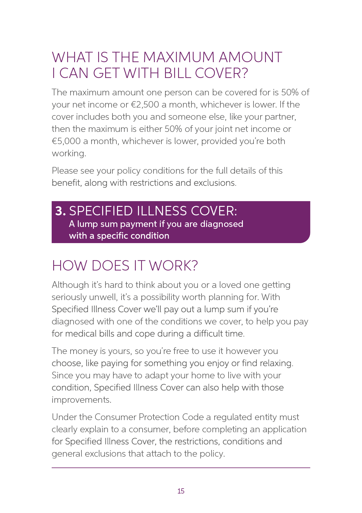
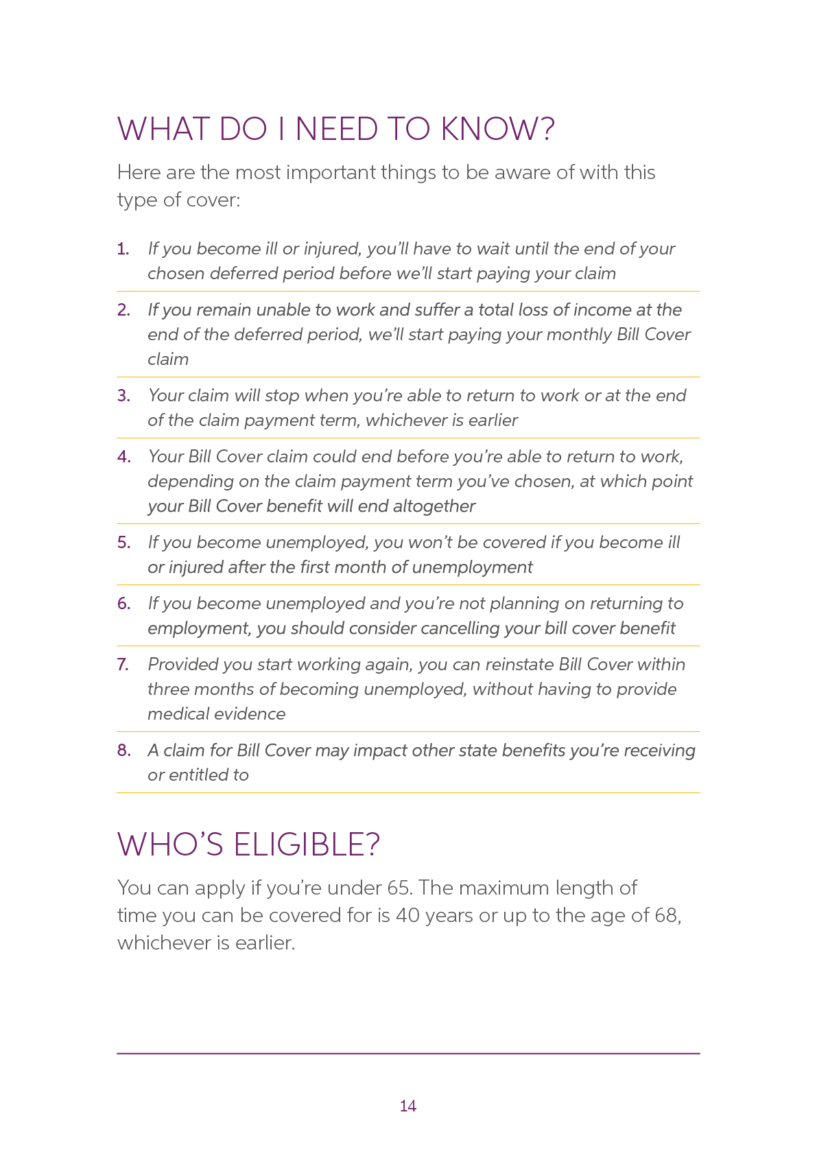
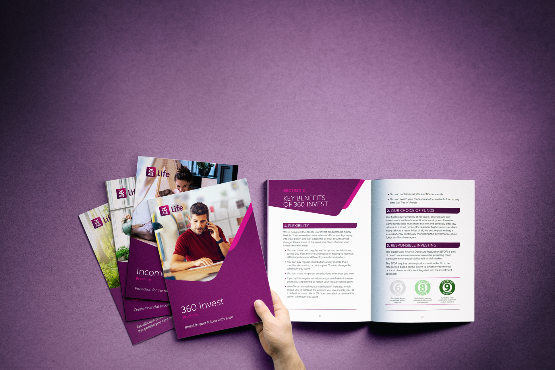
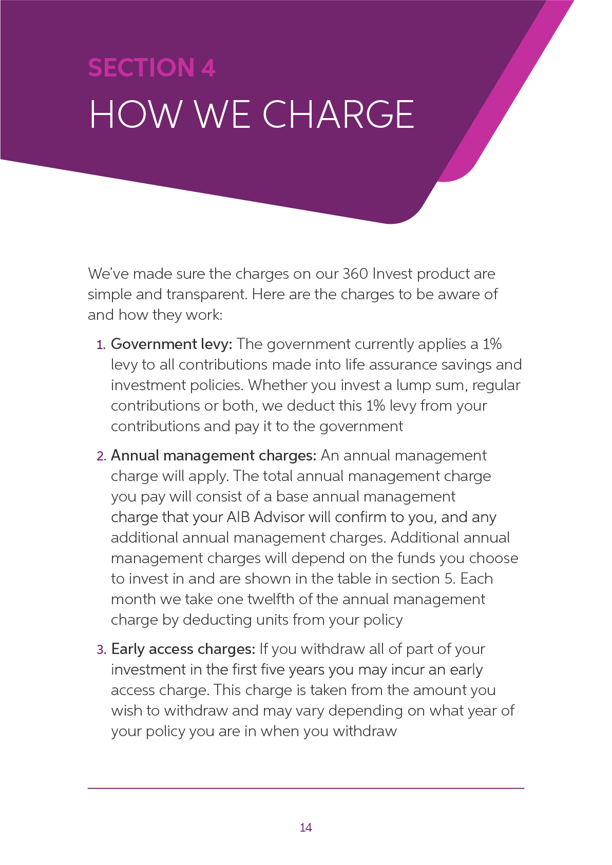
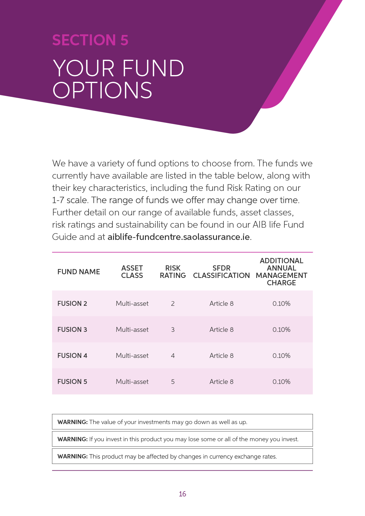
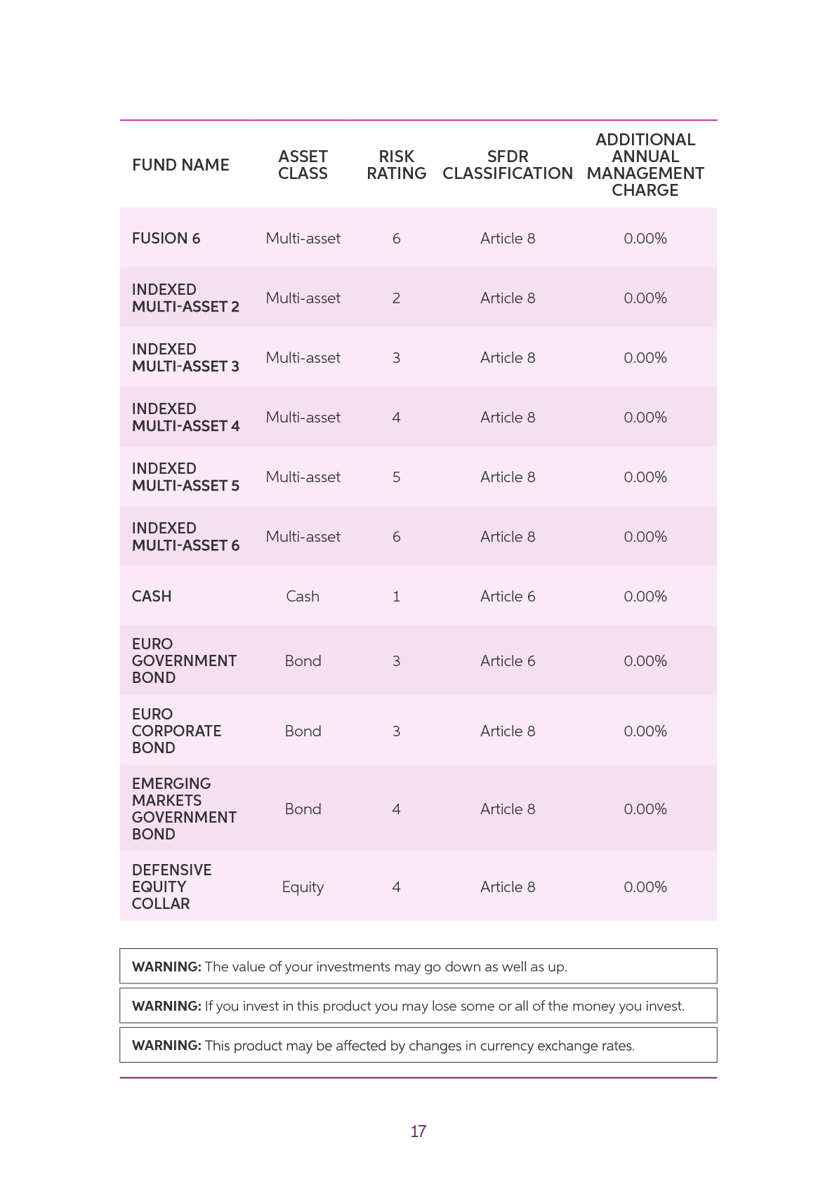
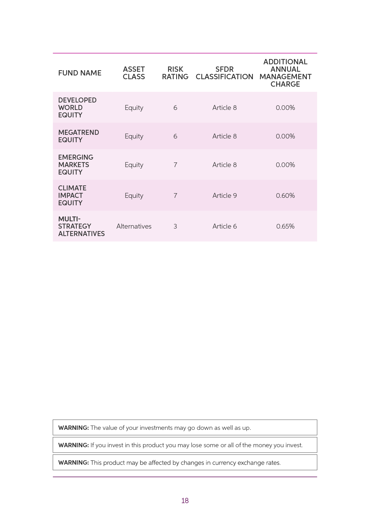
In 2026, the AIB life system was refreshed and rolled out across a new suite of customer-facing brochures.
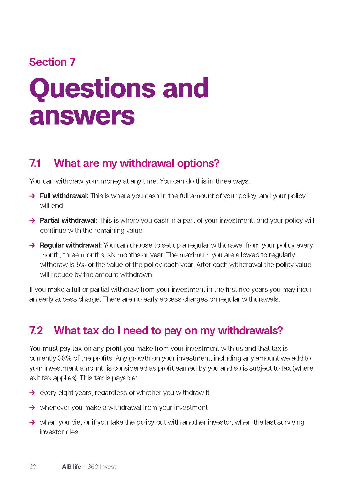
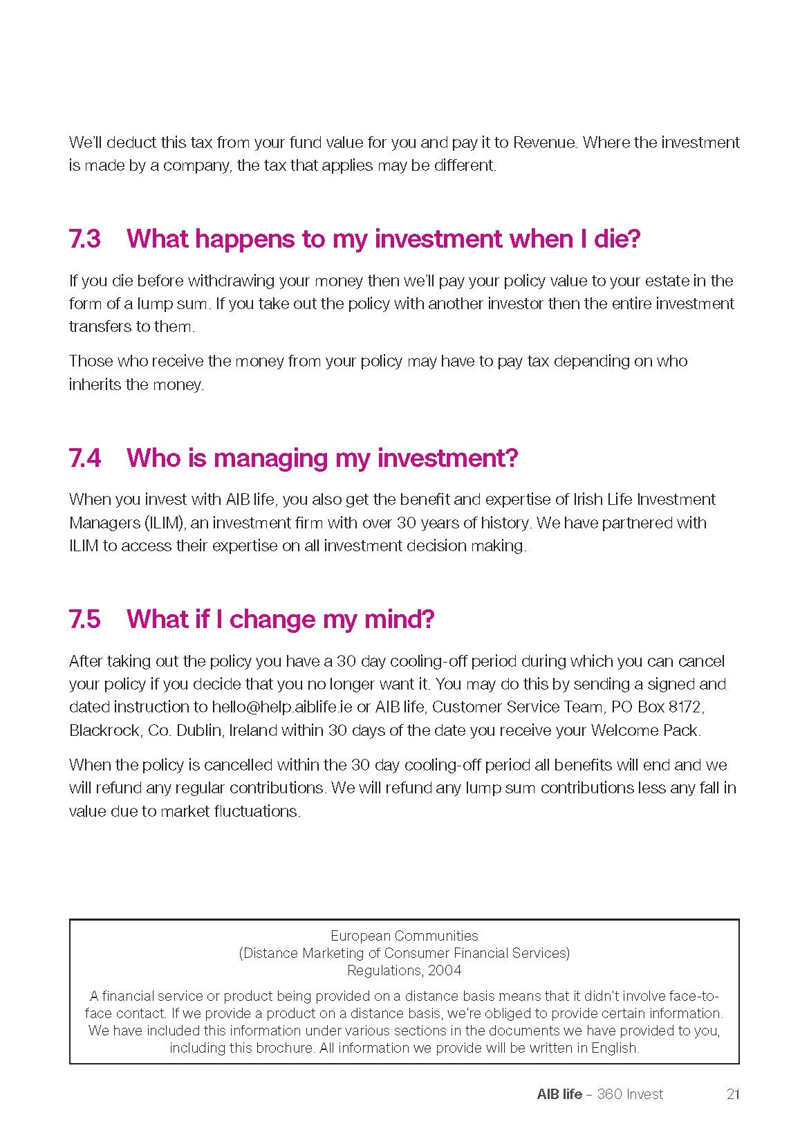
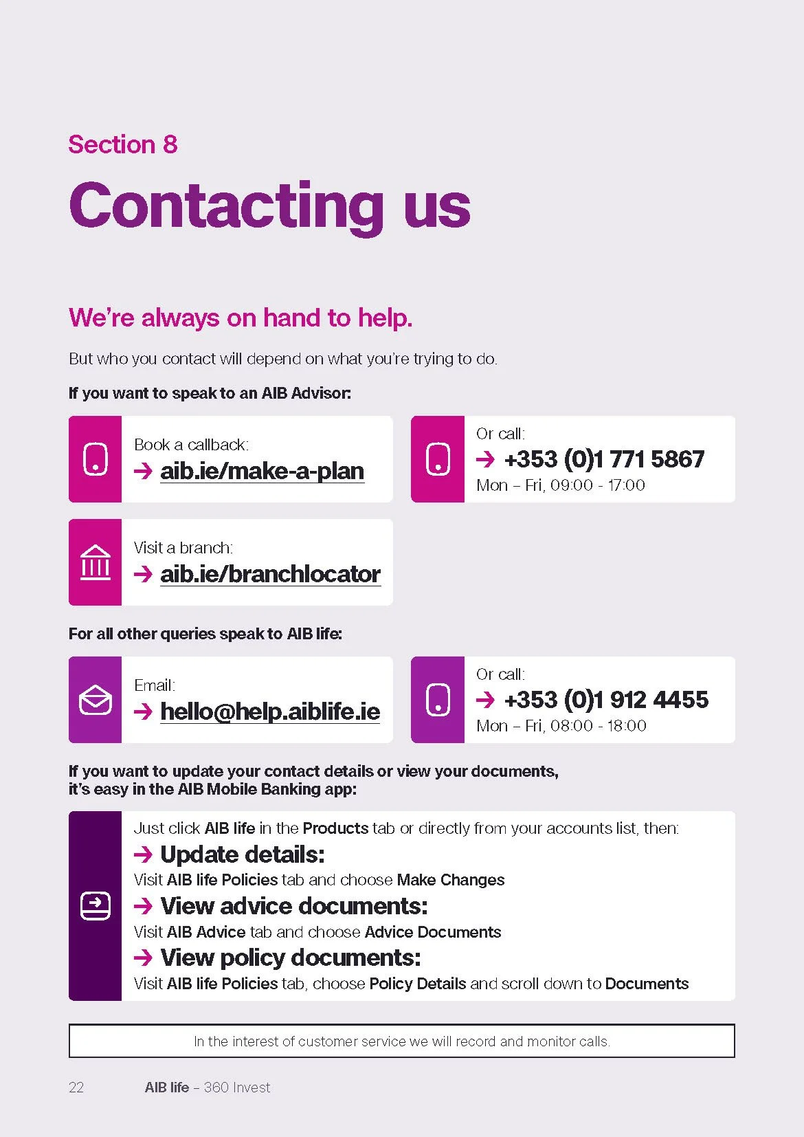
The update kept the more familiar photographic direction, but tightened the structure, hierarchy and overall finish, creating a clearer and more consistent brochure system across the range.